Skip to content
  • Categories
  • Recent
  • Tags
  • Popular
  • World
  • Users
  • Groups
Skins
  • Light
  • Brite
  • Cerulean
  • Cosmo
  • Flatly
  • Journal
  • Litera
  • Lumen
  • Lux
  • Materia
  • Minty
  • Morph
  • Pulse
  • Sandstone
  • Simplex
  • Sketchy
  • Spacelab
  • United
  • Yeti
  • Zephyr
  • Dark
  • Cyborg
  • Darkly
  • Quartz
  • Slate
  • Solar
  • Superhero
  • Vapor

  • Default (Cyborg)
  • No Skin
Collapse
Brand Logo

CIRCLE WITH A DOT

  1. Home
  2. Uncategorized
  3. When I was in my early twenties I read The Visual Display of Quantitative Information from Tufte and agonized over making charts great for users.

When I was in my early twenties I read The Visual Display of Quantitative Information from Tufte and agonized over making charts great for users.

Scheduled Pinned Locked Moved Uncategorized
91 Posts 70 Posters 1 Views
  • Oldest to Newest
  • Newest to Oldest
  • Most Votes
Reply
  • Reply as topic
Log in to reply
This topic has been deleted. Only users with topic management privileges can see it.
  • thomasfuchs@hachyderm.ioT thomasfuchs@hachyderm.io

    Source: https://learn.microsoft.com/en-us/training/modules/introduction-to-github/3-components-of-github-flow

    h_offen@nrw.socialH This user is from outside of this forum
    h_offen@nrw.socialH This user is from outside of this forum
    h_offen@nrw.social
    wrote last edited by
    #48

    @thomasfuchs first time I committed the feedback form over there. Like really, wtf‽ Hopefully it will be read by an actual person not another stupid micro$lop AI agent.

    galaxis@mastodon.infra.deG 1 Reply Last reply
    0
    • elithebearded@fed.qaz.redE elithebearded@fed.qaz.red

      @lmorchard @thomasfuchs

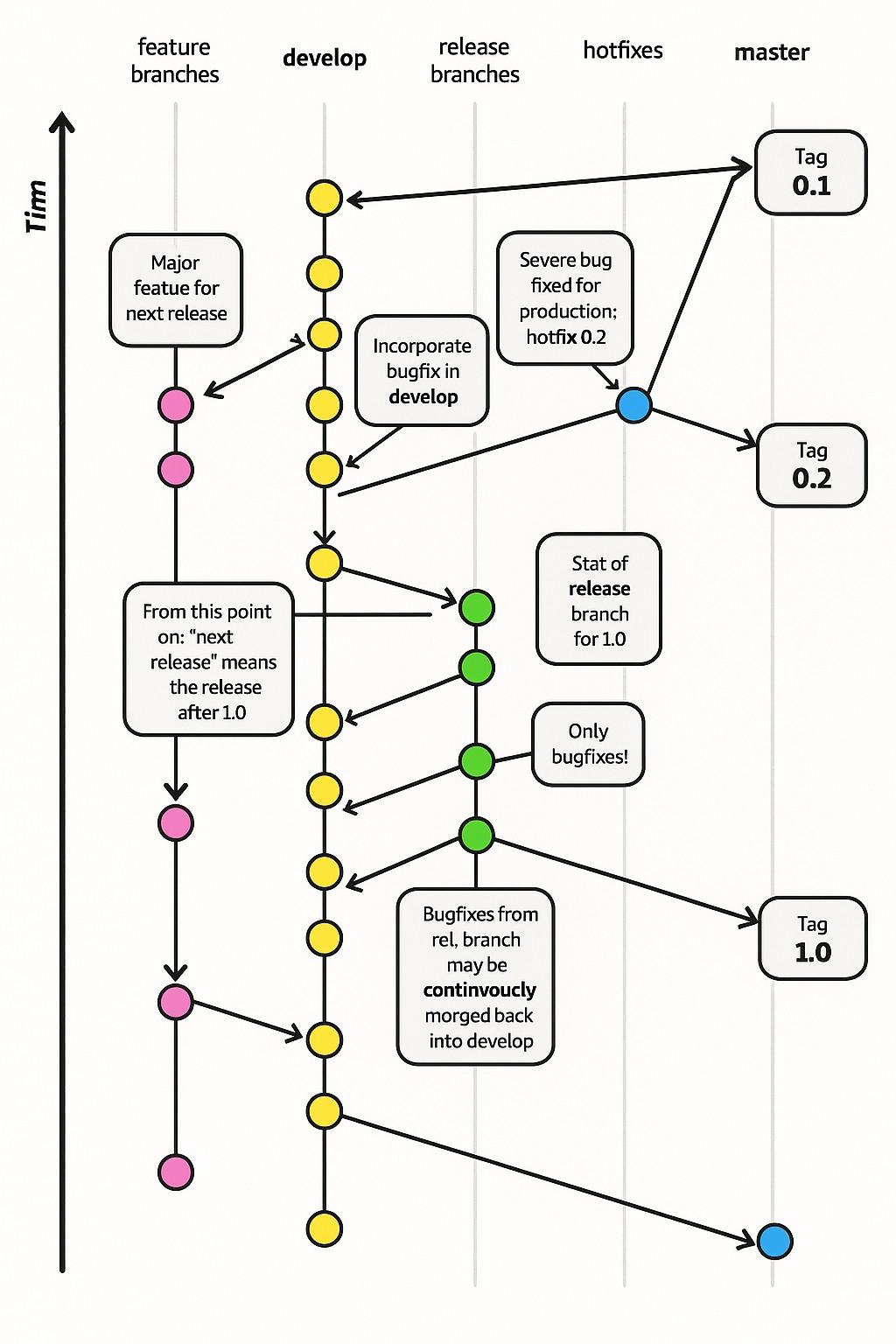
      Backwards timn

      gunstick@mastodon.opencloud.luG This user is from outside of this forum
      gunstick@mastodon.opencloud.luG This user is from outside of this forum
      gunstick@mastodon.opencloud.lu
      wrote last edited by
      #49

      @elithebearded @lmorchard @thomasfuchs from rnicrosoft we learned that his name is Tirm

      ariels@hachyderm.ioA 1 Reply Last reply
      0
      • thomasfuchs@hachyderm.ioT thomasfuchs@hachyderm.io

        When I was in my early twenties I read The Visual Display of Quantitative Information from Tufte and agonized over making charts great for users.

        These days, Microsoft releases graphs like this

        h_offen@nrw.socialH This user is from outside of this forum
        h_offen@nrw.socialH This user is from outside of this forum
        h_offen@nrw.social
        wrote last edited by
        #50

        @thomasfuchs if I were @nvie I'd partner up with an attorney specialised in copyright and sue the f**k out of them

        1 Reply Last reply
        0
        • thomasfuchs@hachyderm.ioT thomasfuchs@hachyderm.io

          When I was in my early twenties I read The Visual Display of Quantitative Information from Tufte and agonized over making charts great for users.

          These days, Microsoft releases graphs like this

          katana@mas.toK This user is from outside of this forum
          katana@mas.toK This user is from outside of this forum
          katana@mas.to
          wrote last edited by
          #51

          @thomasfuchs appears to have been silently replaced within the last ~10 minutes, i just opened the page again to grab a screenshot and there's a new diagram where that one was

          lapo@f.lapo.itL 1 Reply Last reply
          0
          • gunstick@mastodon.opencloud.luG gunstick@mastodon.opencloud.lu

            @elithebearded @lmorchard @thomasfuchs from rnicrosoft we learned that his name is Tirm

            ariels@hachyderm.ioA This user is from outside of this forum
            ariels@hachyderm.ioA This user is from outside of this forum
            ariels@hachyderm.io
            wrote last edited by
            #52

            @gunstick @elithebearded @lmorchard @thomasfuchs I believe it was Dorian Gray who invented the "timn-sequence diagram" we all use today.
            #DorianGray #timn #uml

            ariels@hachyderm.ioA 1 Reply Last reply
            0
            • thomasfuchs@hachyderm.ioT thomasfuchs@hachyderm.io

              When I was in my early twenties I read The Visual Display of Quantitative Information from Tufte and agonized over making charts great for users.

              These days, Microsoft releases graphs like this

              mtnrbq65@social.vivaldi.netM This user is from outside of this forum
              mtnrbq65@social.vivaldi.netM This user is from outside of this forum
              mtnrbq65@social.vivaldi.net
              wrote last edited by
              #53

              @thomasfuchs

              I'm going to be morging my changes back to the develop branch from now on!

              rytmis@hachyderm.ioR 1 Reply Last reply
              0
              • ariels@hachyderm.ioA ariels@hachyderm.io

                @gunstick @elithebearded @lmorchard @thomasfuchs I believe it was Dorian Gray who invented the "timn-sequence diagram" we all use today.
                #DorianGray #timn #uml

                ariels@hachyderm.ioA This user is from outside of this forum
                ariels@hachyderm.ioA This user is from outside of this forum
                ariels@hachyderm.io
                wrote last edited by
                #54

                @gunstick @elithebearded @lmorchard @thomasfuchs
                Great, now because of you lot they deleted timn and the world will never learn. The irony of changing the docs about versioning flows without documenting the change is delicious. Almost as delicious as the fact that archive.org exists.
                To save you the time: https://web.archive.org/web/20260217061031/https://learn.microsoft.com/en-us/training/modules/introduction-to-github/3-components-of-github-flow

                1 Reply Last reply
                0
                • thomasfuchs@hachyderm.ioT thomasfuchs@hachyderm.io

                  When I was in my early twenties I read The Visual Display of Quantitative Information from Tufte and agonized over making charts great for users.

                  These days, Microsoft releases graphs like this

                  pikesley@mastodon.me.ukP This user is from outside of this forum
                  pikesley@mastodon.me.ukP This user is from outside of this forum
                  pikesley@mastodon.me.uk
                  wrote last edited by
                  #55

                  @thomasfuchs

                  "What do you call yourselves?"
                  "The Aristocrats"

                  1 Reply Last reply
                  0
                  • katana@mas.toK katana@mas.to

                    @thomasfuchs appears to have been silently replaced within the last ~10 minutes, i just opened the page again to grab a screenshot and there's a new diagram where that one was

                    lapo@f.lapo.itL This user is from outside of this forum
                    lapo@f.lapo.itL This user is from outside of this forum
                    lapo@f.lapo.it
                    wrote last edited by
                    #56
                    @thomasfuchs @katana Which is more nice, but also completely devoid of details. 🤣
                    1 Reply Last reply
                    0
                    • thomasfuchs@hachyderm.ioT thomasfuchs@hachyderm.io

                      When I was in my early twenties I read The Visual Display of Quantitative Information from Tufte and agonized over making charts great for users.

                      These days, Microsoft releases graphs like this

                      landetannien@mastodonsweden.seL This user is from outside of this forum
                      landetannien@mastodonsweden.seL This user is from outside of this forum
                      landetannien@mastodonsweden.se
                      wrote last edited by
                      #57

                      @thomasfuchs Does the existence of pictures like this indicate how most people never try to read and understand charts?

                      When this exists, they will never learn that it's worth making the effort 😞

                      1 Reply Last reply
                      0
                      • thomasfuchs@hachyderm.ioT thomasfuchs@hachyderm.io

                        @bplein If you're lost, you can look and you will find me
                        Timn after Timn

                        d1@autistics.lifeD This user is from outside of this forum
                        d1@autistics.lifeD This user is from outside of this forum
                        d1@autistics.life
                        wrote last edited by
                        #58

                        @thomasfuchs @bplein There should be a passionate Karaoke over this

                        1 Reply Last reply
                        0
                        • thomasfuchs@hachyderm.ioT thomasfuchs@hachyderm.io

                          When I was in my early twenties I read The Visual Display of Quantitative Information from Tufte and agonized over making charts great for users.

                          These days, Microsoft releases graphs like this

                          oisin@mastodon.ieO This user is from outside of this forum
                          oisin@mastodon.ieO This user is from outside of this forum
                          oisin@mastodon.ie
                          wrote last edited by
                          #59

                          @thomasfuchs what the actual fuck is that! rhetorical question of course, we all know what it is, it is a pile of crap.

                          1 Reply Last reply
                          0
                          • h_offen@nrw.socialH h_offen@nrw.social

                            @thomasfuchs first time I committed the feedback form over there. Like really, wtf‽ Hopefully it will be read by an actual person not another stupid micro$lop AI agent.

                            galaxis@mastodon.infra.deG This user is from outside of this forum
                            galaxis@mastodon.infra.deG This user is from outside of this forum
                            galaxis@mastodon.infra.de
                            wrote last edited by
                            #60

                            @h_offen @thomasfuchs It looks like they replaced that graph at least (with something that has no words at all).

                            1 Reply Last reply
                            0
                            • thomasfuchs@hachyderm.ioT thomasfuchs@hachyderm.io

                              When I was in my early twenties I read The Visual Display of Quantitative Information from Tufte and agonized over making charts great for users.

                              These days, Microsoft releases graphs like this

                              rightsprung@c.imR This user is from outside of this forum
                              rightsprung@c.imR This user is from outside of this forum
                              rightsprung@c.im
                              wrote last edited by
                              #61

                              @thomasfuchs

                              Omg i was so confused until I read the alt-text

                              1 Reply Last reply
                              0
                              • thomasfuchs@hachyderm.ioT thomasfuchs@hachyderm.io

                                When I was in my early twenties I read The Visual Display of Quantitative Information from Tufte and agonized over making charts great for users.

                                These days, Microsoft releases graphs like this

                                drahardja@sfba.socialD This user is from outside of this forum
                                drahardja@sfba.socialD This user is from outside of this forum
                                drahardja@sfba.social
                                wrote last edited by
                                #62

                                @thomasfuchs They changed the image on the site, but it’s still available here: https://web.archive.org/web/20260216165612/https://learn.microsoft.com/en-us/training/modules/introduction-to-github/3-components-of-github-flow

                                I find this absolutely insulting. The fact that Microsoft deems it appropriate to publish this utter slop tells me volumes about what they think of their readers.

                                It’s also heartbreaking. I learned so much from learn.microsoft.com way back when.

                                1 Reply Last reply
                                0
                                • thomasfuchs@hachyderm.ioT thomasfuchs@hachyderm.io

                                  When I was in my early twenties I read The Visual Display of Quantitative Information from Tufte and agonized over making charts great for users.

                                  These days, Microsoft releases graphs like this

                                  vogelchr@chaos.socialV This user is from outside of this forum
                                  vogelchr@chaos.socialV This user is from outside of this forum
                                  vogelchr@chaos.social
                                  wrote last edited by
                                  #63

                                  @thomasfuchs The “Time”(?) axis is labelled “Tiꦟ”…?

                                  1 Reply Last reply
                                  0
                                  • thomasfuchs@hachyderm.ioT thomasfuchs@hachyderm.io

                                    When I was in my early twenties I read The Visual Display of Quantitative Information from Tufte and agonized over making charts great for users.

                                    These days, Microsoft releases graphs like this

                                    fabienmarry@mastodon.socialF This user is from outside of this forum
                                    fabienmarry@mastodon.socialF This user is from outside of this forum
                                    fabienmarry@mastodon.social
                                    wrote last edited by
                                    #64

                                    @thomasfuchs @edeverett Best diagram to explain “continvoucly morging” IMHO

                                    1 Reply Last reply
                                    0
                                    • thomasfuchs@hachyderm.ioT thomasfuchs@hachyderm.io

                                      When I was in my early twenties I read The Visual Display of Quantitative Information from Tufte and agonized over making charts great for users.

                                      These days, Microsoft releases graphs like this

                                      groupnebula563@mastodon.socialG This user is from outside of this forum
                                      groupnebula563@mastodon.socialG This user is from outside of this forum
                                      groupnebula563@mastodon.social
                                      wrote last edited by
                                      #65

                                      @thomasfuchs you know what this reminds me of? i collect random bootleg items and often times they use flavor text stolen from other things, and then retyped manually by people who don't speak english. so you end up with shit like this:

                                      groupnebula563@mastodon.socialG wcbdata@vis.socialW 2 Replies Last reply
                                      0
                                      • groupnebula563@mastodon.socialG groupnebula563@mastodon.social

                                        @thomasfuchs you know what this reminds me of? i collect random bootleg items and often times they use flavor text stolen from other things, and then retyped manually by people who don't speak english. so you end up with shit like this:

                                        groupnebula563@mastodon.socialG This user is from outside of this forum
                                        groupnebula563@mastodon.socialG This user is from outside of this forum
                                        groupnebula563@mastodon.social
                                        wrote last edited by
                                        #66

                                        @thomasfuchs this is the best example i could find online, but i'm sure i could pull something out of my collection that's *far* worse

                                        1 Reply Last reply
                                        0
                                        • thomasfuchs@hachyderm.ioT thomasfuchs@hachyderm.io

                                          When I was in my early twenties I read The Visual Display of Quantitative Information from Tufte and agonized over making charts great for users.

                                          These days, Microsoft releases graphs like this

                                          jeeger@mastodon.socialJ This user is from outside of this forum
                                          jeeger@mastodon.socialJ This user is from outside of this forum
                                          jeeger@mastodon.social
                                          wrote last edited by
                                          #67

                                          @thomasfuchs "The Dyslexia of Graphics"

                                          1 Reply Last reply
                                          0
                                          Reply
                                          • Reply as topic
                                          Log in to reply
                                          • Oldest to Newest
                                          • Newest to Oldest
                                          • Most Votes


                                          • Login

                                          • Login or register to search.
                                          • First post
                                            Last post
                                          0
                                          • Categories
                                          • Recent
                                          • Tags
                                          • Popular
                                          • World
                                          • Users
                                          • Groups