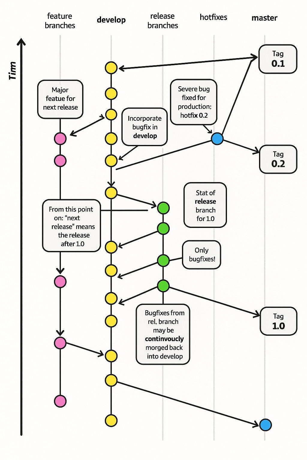
When I was in my early twenties I read The Visual Display of Quantitative Information from Tufte and agonized over making charts great for users.
-
When I was in my early twenties I read The Visual Display of Quantitative Information from Tufte and agonized over making charts great for users.
These days, Microsoft releases graphs like this
@thomasfuchs Does the existence of pictures like this indicate how most people never try to read and understand charts?
When this exists, they will never learn that it's worth making the effort

-
@bplein If you're lost, you can look and you will find me
Timn after Timn@thomasfuchs @bplein There should be a passionate Karaoke over this
-
When I was in my early twenties I read The Visual Display of Quantitative Information from Tufte and agonized over making charts great for users.
These days, Microsoft releases graphs like this
@thomasfuchs what the actual fuck is that! rhetorical question of course, we all know what it is, it is a pile of crap.
-
@thomasfuchs first time I committed the feedback form over there. Like really, wtf‽ Hopefully it will be read by an actual person not another stupid micro$lop AI agent.
@h_offen @thomasfuchs It looks like they replaced that graph at least (with something that has no words at all).
-
When I was in my early twenties I read The Visual Display of Quantitative Information from Tufte and agonized over making charts great for users.
These days, Microsoft releases graphs like this
Omg i was so confused until I read the alt-text
-
When I was in my early twenties I read The Visual Display of Quantitative Information from Tufte and agonized over making charts great for users.
These days, Microsoft releases graphs like this
@thomasfuchs They changed the image on the site, but it’s still available here: https://web.archive.org/web/20260216165612/https://learn.microsoft.com/en-us/training/modules/introduction-to-github/3-components-of-github-flow
I find this absolutely insulting. The fact that Microsoft deems it appropriate to publish this utter slop tells me volumes about what they think of their readers.
It’s also heartbreaking. I learned so much from learn.microsoft.com way back when.
-
When I was in my early twenties I read The Visual Display of Quantitative Information from Tufte and agonized over making charts great for users.
These days, Microsoft releases graphs like this
@thomasfuchs The “Time”(?) axis is labelled “Tiꦟ”…?
-
When I was in my early twenties I read The Visual Display of Quantitative Information from Tufte and agonized over making charts great for users.
These days, Microsoft releases graphs like this
@thomasfuchs @edeverett Best diagram to explain “continvoucly morging” IMHO
-
When I was in my early twenties I read The Visual Display of Quantitative Information from Tufte and agonized over making charts great for users.
These days, Microsoft releases graphs like this
@thomasfuchs you know what this reminds me of? i collect random bootleg items and often times they use flavor text stolen from other things, and then retyped manually by people who don't speak english. so you end up with shit like this:
-
@thomasfuchs you know what this reminds me of? i collect random bootleg items and often times they use flavor text stolen from other things, and then retyped manually by people who don't speak english. so you end up with shit like this:
@thomasfuchs this is the best example i could find online, but i'm sure i could pull something out of my collection that's *far* worse
-
When I was in my early twenties I read The Visual Display of Quantitative Information from Tufte and agonized over making charts great for users.
These days, Microsoft releases graphs like this
@thomasfuchs "The Dyslexia of Graphics"
-
When I was in my early twenties I read The Visual Display of Quantitative Information from Tufte and agonized over making charts great for users.
These days, Microsoft releases graphs like this
@thomasfuchs $ alias morge="git merge"
-
When I was in my early twenties I read The Visual Display of Quantitative Information from Tufte and agonized over making charts great for users.
These days, Microsoft releases graphs like this
@thomasfuchs poor Tim
-
When I was in my early twenties I read The Visual Display of Quantitative Information from Tufte and agonized over making charts great for users.
These days, Microsoft releases graphs like this
@thomasfuchs And Nadella wants us to stop calling this slop

 ️
️ -
@thomasfuchs They fixed the image but IA caught it.

Components of the GitHub flow - Training
Learn to use the components of the GitHub flow
(web.archive.org)
-
@thomasfuchs
Looks like they've fixed it? -
@nygl @thomasfuchs you need to do it going backwards in Tinm
-
@thomasfuchs did they just take the original (https://nvie.com/posts/a-successful-git-branching-model/) and run it through an image generator?
@colincornaby @thomasfuchs I was thinking ai and with this it definitely makes sense. Plus this is likely copyright violation!
-
Well, first you need two bottles of industrial lube, a goose, and a bag of pretzels.
-
I think it's a haiku and they wanted to stretch the sillable count so they made up a word. It's a mood thing, a-la jabberwocky.
Bugfix from rel, branch
Continvoucly morged back
into development
All jokes aside continvouclious development is all the rage these days.