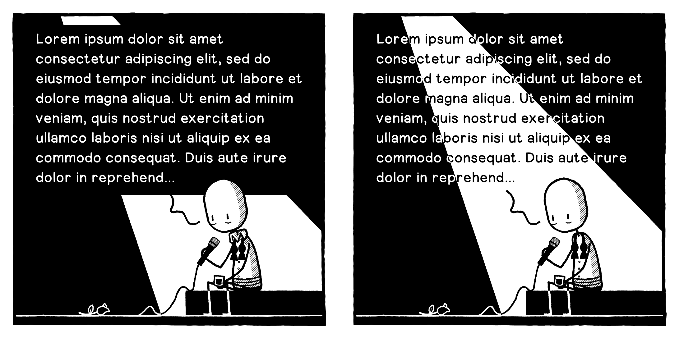
Okay, opinion needed. Should I A: obscure the spotlight to have more legible text, or B: incorporate the text into the spotlight but have it slightly harder to read?
-
@designthinkingcomic If you can do it, have all the text within the light beam and don't spill it over the edges into the dark. Or vice versa (though this wouldn't work as well), all the text in the dark areas to left and right but none in the light.
@JonnyT Unfortunately not, there's too much of it.
-
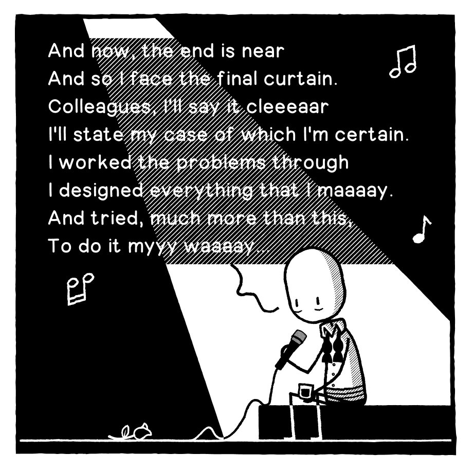
Another option...
C. It's clearly a spotlight AND it's legible.

-
Okay, opinion needed. Should I A: obscure the spotlight to have more legible text, or B: incorporate the text into the spotlight but have it slightly harder to read? Text is placeholder obvs.
-
Okay, opinion needed. Should I A: obscure the spotlight to have more legible text, or B: incorporate the text into the spotlight but have it slightly harder to read? Text is placeholder obvs.
@designthinkingcomic C, else A
-
Another option...
Option D. A last ditch attempt to retain my strip's Black & White aesthetic.
-
Option D. A last ditch attempt to retain my strip's Black & White aesthetic.
@designthinkingcomic I like D a lot!
Because it does not break the style. -
Option D. A last ditch attempt to retain my strip's Black & White aesthetic.
Haha, shit I gave away the premise of the joke...
-
Another option...
@designthinkingcomic
This works well. You already have the same grey in the character shading so it fits. -
Okay, opinion needed. Should I A: obscure the spotlight to have more legible text, or B: incorporate the text into the spotlight but have it slightly harder to read? Text is placeholder obvs.
@designthinkingcomic between de 4, B is still the best for me
-
@designthinkingcomic I like D a lot!
Because it does not break the style.@Aubrieta @designthinkingcomic D for me too.
-
Option D. A last ditch attempt to retain my strip's Black & White aesthetic.
@designthinkingcomic Ofption D is the winner, it has clarity and the style. -
Option D. A last ditch attempt to retain my strip's Black & White aesthetic.
@designthinkingcomic
Make it D -
Another option...
@designthinkingcomic I can read all of them without problem, but C looks the best, imho.
-
Okay, opinion needed. Should I A: obscure the spotlight to have more legible text, or B: incorporate the text into the spotlight but have it slightly harder to read? Text is placeholder obvs.
Thank you for the feedback everyone! I will now casually disregard it and do what I want to do like the terrible designer I am.

-
Thank you for the feedback everyone! I will now casually disregard it and do what I want to do like the terrible designer I am.
@designthinkingcomic sorry, but head office wants to see it in red, and run 26 sponsor logos across the bottom. And change the guy to a Shrek lookalike that won't get a copyright strike. Other than that all good
-
Thank you for the feedback everyone! I will now casually disregard it and do what I want to do like the terrible designer I am.
-
Okay, opinion needed. Should I A: obscure the spotlight to have more legible text, or B: incorporate the text into the spotlight but have it slightly harder to read? Text is placeholder obvs.
@designthinkingcomic weird I know, but I prefer the ipsum version. The unknown. It's way more gut wrenching.
Edit: for the record. I prefer C.
-
Thank you for the feedback everyone! I will now casually disregard it and do what I want to do like the terrible designer I am.
@designthinkingcomic What a beautiful way to say "none of you have the slightest idea"
-
@designthinkingcomic weird I know, but I prefer the ipsum version. The unknown. It's way more gut wrenching.
Edit: for the record. I prefer C.
@Ra Heh, I kinda liked the Lorem Ipsum one too, but that’s a whole different joke!
-
Okay, opinion needed. Should I A: obscure the spotlight to have more legible text, or B: incorporate the text into the spotlight but have it slightly harder to read? Text is placeholder obvs.
@designthinkingcomic A. the longer i stare at em, the nicer becomes A and less good B, although i liked it better at first.. D comes next.
