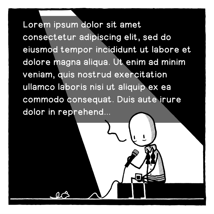
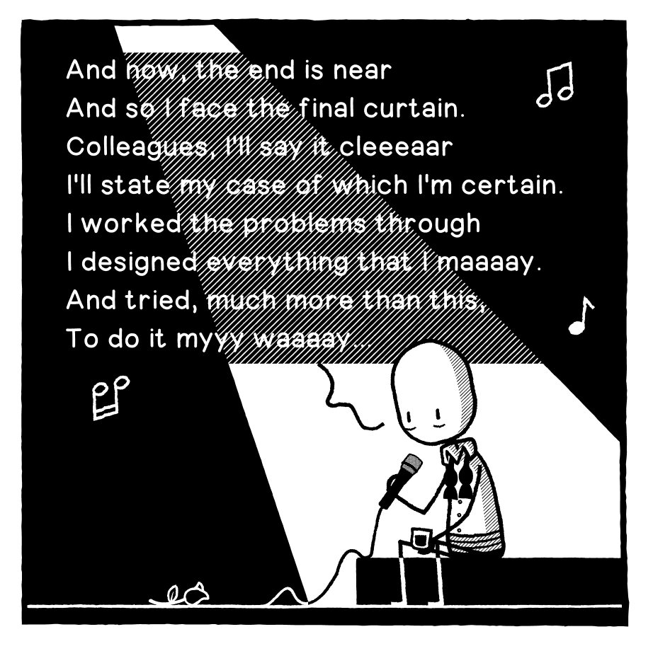
Okay, opinion needed. Should I A: obscure the spotlight to have more legible text, or B: incorporate the text into the spotlight but have it slightly harder to read?
-
Another option...
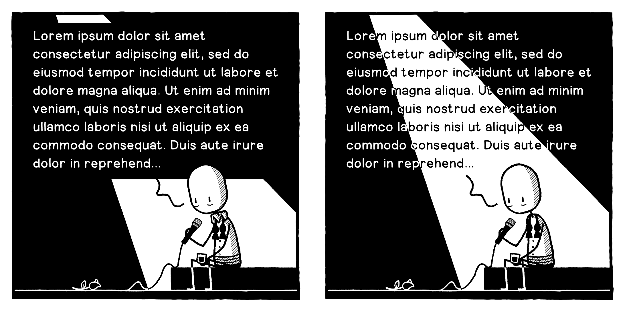
Option D. A last ditch attempt to retain my strip's Black & White aesthetic.
-
Option D. A last ditch attempt to retain my strip's Black & White aesthetic.
@designthinkingcomic I like D a lot!
Because it does not break the style. -
Option D. A last ditch attempt to retain my strip's Black & White aesthetic.
Haha, shit I gave away the premise of the joke...
-
Another option...
@designthinkingcomic
This works well. You already have the same grey in the character shading so it fits. -
Okay, opinion needed. Should I A: obscure the spotlight to have more legible text, or B: incorporate the text into the spotlight but have it slightly harder to read? Text is placeholder obvs.
@designthinkingcomic between de 4, B is still the best for me
-
@designthinkingcomic I like D a lot!
Because it does not break the style.@Aubrieta @designthinkingcomic D for me too.
-
Option D. A last ditch attempt to retain my strip's Black & White aesthetic.
@designthinkingcomic Ofption D is the winner, it has clarity and the style. -
Option D. A last ditch attempt to retain my strip's Black & White aesthetic.
@designthinkingcomic
Make it D -
Another option...
@designthinkingcomic I can read all of them without problem, but C looks the best, imho.
-
Okay, opinion needed. Should I A: obscure the spotlight to have more legible text, or B: incorporate the text into the spotlight but have it slightly harder to read? Text is placeholder obvs.
Thank you for the feedback everyone! I will now casually disregard it and do what I want to do like the terrible designer I am.

-
Thank you for the feedback everyone! I will now casually disregard it and do what I want to do like the terrible designer I am.
@designthinkingcomic sorry, but head office wants to see it in red, and run 26 sponsor logos across the bottom. And change the guy to a Shrek lookalike that won't get a copyright strike. Other than that all good
-
Thank you for the feedback everyone! I will now casually disregard it and do what I want to do like the terrible designer I am.
-
Okay, opinion needed. Should I A: obscure the spotlight to have more legible text, or B: incorporate the text into the spotlight but have it slightly harder to read? Text is placeholder obvs.
@designthinkingcomic weird I know, but I prefer the ipsum version. The unknown. It's way more gut wrenching.
Edit: for the record. I prefer C.
-
Thank you for the feedback everyone! I will now casually disregard it and do what I want to do like the terrible designer I am.
@designthinkingcomic What a beautiful way to say "none of you have the slightest idea"
-
@designthinkingcomic weird I know, but I prefer the ipsum version. The unknown. It's way more gut wrenching.
Edit: for the record. I prefer C.
@Ra Heh, I kinda liked the Lorem Ipsum one too, but that’s a whole different joke!
-
Okay, opinion needed. Should I A: obscure the spotlight to have more legible text, or B: incorporate the text into the spotlight but have it slightly harder to read? Text is placeholder obvs.
@designthinkingcomic A. the longer i stare at em, the nicer becomes A and less good B, although i liked it better at first.. D comes next.
-
Another option...
@designthinkingcomic this is the best option for me
-
Option D. A last ditch attempt to retain my strip's Black & White aesthetic.
@designthinkingcomic D makes my eyes hurt, even more so than option B
-
Option D. A last ditch attempt to retain my strip's Black & White aesthetic.
@designthinkingcomic I would go with B or C
-
Another option...
@designthinkingcomic this one (and yes I saw option D)
-
R relay@relay.infosec.exchange shared this topic
