Pixelfed logo variants, one of these will be the new logo ✨

-
Pixelfed logo variants, one of these will be the new logo

@dansup I like the pixel one because it matches the name and the product.
Less keen on rainbow iris(es) that are to close tot the beach ball of death on macOS. -
Pixelfed logo variants, one of these will be the new logo
@dansup I’m in love with the first row
-
Pixelfed logo variants, one of these will be the new logo
@dansup I like the second one from the second row.
-
Pixelfed logo variants, one of these will be the new logo
@dansup Just so it doesn’t look like the chrome logo

-
Pixelfed logo variants, one of these will be the new logo
@dansup This stands out most to me
-
@dansup I like this one
-
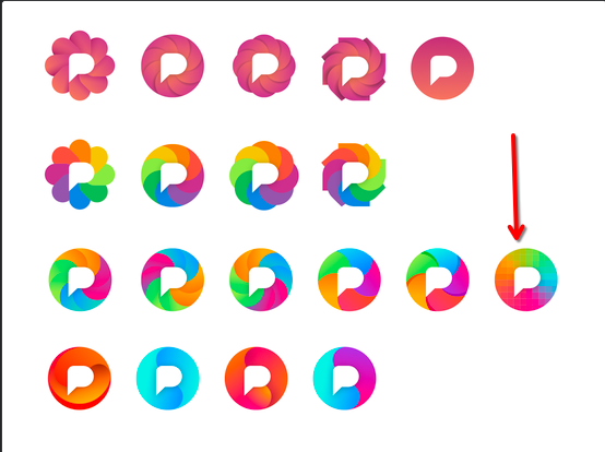
Pixelfed logo variants, one of these will be the new logo
@dansup ooo please have a selection people can choose from! I love the pink ones of the top row but it would be fun to see everyone have the ones they like best. Maybe a poll?
-
Pixelfed logo variants, one of these will be the new logo
I like the 2nd row flower one.

-
Pixelfed logo variants, one of these will be the new logo
@dansup
Proposal: watch them in greyscale and check, if they work as intended as well as colored. -
Pixelfed logo variants, one of these will be the new logo
@dansup From a designer's perspective, none of them are actually very good (technically speaking). Start from black and do colouring later. It should be legible as a favicon, as well as (already mentioned) near other social icons. A good logo needs to be able to work on different media; digital, print etc. I would suggest choosing a single colour as it makes creating a brand easier and more distinct. For me, these logos seem generic.