Skip to content
  • Categories
  • Recent
  • Tags
  • Popular
  • World
  • Users
  • Groups
Skins
  • Light
  • Brite
  • Cerulean
  • Cosmo
  • Flatly
  • Journal
  • Litera
  • Lumen
  • Lux
  • Materia
  • Minty
  • Morph
  • Pulse
  • Sandstone
  • Simplex
  • Sketchy
  • Spacelab
  • United
  • Yeti
  • Zephyr
  • Dark
  • Cyborg
  • Darkly
  • Quartz
  • Slate
  • Solar
  • Superhero
  • Vapor

  • Default (Cyborg)
  • No Skin
Collapse
Brand Logo

CIRCLE WITH A DOT

  1. Home
  2. Uncategorized
  3. Pixelfed logo variants, one of these will be the new logo ✨

Pixelfed logo variants, one of these will be the new logo ✨

Scheduled Pinned Locked Moved Uncategorized
39 Posts 38 Posters 19 Views
  • Oldest to Newest
  • Newest to Oldest
  • Most Votes
Reply
  • Reply as topic
Log in to reply
This topic has been deleted. Only users with topic management privileges can see it.
  • dansup@mastodon.socialD dansup@mastodon.social

    Pixelfed logo variants, one of these will be the new logo ✨

    pouakai@mastodon.socialP This user is from outside of this forum
    pouakai@mastodon.socialP This user is from outside of this forum
    pouakai@mastodon.social
    wrote last edited by
    #27

    @dansup
    The current one is good actually.

    1 Reply Last reply
    0
    • dansup@mastodon.socialD dansup@mastodon.social

      Pixelfed logo variants, one of these will be the new logo ✨

      oschell@mastodon.socialO This user is from outside of this forum
      oschell@mastodon.socialO This user is from outside of this forum
      oschell@mastodon.social
      wrote last edited by
      #28

      @dansup right on the first row or third

      1 Reply Last reply
      0
      • ameliasbrain@mstdn.caA ameliasbrain@mstdn.ca

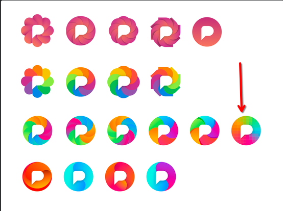
        @dansup If you're taking votes, I really like the pixelated gradient one (rightmost on 3rd row).

        You lose the camera aperture visual metaphor, but given how many nasty AI companies have similar segmented circle logos, maybe that's not a bad thing?

        casparvdburgh@mastodon.socialC This user is from outside of this forum
        casparvdburgh@mastodon.socialC This user is from outside of this forum
        casparvdburgh@mastodon.social
        wrote last edited by
        #29

        @AmeliasBrain @dansup strong argument, I like both. The pixelation is subtle, though, needs a sharp eye and/or big screen.

        1 Reply Last reply
        0
        • dansup@mastodon.socialD dansup@mastodon.social

          Pixelfed logo variants, one of these will be the new logo ✨

          fabienmarry@mastodon.socialF This user is from outside of this forum
          fabienmarry@mastodon.socialF This user is from outside of this forum
          fabienmarry@mastodon.social
          wrote last edited by
          #30

          @dansup I like the pixel one because it matches the name and the product.
          Less keen on rainbow iris(es) that are to close tot the beach ball of death on macOS.

          1 Reply Last reply
          0
          • dansup@mastodon.socialD dansup@mastodon.social

            Pixelfed logo variants, one of these will be the new logo ✨

            anatolegc@piaille.frA This user is from outside of this forum
            anatolegc@piaille.frA This user is from outside of this forum
            anatolegc@piaille.fr
            wrote last edited by
            #31

            @dansup I’m in love with the first row

            1 Reply Last reply
            0
            • dansup@mastodon.socialD dansup@mastodon.social

              Pixelfed logo variants, one of these will be the new logo ✨

              sashin@veganism.socialS This user is from outside of this forum
              sashin@veganism.socialS This user is from outside of this forum
              sashin@veganism.social
              wrote last edited by
              #32

              @dansup I like the second one from the second row.

              1 Reply Last reply
              0
              • dansup@mastodon.socialD dansup@mastodon.social

                Pixelfed logo variants, one of these will be the new logo ✨

                thedarktangent@defcon.socialT This user is from outside of this forum
                thedarktangent@defcon.socialT This user is from outside of this forum
                thedarktangent@defcon.social
                wrote last edited by
                #33

                @dansup Just so it doesn’t look like the chrome logo 🙏

                1 Reply Last reply
                0
                • dansup@mastodon.socialD dansup@mastodon.social

                  Pixelfed logo variants, one of these will be the new logo ✨

                  squirrel_767@hachyderm.ioS This user is from outside of this forum
                  squirrel_767@hachyderm.ioS This user is from outside of this forum
                  squirrel_767@hachyderm.io
                  wrote last edited by
                  #34

                  @dansup This stands out most to me

                  Link Preview Image
                  1 Reply Last reply
                  0
                  • akamran@indieweb.socialA akamran@indieweb.social

                    @dansup I like this one

                    sunnythesheep@mastodon.socialS This user is from outside of this forum
                    sunnythesheep@mastodon.socialS This user is from outside of this forum
                    sunnythesheep@mastodon.social
                    wrote last edited by
                    #35

                    @akamran after all, I like the pixelated one the most, too.

                    @dansup

                    1 Reply Last reply
                    0
                    • dansup@mastodon.socialD dansup@mastodon.social

                      Pixelfed logo variants, one of these will be the new logo ✨

                      blueberrie231@mastodon.socialB This user is from outside of this forum
                      blueberrie231@mastodon.socialB This user is from outside of this forum
                      blueberrie231@mastodon.social
                      wrote last edited by
                      #36

                      @dansup ooo please have a selection people can choose from! I love the pink ones of the top row but it would be fun to see everyone have the ones they like best. Maybe a poll?

                      1 Reply Last reply
                      0
                      • dansup@mastodon.socialD dansup@mastodon.social

                        Pixelfed logo variants, one of these will be the new logo ✨

                        gooberific@furry.engineerG This user is from outside of this forum
                        gooberific@furry.engineerG This user is from outside of this forum
                        gooberific@furry.engineer
                        wrote last edited by
                        #37

                        @dansup

                        I like the 2nd row flower one. 🌺

                        1 Reply Last reply
                        0
                        • dansup@mastodon.socialD dansup@mastodon.social

                          Pixelfed logo variants, one of these will be the new logo ✨

                          fasnix@fe.disroot.orgF This user is from outside of this forum
                          fasnix@fe.disroot.orgF This user is from outside of this forum
                          fasnix@fe.disroot.org
                          wrote last edited by
                          #38
                          @dansup
                          Proposal: watch them in greyscale and check, if they work as intended as well as colored.
                          1 Reply Last reply
                          0
                          • dansup@mastodon.socialD dansup@mastodon.social

                            Pixelfed logo variants, one of these will be the new logo ✨

                            dunesec@mastodon.socialD This user is from outside of this forum
                            dunesec@mastodon.socialD This user is from outside of this forum
                            dunesec@mastodon.social
                            wrote last edited by
                            #39

                            @dansup From a designer's perspective, none of them are actually very good (technically speaking). Start from black and do colouring later. It should be legible as a favicon, as well as (already mentioned) near other social icons. A good logo needs to be able to work on different media; digital, print etc. I would suggest choosing a single colour as it makes creating a brand easier and more distinct. For me, these logos seem generic.

                            1 Reply Last reply
                            0
                            Reply
                            • Reply as topic
                            Log in to reply
                            • Oldest to Newest
                            • Newest to Oldest
                            • Most Votes


                            • Login

                            • Login or register to search.
                            • First post
                              Last post
                            0
                            • Categories
                            • Recent
                            • Tags
                            • Popular
                            • World
                            • Users
                            • Groups