Skip to content
  • Categories
  • Recent
  • Tags
  • Popular
  • World
  • Users
  • Groups
Skins
  • Light
  • Brite
  • Cerulean
  • Cosmo
  • Flatly
  • Journal
  • Litera
  • Lumen
  • Lux
  • Materia
  • Minty
  • Morph
  • Pulse
  • Sandstone
  • Simplex
  • Sketchy
  • Spacelab
  • United
  • Yeti
  • Zephyr
  • Dark
  • Cyborg
  • Darkly
  • Quartz
  • Slate
  • Solar
  • Superhero
  • Vapor

  • Default (Cyborg)
  • No Skin
Collapse
Brand Logo

CIRCLE WITH A DOT

  1. Home
  2. Uncategorized
  3. Pixelfed logo variants, one of these will be the new logo ✨

Pixelfed logo variants, one of these will be the new logo ✨

Scheduled Pinned Locked Moved Uncategorized
39 Posts 38 Posters 18 Views
  • Oldest to Newest
  • Newest to Oldest
  • Most Votes
Reply
  • Reply as topic
Log in to reply
This topic has been deleted. Only users with topic management privileges can see it.
  • devlord@hachyderm.ioD devlord@hachyderm.io

    @dansup I like this one because it looks like camera shutters
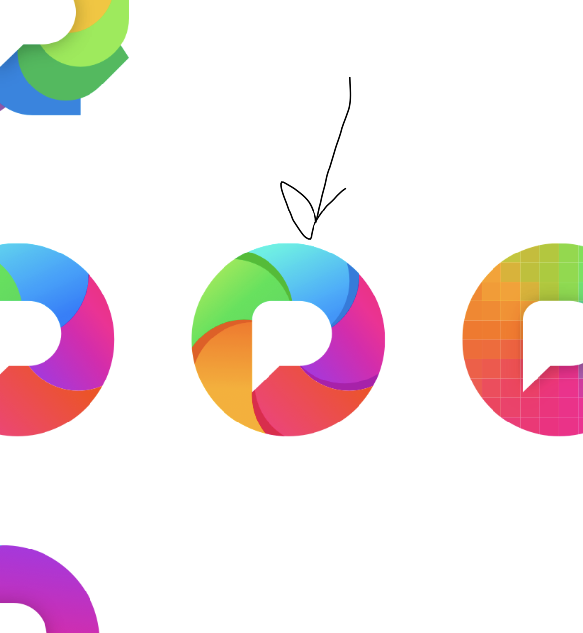
    Link Preview Image
    devlord@hachyderm.ioD This user is from outside of this forum
    devlord@hachyderm.ioD This user is from outside of this forum
    devlord@hachyderm.io
    wrote last edited by
    #17

    @dansup iris?

    1 Reply Last reply
    0
    • dansup@mastodon.socialD dansup@mastodon.social

      Pixelfed logo variants, one of these will be the new logo ✨

      fruitcakesareyum@mastodon.socialF This user is from outside of this forum
      fruitcakesareyum@mastodon.socialF This user is from outside of this forum
      fruitcakesareyum@mastodon.social
      wrote last edited by
      #18

      @dansup

      If you're asking for opinions... Disclaimer, I might not even use Pixelfed (but maybe this is somehow useful still).

      1st row: none

      2nd row: nice, but none

      3rd row: good, I vote for all but especially 5 and 6 (last two from left-to-right)

      4th row: none

      1 Reply Last reply
      0
      • dansup@mastodon.socialD dansup@mastodon.social

        Pixelfed logo variants, one of these will be the new logo ✨

        tobi208@ohai.socialT This user is from outside of this forum
        tobi208@ohai.socialT This user is from outside of this forum
        tobi208@ohai.social
        wrote last edited by
        #19

        @dansup The last one on the third row feels great

        1 Reply Last reply
        0
        • dansup@mastodon.socialD dansup@mastodon.social

          Pixelfed logo variants, one of these will be the new logo ✨

          samir@m.fedica.comS This user is from outside of this forum
          samir@m.fedica.comS This user is from outside of this forum
          samir@m.fedica.com
          wrote last edited by
          #20

          @dansup
          Simple is good so it doesn't get unrecognizable when scaled down in small UI, also needs to look fine on dark/light modes (or have two versions)

          Although the current logo is busy, it does stand out when you put it next to other platforms

          elcelio@mastodon.unoE 1 Reply Last reply
          0
          • R relay@relay.an.exchange shared this topic
          • dansup@mastodon.socialD dansup@mastodon.social

            Pixelfed logo variants, one of these will be the new logo ✨

            dkieffer@mastodon.sdf.orgD This user is from outside of this forum
            dkieffer@mastodon.sdf.orgD This user is from outside of this forum
            dkieffer@mastodon.sdf.org
            wrote last edited by
            #21

            @dansup number 14 is the strongest IMO

            1 Reply Last reply
            0
            • dansup@mastodon.socialD dansup@mastodon.social

              Pixelfed logo variants, one of these will be the new logo ✨

              admin@mstdn.feddit.socialA This user is from outside of this forum
              admin@mstdn.feddit.socialA This user is from outside of this forum
              admin@mstdn.feddit.social
              wrote last edited by
              #22

              @dansup
              1,1 1,2 3,2 6,3 4,4 are great

              1 Reply Last reply
              0
              • keradamo@pixelfed.artK This user is from outside of this forum
                keradamo@pixelfed.artK This user is from outside of this forum
                keradamo@pixelfed.art
                wrote last edited by
                #23
                At first I thought about the most bottom right version, but that is more my personal taste as it somehow fits within my own designs.

                However, I fully agree with the others about the pixelated version being the best. Pixels, yès! All the colours of humanity, yès! It also feels most distinctive from other brands.
                1 Reply Last reply
                0
                • dansup@mastodon.socialD dansup@mastodon.social

                  Pixelfed logo variants, one of these will be the new logo ✨

                  worldwidewerner@mastodon.socialW This user is from outside of this forum
                  worldwidewerner@mastodon.socialW This user is from outside of this forum
                  worldwidewerner@mastodon.social
                  wrote last edited by
                  #24

                  @dansup
                  All the three last ones on the third row are nice.

                  1 Reply Last reply
                  0
                  • samir@m.fedica.comS samir@m.fedica.com

                    @dansup
                    Simple is good so it doesn't get unrecognizable when scaled down in small UI, also needs to look fine on dark/light modes (or have two versions)

                    Although the current logo is busy, it does stand out when you put it next to other platforms

                    elcelio@mastodon.unoE This user is from outside of this forum
                    elcelio@mastodon.unoE This user is from outside of this forum
                    elcelio@mastodon.uno
                    wrote last edited by
                    #25

                    @samir @dansup but it is not very recognizable in black&white.
                    It seems stupid, but a good logo must be recognizable without colours

                    1 Reply Last reply
                    0
                    • dansup@mastodon.socialD dansup@mastodon.social

                      Pixelfed logo variants, one of these will be the new logo ✨

                      pixelcode@social.tchncs.deP This user is from outside of this forum
                      pixelcode@social.tchncs.deP This user is from outside of this forum
                      pixelcode@social.tchncs.de
                      wrote last edited by
                      #26

                      @dansup I know it will be the leftmost one in the 2nd row 😉

                      What makes it stand out to me are its unique, but still simple shape and its nice retro colours.

                      A regular circle is a bit boring, and the rightmost leaf shape looks a bit too ”aggressive” with its sharp corners.

                      The monochromatic icons could also be slightly more interesting, and I fear they might not provide sufficient internal contrast to be recognisable easily at small scales.

                      I feel like the colours of the rightmost icon in the last row are a bit generic and that they are frequently used by those rather cheap photo-editing apps/websites.

                      1 Reply Last reply
                      0
                      • dansup@mastodon.socialD dansup@mastodon.social

                        Pixelfed logo variants, one of these will be the new logo ✨

                        pouakai@mastodon.socialP This user is from outside of this forum
                        pouakai@mastodon.socialP This user is from outside of this forum
                        pouakai@mastodon.social
                        wrote last edited by
                        #27

                        @dansup
                        The current one is good actually.

                        1 Reply Last reply
                        0
                        • dansup@mastodon.socialD dansup@mastodon.social

                          Pixelfed logo variants, one of these will be the new logo ✨

                          oschell@mastodon.socialO This user is from outside of this forum
                          oschell@mastodon.socialO This user is from outside of this forum
                          oschell@mastodon.social
                          wrote last edited by
                          #28

                          @dansup right on the first row or third

                          1 Reply Last reply
                          0
                          • ameliasbrain@mstdn.caA ameliasbrain@mstdn.ca

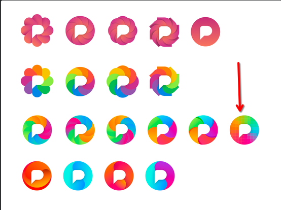
                            @dansup If you're taking votes, I really like the pixelated gradient one (rightmost on 3rd row).

                            You lose the camera aperture visual metaphor, but given how many nasty AI companies have similar segmented circle logos, maybe that's not a bad thing?

                            casparvdburgh@mastodon.socialC This user is from outside of this forum
                            casparvdburgh@mastodon.socialC This user is from outside of this forum
                            casparvdburgh@mastodon.social
                            wrote last edited by
                            #29

                            @AmeliasBrain @dansup strong argument, I like both. The pixelation is subtle, though, needs a sharp eye and/or big screen.

                            1 Reply Last reply
                            0
                            • dansup@mastodon.socialD dansup@mastodon.social

                              Pixelfed logo variants, one of these will be the new logo ✨

                              fabienmarry@mastodon.socialF This user is from outside of this forum
                              fabienmarry@mastodon.socialF This user is from outside of this forum
                              fabienmarry@mastodon.social
                              wrote last edited by
                              #30

                              @dansup I like the pixel one because it matches the name and the product.
                              Less keen on rainbow iris(es) that are to close tot the beach ball of death on macOS.

                              1 Reply Last reply
                              0
                              • dansup@mastodon.socialD dansup@mastodon.social

                                Pixelfed logo variants, one of these will be the new logo ✨

                                anatolegc@piaille.frA This user is from outside of this forum
                                anatolegc@piaille.frA This user is from outside of this forum
                                anatolegc@piaille.fr
                                wrote last edited by
                                #31

                                @dansup I’m in love with the first row

                                1 Reply Last reply
                                0
                                • dansup@mastodon.socialD dansup@mastodon.social

                                  Pixelfed logo variants, one of these will be the new logo ✨

                                  sashin@veganism.socialS This user is from outside of this forum
                                  sashin@veganism.socialS This user is from outside of this forum
                                  sashin@veganism.social
                                  wrote last edited by
                                  #32

                                  @dansup I like the second one from the second row.

                                  1 Reply Last reply
                                  0
                                  • dansup@mastodon.socialD dansup@mastodon.social

                                    Pixelfed logo variants, one of these will be the new logo ✨

                                    thedarktangent@defcon.socialT This user is from outside of this forum
                                    thedarktangent@defcon.socialT This user is from outside of this forum
                                    thedarktangent@defcon.social
                                    wrote last edited by
                                    #33

                                    @dansup Just so it doesn’t look like the chrome logo 🙏

                                    1 Reply Last reply
                                    0
                                    • dansup@mastodon.socialD dansup@mastodon.social

                                      Pixelfed logo variants, one of these will be the new logo ✨

                                      squirrel_767@hachyderm.ioS This user is from outside of this forum
                                      squirrel_767@hachyderm.ioS This user is from outside of this forum
                                      squirrel_767@hachyderm.io
                                      wrote last edited by
                                      #34

                                      @dansup This stands out most to me

                                      Link Preview Image
                                      1 Reply Last reply
                                      0
                                      • akamran@indieweb.socialA akamran@indieweb.social

                                        @dansup I like this one

                                        sunnythesheep@mastodon.socialS This user is from outside of this forum
                                        sunnythesheep@mastodon.socialS This user is from outside of this forum
                                        sunnythesheep@mastodon.social
                                        wrote last edited by
                                        #35

                                        @akamran after all, I like the pixelated one the most, too.

                                        @dansup

                                        1 Reply Last reply
                                        0
                                        • dansup@mastodon.socialD dansup@mastodon.social

                                          Pixelfed logo variants, one of these will be the new logo ✨

                                          blueberrie231@mastodon.socialB This user is from outside of this forum
                                          blueberrie231@mastodon.socialB This user is from outside of this forum
                                          blueberrie231@mastodon.social
                                          wrote last edited by
                                          #36

                                          @dansup ooo please have a selection people can choose from! I love the pink ones of the top row but it would be fun to see everyone have the ones they like best. Maybe a poll?

                                          1 Reply Last reply
                                          0
                                          Reply
                                          • Reply as topic
                                          Log in to reply
                                          • Oldest to Newest
                                          • Newest to Oldest
                                          • Most Votes


                                          • Login

                                          • Login or register to search.
                                          • First post
                                            Last post
                                          0
                                          • Categories
                                          • Recent
                                          • Tags
                                          • Popular
                                          • World
                                          • Users
                                          • Groups