Skip to content
  • Categories
  • Recent
  • Tags
  • Popular
  • World
  • Users
  • Groups
Skins
  • Light
  • Brite
  • Cerulean
  • Cosmo
  • Flatly
  • Journal
  • Litera
  • Lumen
  • Lux
  • Materia
  • Minty
  • Morph
  • Pulse
  • Sandstone
  • Simplex
  • Sketchy
  • Spacelab
  • United
  • Yeti
  • Zephyr
  • Dark
  • Cyborg
  • Darkly
  • Quartz
  • Slate
  • Solar
  • Superhero
  • Vapor

  • Default (Cyborg)
  • No Skin
Collapse
Brand Logo

CIRCLE WITH A DOT

  1. Home
  2. Uncategorized
  3. Advice I was given in my youth:

Advice I was given in my youth:

Scheduled Pinned Locked Moved Uncategorized
57 Posts 45 Posters 0 Views
  • Oldest to Newest
  • Newest to Oldest
  • Most Votes
Reply
  • Reply as topic
Log in to reply
This topic has been deleted. Only users with topic management privileges can see it.
  • suramya@mastodon.socialS suramya@mastodon.social

    @freakboy3742 completely agree.

    In addition my father gave me similar advice about my resume that I want to share.

    He told me not to use small font size on my resume (I was using size 8 to fit everything in one page) because most hiring managers are older and would have trouble reading the resume especially if they printed it out.

    Now years later I see the validity of the statement because I face that problem when people use small fonts in their resume.

    endlessmason@hachyderm.ioE This user is from outside of this forum
    endlessmason@hachyderm.ioE This user is from outside of this forum
    endlessmason@hachyderm.io
    wrote last edited by
    #19

    @suramya @freakboy3742
    I am currently working on my resume and was about to make this mistake.

    Excellent timing.

    1 Reply Last reply
    0
    • freakboy3742@cloudisland.nzF freakboy3742@cloudisland.nz

      RE: https://oldbytes.space/@feoh/116687129039392818

      Advice I was given in my youth:

      Print your slide on a full piece of paper. Put the paper on the ground. Stand on a chair.

      If you can’t easily read your slide, neither can the person at the back of the room.

      It flummoxes me that 30 years into using computers to show slides, tiny fonts in slide is *still* widespread practice.

      renespronk@c.imR This user is from outside of this forum
      renespronk@c.imR This user is from outside of this forum
      renespronk@c.im
      wrote last edited by
      #20

      @freakboy3742 Personally I blame the prelevalence of online presentations. Small fonts are more acceptable in such a setting because all attendees have a high resolution screen directly in front of them.

      Pesenting an in person training, let alone a talk at a conference in a long shoebox shaped room - minimal text, super large fonts.

      As a trainer I've worked with companies whose presentation template was created by a design company. Cool, but only aimed at online presentations, so unusable for training.

      And no, slide content is neither 'the talk', nor is it reference reading for the attendees. A violin is important in a concerto, but it's not about the violin, but about its effect on those listening, a means to an end.

      If you disagree, feel free to use minute fonts and add lots of preferably unrelated clipart, or super complicated ai generated infographics. Wingdings, anyone?

      infrapink@mastodon.ieI 1 Reply Last reply
      0
      • chessert@mastodon.onlineC chessert@mastodon.online

        @freakboy3742

        When I served in the Army, there was a minimum font size for PPT presentations. I want to say 18pt?

        freakboy3742@cloudisland.nzF This user is from outside of this forum
        freakboy3742@cloudisland.nzF This user is from outside of this forum
        freakboy3742@cloudisland.nz
        wrote last edited by
        #21

        @chessert I’m pretty sure 24pt was the value I was told… but either way, a lot more than 12.

        1 Reply Last reply
        0
        • freakboy3742@cloudisland.nzF freakboy3742@cloudisland.nz

          RE: https://oldbytes.space/@feoh/116687129039392818

          Advice I was given in my youth:

          Print your slide on a full piece of paper. Put the paper on the ground. Stand on a chair.

          If you can’t easily read your slide, neither can the person at the back of the room.

          It flummoxes me that 30 years into using computers to show slides, tiny fonts in slide is *still* widespread practice.

          d1@autistics.lifeD This user is from outside of this forum
          d1@autistics.lifeD This user is from outside of this forum
          d1@autistics.life
          wrote last edited by
          #22

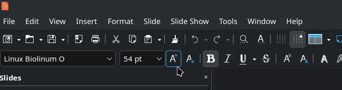
          @freakboy3742 The font "size-up" button is right there. Smash it! Lots of times!

          Shown is the "Increase Font Size" button in #LibreOffice. Shortcut is Ctrl + ]

          #OpenSource

          Link Preview Image
          1 Reply Last reply
          0
          • david_chisnall@infosec.exchangeD david_chisnall@infosec.exchange

            @freakboy3742

            It flummoxes me that 30 years into using computers to show slides, tiny fonts in slide is still widespread practice.

            25+ years ago, PowerPoint shipped a misfeature where, if you typed more text into a text box, it would automatically shrink the text to fit.

            When Keynote shipped, it did not have this misfeature. I believe this is 90% of the reason that early Keynote presentations looked better than PowerPoint presentations of the same era: If you typed too much text into a box in PowerPoint, it would make it unreadable for people in the audience, if you did the same in Keynote you had to manually reduce the size and that felt wrong.

            Some time around Keynote 3ish, they also added this misfeature.

            laescude@mastodon.crL This user is from outside of this forum
            laescude@mastodon.crL This user is from outside of this forum
            laescude@mastodon.cr
            wrote last edited by
            #23

            @david_chisnall @freakboy3742 😡 I hate autofit!

            1 Reply Last reply
            0
            • freakboy3742@cloudisland.nzF freakboy3742@cloudisland.nz

              RE: https://oldbytes.space/@feoh/116687129039392818

              Advice I was given in my youth:

              Print your slide on a full piece of paper. Put the paper on the ground. Stand on a chair.

              If you can’t easily read your slide, neither can the person at the back of the room.

              It flummoxes me that 30 years into using computers to show slides, tiny fonts in slide is *still* widespread practice.

              mdione@en.osm.townM This user is from outside of this forum
              mdione@en.osm.townM This user is from outside of this forum
              mdione@en.osm.town
              wrote last edited by
              #24

              @freakboy3742 and it would be nice if conference organizers would advise the projector's resolutions, because it's not the same to write slides in an 8k screen and then project in a 1080p projector.

              freakboy3742@cloudisland.nzF 1 Reply Last reply
              0
              • freakboy3742@cloudisland.nzF freakboy3742@cloudisland.nz

                RE: https://oldbytes.space/@feoh/116687129039392818

                Advice I was given in my youth:

                Print your slide on a full piece of paper. Put the paper on the ground. Stand on a chair.

                If you can’t easily read your slide, neither can the person at the back of the room.

                It flummoxes me that 30 years into using computers to show slides, tiny fonts in slide is *still* widespread practice.

                em_and_future_cats@mastodon.socialE This user is from outside of this forum
                em_and_future_cats@mastodon.socialE This user is from outside of this forum
                em_and_future_cats@mastodon.social
                wrote last edited by
                #25

                @freakboy3742
                That’s a perfect idea for proofreading! I try to adjust font size so others can see, but depending on the projector and room size it’s hard to judge with a laptop screen. Making sure the font is contrasting well with the background helps ( i .e. background is a picture and font is white, the picture has to be dim so the font stands out) but this makes so much more sense!

                1 Reply Last reply
                0
                • freakboy3742@cloudisland.nzF freakboy3742@cloudisland.nz

                  RE: https://oldbytes.space/@feoh/116687129039392818

                  Advice I was given in my youth:

                  Print your slide on a full piece of paper. Put the paper on the ground. Stand on a chair.

                  If you can’t easily read your slide, neither can the person at the back of the room.

                  It flummoxes me that 30 years into using computers to show slides, tiny fonts in slide is *still* widespread practice.

                  giliell@mastodon.socialG This user is from outside of this forum
                  giliell@mastodon.socialG This user is from outside of this forum
                  giliell@mastodon.social
                  wrote last edited by
                  #26

                  @freakboy3742 I'm trying SO FUCKING HARD to teach my students how to do a good presentation.
                  Your presentation should be readable. Your presentation should add to what you're saying (visuals) and support it (key points). If your presentation is 1:1 what you're saying, then one of you is unnecessary.

                  chessert@mastodon.onlineC 1 Reply Last reply
                  0
                  • renespronk@c.imR renespronk@c.im

                    @freakboy3742 Personally I blame the prelevalence of online presentations. Small fonts are more acceptable in such a setting because all attendees have a high resolution screen directly in front of them.

                    Pesenting an in person training, let alone a talk at a conference in a long shoebox shaped room - minimal text, super large fonts.

                    As a trainer I've worked with companies whose presentation template was created by a design company. Cool, but only aimed at online presentations, so unusable for training.

                    And no, slide content is neither 'the talk', nor is it reference reading for the attendees. A violin is important in a concerto, but it's not about the violin, but about its effect on those listening, a means to an end.

                    If you disagree, feel free to use minute fonts and add lots of preferably unrelated clipart, or super complicated ai generated infographics. Wingdings, anyone?

                    infrapink@mastodon.ieI This user is from outside of this forum
                    infrapink@mastodon.ieI This user is from outside of this forum
                    infrapink@mastodon.ie
                    wrote last edited by
                    #27

                    @renespronk @freakboy3742 The problem is older than online presentations. Lots of people just use the slideshow as a bad teleprompter instead of learning how to use it to complement as presentation. Way too many people don't even know how to put their presentation into fullscreen.

                    Source: I was at uni form 2004 to 2008. Good profs used presentations to complement lectures. Bad profs used it as the lecture.

                    renespronk@c.imR 1 Reply Last reply
                    0
                    • mdione@en.osm.townM mdione@en.osm.town

                      @freakboy3742 and it would be nice if conference organizers would advise the projector's resolutions, because it's not the same to write slides in an 8k screen and then project in a 1080p projector.

                      freakboy3742@cloudisland.nzF This user is from outside of this forum
                      freakboy3742@cloudisland.nzF This user is from outside of this forum
                      freakboy3742@cloudisland.nz
                      wrote last edited by
                      #28

                      @mdione If that matters, you’re doing it wrong.

                      A person in the back row can’t tell the difference between 8k and a potato. Assume it’s being projected at 640x480. If it’s not legible at that resolution, it’s not legible *at all*.

                      mdione@en.osm.townM flippac@types.plF 2 Replies Last reply
                      0
                      • freakboy3742@cloudisland.nzF freakboy3742@cloudisland.nz

                        @mdione If that matters, you’re doing it wrong.

                        A person in the back row can’t tell the difference between 8k and a potato. Assume it’s being projected at 640x480. If it’s not legible at that resolution, it’s not legible *at all*.

                        mdione@en.osm.townM This user is from outside of this forum
                        mdione@en.osm.townM This user is from outside of this forum
                        mdione@en.osm.town
                        wrote last edited by
                        #29

                        @freakboy3742 320x200, 4 colors (CGA 🙂

                        svengeier@mathstodon.xyzS 1 Reply Last reply
                        0
                        • freakboy3742@cloudisland.nzF freakboy3742@cloudisland.nz

                          RE: https://oldbytes.space/@feoh/116687129039392818

                          Advice I was given in my youth:

                          Print your slide on a full piece of paper. Put the paper on the ground. Stand on a chair.

                          If you can’t easily read your slide, neither can the person at the back of the room.

                          It flummoxes me that 30 years into using computers to show slides, tiny fonts in slide is *still* widespread practice.

                          R This user is from outside of this forum
                          R This user is from outside of this forum
                          rickd6@mstdn.ca
                          wrote last edited by
                          #30

                          @freakboy3742 happens on road signs too.

                          1 Reply Last reply
                          1
                          0
                          • infrapink@mastodon.ieI infrapink@mastodon.ie

                            @renespronk @freakboy3742 The problem is older than online presentations. Lots of people just use the slideshow as a bad teleprompter instead of learning how to use it to complement as presentation. Way too many people don't even know how to put their presentation into fullscreen.

                            Source: I was at uni form 2004 to 2008. Good profs used presentations to complement lectures. Bad profs used it as the lecture.

                            renespronk@c.imR This user is from outside of this forum
                            renespronk@c.imR This user is from outside of this forum
                            renespronk@c.im
                            wrote last edited by
                            #31

                            @Infrapink @freakboy3742 True, the problem has existed for ages.. IMHO it has been exacerbated by increased use of online meetings since COVID-19. (Certainly in Europe that was a game changer when it comes to the acceptance of online meetings)

                            1 Reply Last reply
                            0
                            • freakboy3742@cloudisland.nzF freakboy3742@cloudisland.nz

                              RE: https://oldbytes.space/@feoh/116687129039392818

                              Advice I was given in my youth:

                              Print your slide on a full piece of paper. Put the paper on the ground. Stand on a chair.

                              If you can’t easily read your slide, neither can the person at the back of the room.

                              It flummoxes me that 30 years into using computers to show slides, tiny fonts in slide is *still* widespread practice.

                              catmisgivings@stranger.socialC This user is from outside of this forum
                              catmisgivings@stranger.socialC This user is from outside of this forum
                              catmisgivings@stranger.social
                              wrote last edited by
                              #32

                              @freakboy3742 at work only about half of us were issued email addresses so the main mode of communication from HR to all staff is via the TVs in the break room

                              They will just copypaste a whole page letter from the president of the company onto a PowerPoint slide and call that communication

                              1 Reply Last reply
                              0
                              • freakboy3742@cloudisland.nzF freakboy3742@cloudisland.nz

                                RE: https://oldbytes.space/@feoh/116687129039392818

                                Advice I was given in my youth:

                                Print your slide on a full piece of paper. Put the paper on the ground. Stand on a chair.

                                If you can’t easily read your slide, neither can the person at the back of the room.

                                It flummoxes me that 30 years into using computers to show slides, tiny fonts in slide is *still* widespread practice.

                                chessert@mastodon.onlineC This user is from outside of this forum
                                chessert@mastodon.onlineC This user is from outside of this forum
                                chessert@mastodon.online
                                wrote last edited by
                                #33

                                @freakboy3742

                                My absolute favorite in the Army were the 35+ slide presentations which the presenter read to you verbatim off the screen, with few or no illustrations. Always time well spent. /s 🤣 🫡

                                1 Reply Last reply
                                0
                                • giliell@mastodon.socialG giliell@mastodon.social

                                  @freakboy3742 I'm trying SO FUCKING HARD to teach my students how to do a good presentation.
                                  Your presentation should be readable. Your presentation should add to what you're saying (visuals) and support it (key points). If your presentation is 1:1 what you're saying, then one of you is unnecessary.

                                  chessert@mastodon.onlineC This user is from outside of this forum
                                  chessert@mastodon.onlineC This user is from outside of this forum
                                  chessert@mastodon.online
                                  wrote last edited by
                                  #34

                                  @Giliell @freakboy3742

                                  👆 This!!

                                  1 Reply Last reply
                                  0
                                  • freakboy3742@cloudisland.nzF freakboy3742@cloudisland.nz

                                    RE: https://oldbytes.space/@feoh/116687129039392818

                                    Advice I was given in my youth:

                                    Print your slide on a full piece of paper. Put the paper on the ground. Stand on a chair.

                                    If you can’t easily read your slide, neither can the person at the back of the room.

                                    It flummoxes me that 30 years into using computers to show slides, tiny fonts in slide is *still* widespread practice.

                                    centretowner@urbanists.socialC This user is from outside of this forum
                                    centretowner@urbanists.socialC This user is from outside of this forum
                                    centretowner@urbanists.social
                                    wrote last edited by
                                    #35

                                    @freakboy3742 A little while back, three candidates gave us presentations.

                                    The first talked about how good a communicator they were, using text too small to read on a regular screen, much less in a slide deck.

                                    The second talked about how good a communicator they were, using an unreadable font where every character resembled the Threads logo.

                                    The third just had a clear presentation.

                                    We picked the third.

                                    1 Reply Last reply
                                    0
                                    • freakboy3742@cloudisland.nzF freakboy3742@cloudisland.nz

                                      RE: https://oldbytes.space/@feoh/116687129039392818

                                      Advice I was given in my youth:

                                      Print your slide on a full piece of paper. Put the paper on the ground. Stand on a chair.

                                      If you can’t easily read your slide, neither can the person at the back of the room.

                                      It flummoxes me that 30 years into using computers to show slides, tiny fonts in slide is *still* widespread practice.

                                      els@sfba.socialE This user is from outside of this forum
                                      els@sfba.socialE This user is from outside of this forum
                                      els@sfba.social
                                      wrote last edited by
                                      #36

                                      @freakboy3742 Our strategy was to type your text in pica on a 3” x 5” index card and photograph the card. The goal was large font, but also less text. Ensure that any text is useful for the audience, not just to cue you. Don’t use your image text to cue yourself.

                                      1 Reply Last reply
                                      0
                                      • killick@dmv.communityK killick@dmv.community

                                        @datenwolf @freakboy3742

                                        EXACTLY. If your audience is reading everything you plan to say, then why are you there?

                                        ohir@social.vivaldi.netO This user is from outside of this forum
                                        ohir@social.vivaldi.netO This user is from outside of this forum
                                        ohir@social.vivaldi.net
                                        wrote last edited by
                                        #37

                                        @killick
                                        > If your audience is reading everything you plan to say, then why are you there?

                                        Umm, a popular blogger much-sought post ad-0driven income is now in the $10 ranges. Per annum.

                                        The same knowledge at the conference pays around $10 too. Per minute.

                                        @datenwolf @freakboy3742

                                        datenwolf@chaos.socialD 1 Reply Last reply
                                        0
                                        • hynek@mastodon.socialH hynek@mastodon.social

                                          @nedbat @freakboy3742 … with poor contrast because some people think colors that look great on their hi-dpi monitor looks great on a projector too. And I mean both classic light/dark contrast AND color contrast.

                                          hwine@vmst.ioH This user is from outside of this forum
                                          hwine@vmst.ioH This user is from outside of this forum
                                          hwine@vmst.io
                                          wrote last edited by
                                          #38

                                          @hynek @nedbat @freakboy3742 Related - some of the best presentation prep info I was taught was in a class (long ago) on how to use flip charts! Those basics still apply.

                                          1 Reply Last reply
                                          0
                                          Reply
                                          • Reply as topic
                                          Log in to reply
                                          • Oldest to Newest
                                          • Newest to Oldest
                                          • Most Votes


                                          • Login

                                          • Login or register to search.
                                          • First post
                                            Last post
                                          0
                                          • Categories
                                          • Recent
                                          • Tags
                                          • Popular
                                          • World
                                          • Users
                                          • Groups