I'll be teaching a course in the fall on data communication.
-
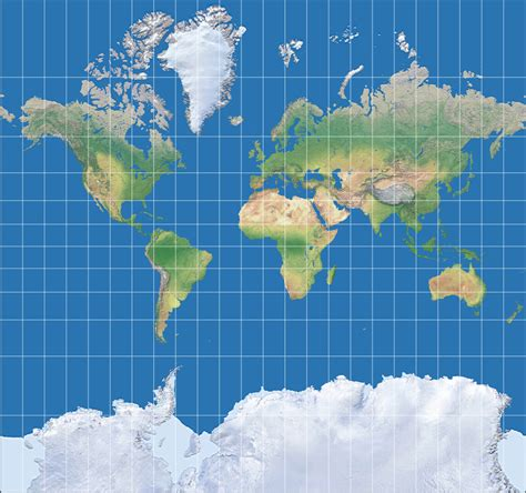
I'm not a researcher, but years ago on Twitter I saw an account promoting anti-climate action nonsense by showing a Mercator projection of the globe and demanding to know how so much ice at the 'poles' could ever be expected to melt or allow the planet to warm.
I was instantly blocked when I questioned it.
So the examples you want don't necessarily need to be sophisticated stuff. Sometimes the biggest, simplest, most outrageous lies will tell the story best.
Ooh. If you ever come across that again, please share.
I'd love to use that as an example
-
I'll be teaching a course in the fall on data communication.
One of the assignments I hope to put together is a lesson on how data is manipulated. I want to show how easy it is for climate change deniers, anti vaxxers, etc to crop data, stretch or flip an axis and suggest the opposite of what the data is actually showing. Still thinking through the assignment and I'm thinking of having them make an honest representation and one less so.
I think there's value to such a lesson given how much downright lying we have from not just randos but even political circles these days.
Was just going to use publicly available data sources but then I am thinking that there must be researchers here who have awesome data they wouldn't mind seeing put into visual form. If you do have data you'd be willing to let me use, please drop me a comment or PM and let me know how to access it. Thanks!
(P.S. would appreciate a share for wider reach)
@chu this is a well known one that I’ve used for the same purposes. https://flowingdata.com/2011/12/12/fox-news-still-makes-awesome-charts/
-
I'll be teaching a course in the fall on data communication.
One of the assignments I hope to put together is a lesson on how data is manipulated. I want to show how easy it is for climate change deniers, anti vaxxers, etc to crop data, stretch or flip an axis and suggest the opposite of what the data is actually showing. Still thinking through the assignment and I'm thinking of having them make an honest representation and one less so.
I think there's value to such a lesson given how much downright lying we have from not just randos but even political circles these days.
Was just going to use publicly available data sources but then I am thinking that there must be researchers here who have awesome data they wouldn't mind seeing put into visual form. If you do have data you'd be willing to let me use, please drop me a comment or PM and let me know how to access it. Thanks!
(P.S. would appreciate a share for wider reach)
@chu
Years ago when I was teaching college freshlings to use Excel, we spent a whole week on "how to lie with charts and graphs." Using 3-d graphs to distort data, usinh amounts when percentages would be more accurate, using graphs that most people are unfamiliar with like radar graphs... -
Ooh. If you ever come across that again, please share.
I'd love to use that as an example
Any Mercator map will do & the story pretty much tells itself.
This might actually be the one they used.
I got used to this format for VTA flying some years ago (the small area around airport terminals). Wiki notes they were also used in old times by sailors, and were in decline until the format happened to work nicely on web browsers, leading to a resurgence in popularity and user recognition - the stuff scammers love to exploit.
-
I'll be teaching a course in the fall on data communication.
One of the assignments I hope to put together is a lesson on how data is manipulated. I want to show how easy it is for climate change deniers, anti vaxxers, etc to crop data, stretch or flip an axis and suggest the opposite of what the data is actually showing. Still thinking through the assignment and I'm thinking of having them make an honest representation and one less so.
I think there's value to such a lesson given how much downright lying we have from not just randos but even political circles these days.
Was just going to use publicly available data sources but then I am thinking that there must be researchers here who have awesome data they wouldn't mind seeing put into visual form. If you do have data you'd be willing to let me use, please drop me a comment or PM and let me know how to access it. Thanks!
(P.S. would appreciate a share for wider reach)
@chu oh that's so cool!
-
I'll be teaching a course in the fall on data communication.
One of the assignments I hope to put together is a lesson on how data is manipulated. I want to show how easy it is for climate change deniers, anti vaxxers, etc to crop data, stretch or flip an axis and suggest the opposite of what the data is actually showing. Still thinking through the assignment and I'm thinking of having them make an honest representation and one less so.
I think there's value to such a lesson given how much downright lying we have from not just randos but even political circles these days.
Was just going to use publicly available data sources but then I am thinking that there must be researchers here who have awesome data they wouldn't mind seeing put into visual form. If you do have data you'd be willing to let me use, please drop me a comment or PM and let me know how to access it. Thanks!
(P.S. would appreciate a share for wider reach)
@chu
https://informationisbeautiful.net/visualizations/climate-change-deniers-vs-the-consensus/
The Escalator
Examines the science and arguments of global warming skepticism. Common objections like 'global warming is caused by the sun', 'temperature has changed naturally in the past' or 'other planets are warming too' are examined to see what the science really says.
Skeptical Science (skepticalscience.com)
-
I'll be teaching a course in the fall on data communication.
One of the assignments I hope to put together is a lesson on how data is manipulated. I want to show how easy it is for climate change deniers, anti vaxxers, etc to crop data, stretch or flip an axis and suggest the opposite of what the data is actually showing. Still thinking through the assignment and I'm thinking of having them make an honest representation and one less so.
I think there's value to such a lesson given how much downright lying we have from not just randos but even political circles these days.
Was just going to use publicly available data sources but then I am thinking that there must be researchers here who have awesome data they wouldn't mind seeing put into visual form. If you do have data you'd be willing to let me use, please drop me a comment or PM and let me know how to access it. Thanks!
(P.S. would appreciate a share for wider reach)
@chu @troublewithwords
I think you probably are, but are you using Tufte's The Visual Display of Quantitative Information?
https://www.edwardtufte.com/book/the-visual-display-of-quantitative-information/
This (and his other works) are my bible for teaching scientific communication via diagrams, charts and graphs.
As well as good practice he highlights poor and deliberately misleading approaches, albeit quite old ones now. -
I'll be teaching a course in the fall on data communication.
One of the assignments I hope to put together is a lesson on how data is manipulated. I want to show how easy it is for climate change deniers, anti vaxxers, etc to crop data, stretch or flip an axis and suggest the opposite of what the data is actually showing. Still thinking through the assignment and I'm thinking of having them make an honest representation and one less so.
I think there's value to such a lesson given how much downright lying we have from not just randos but even political circles these days.
Was just going to use publicly available data sources but then I am thinking that there must be researchers here who have awesome data they wouldn't mind seeing put into visual form. If you do have data you'd be willing to let me use, please drop me a comment or PM and let me know how to access it. Thanks!
(P.S. would appreciate a share for wider reach)
@chu There's a lot of rebuttal on this site. Foster has been doing this noble work for a long time.
e.g. https://tamino.wordpress.com/2025/04/09/un-natural-variation-the-elephant-in-the-room/

What’s Up With That?
The "CO2 Coalition" has prepared a report claiming that in Wyoming, "... high daily temperatures peaked during the Dust Bowl years of the 1930s and have been in a 90-year decline." To back up this claim they show this graph: Note that they list the source for their data as "NOAA National Centers for Environmental…
Open Mind (tamino.wordpress.com)

Not Even Wrong?
Cliff Mass shows a graph, taken from the Seattle Times, of the hottest temperature each July from 1945 through 2022 at Seattle/Tacoma airport (SEATAC). He then says "... and there is very little upward trend! How could this be?" Then he goes further: Just to check on the Seattle Times... I did the same thing…
Open Mind (tamino.wordpress.com)
-
I'll be teaching a course in the fall on data communication.
One of the assignments I hope to put together is a lesson on how data is manipulated. I want to show how easy it is for climate change deniers, anti vaxxers, etc to crop data, stretch or flip an axis and suggest the opposite of what the data is actually showing. Still thinking through the assignment and I'm thinking of having them make an honest representation and one less so.
I think there's value to such a lesson given how much downright lying we have from not just randos but even political circles these days.
Was just going to use publicly available data sources but then I am thinking that there must be researchers here who have awesome data they wouldn't mind seeing put into visual form. If you do have data you'd be willing to let me use, please drop me a comment or PM and let me know how to access it. Thanks!
(P.S. would appreciate a share for wider reach)
@chu this would definitely fit in the television ratings world. Where you can have a show that nobody watches, but Network pundits will claim that it's the number one show for teens age 12 to 16 who live in a certain part of the country and only have three streaming cable channels.
-
@chu @troublewithwords
I think you probably are, but are you using Tufte's The Visual Display of Quantitative Information?
https://www.edwardtufte.com/book/the-visual-display-of-quantitative-information/
This (and his other works) are my bible for teaching scientific communication via diagrams, charts and graphs.
As well as good practice he highlights poor and deliberately misleading approaches, albeit quite old ones now.Thanks. Will look at this. My first time teaching this particular course so all resource suggestions are welcome
-
@chu this is a well known one that I’ve used for the same purposes. https://flowingdata.com/2011/12/12/fox-news-still-makes-awesome-charts/
Fox graphs are probably going to be my go to for this course
-
I'll be teaching a course in the fall on data communication.
One of the assignments I hope to put together is a lesson on how data is manipulated. I want to show how easy it is for climate change deniers, anti vaxxers, etc to crop data, stretch or flip an axis and suggest the opposite of what the data is actually showing. Still thinking through the assignment and I'm thinking of having them make an honest representation and one less so.
I think there's value to such a lesson given how much downright lying we have from not just randos but even political circles these days.
Was just going to use publicly available data sources but then I am thinking that there must be researchers here who have awesome data they wouldn't mind seeing put into visual form. If you do have data you'd be willing to let me use, please drop me a comment or PM and let me know how to access it. Thanks!
(P.S. would appreciate a share for wider reach)
@chu When it comes to charts, the one thing I hate is that most finance-related charts/diagrams are 'zoomed in' and exaggerate volatility... When you zoom out, and set the vertical axis to zero, you often see what appears to be a dramatic shift in price is actually very small.
I'd illustrate this by choosing literally any stock that's having a bad month (or 3) after having a year (or more) of good performance. The most dramatic example of this I can think of is Bitcoin -- the 6-month chart looks awful. The two year chart tells a different story. The 10 year chart shows an insane increase, because the value 10 years ago was far closer to zero than it is now. (This is not an endorsement of crypto -- merely an observation.)
-
@chu When it comes to charts, the one thing I hate is that most finance-related charts/diagrams are 'zoomed in' and exaggerate volatility... When you zoom out, and set the vertical axis to zero, you often see what appears to be a dramatic shift in price is actually very small.
I'd illustrate this by choosing literally any stock that's having a bad month (or 3) after having a year (or more) of good performance. The most dramatic example of this I can think of is Bitcoin -- the 6-month chart looks awful. The two year chart tells a different story. The 10 year chart shows an insane increase, because the value 10 years ago was far closer to zero than it is now. (This is not an endorsement of crypto -- merely an observation.)
Fair. Don't worry. It'll go back to zero.
-
Thanks. Will look at this. My first time teaching this particular course so all resource suggestions are welcome
@chu
PM me and I'll happily share handout and slides for my presenting course (env sci at UTokyo) if you think it might be useful. -
I'll be teaching a course in the fall on data communication.
One of the assignments I hope to put together is a lesson on how data is manipulated. I want to show how easy it is for climate change deniers, anti vaxxers, etc to crop data, stretch or flip an axis and suggest the opposite of what the data is actually showing. Still thinking through the assignment and I'm thinking of having them make an honest representation and one less so.
I think there's value to such a lesson given how much downright lying we have from not just randos but even political circles these days.
Was just going to use publicly available data sources but then I am thinking that there must be researchers here who have awesome data they wouldn't mind seeing put into visual form. If you do have data you'd be willing to let me use, please drop me a comment or PM and let me know how to access it. Thanks!
(P.S. would appreciate a share for wider reach)
@chu My all-time favorite for this is "How to Lie with Statistics" https://dn710604.ca.archive.org/0/items/HowToLieWithStatistics_201608/How-to-Lie-With-Statistics-1954-Huff_text.pdf
-
I'll be teaching a course in the fall on data communication.
One of the assignments I hope to put together is a lesson on how data is manipulated. I want to show how easy it is for climate change deniers, anti vaxxers, etc to crop data, stretch or flip an axis and suggest the opposite of what the data is actually showing. Still thinking through the assignment and I'm thinking of having them make an honest representation and one less so.
I think there's value to such a lesson given how much downright lying we have from not just randos but even political circles these days.
Was just going to use publicly available data sources but then I am thinking that there must be researchers here who have awesome data they wouldn't mind seeing put into visual form. If you do have data you'd be willing to let me use, please drop me a comment or PM and let me know how to access it. Thanks!
(P.S. would appreciate a share for wider reach)
@chu Neil Brooks analysis of Fraser Institutes "Tax Freedom Day" could be good.
Fraser I., is a conservative Canadian "Think tank" (political advocacy organization)
It releases a new "study" each year, it has received wide uncritical coverage in Canadian media for decades
https://www.policyalternatives.ca/wp-content/uploads/attachments/tax_freedom_day.pdf?x46002
-
@chu Neil Brooks analysis of Fraser Institutes "Tax Freedom Day" could be good.
Fraser I., is a conservative Canadian "Think tank" (political advocacy organization)
It releases a new "study" each year, it has received wide uncritical coverage in Canadian media for decades
https://www.policyalternatives.ca/wp-content/uploads/attachments/tax_freedom_day.pdf?x46002
Thanks
-
I'll be teaching a course in the fall on data communication.
One of the assignments I hope to put together is a lesson on how data is manipulated. I want to show how easy it is for climate change deniers, anti vaxxers, etc to crop data, stretch or flip an axis and suggest the opposite of what the data is actually showing. Still thinking through the assignment and I'm thinking of having them make an honest representation and one less so.
I think there's value to such a lesson given how much downright lying we have from not just randos but even political circles these days.
Was just going to use publicly available data sources but then I am thinking that there must be researchers here who have awesome data they wouldn't mind seeing put into visual form. If you do have data you'd be willing to let me use, please drop me a comment or PM and let me know how to access it. Thanks!
(P.S. would appreciate a share for wider reach)
@chu if you are interested in #OpenData you may want to consider the following, although it is quite UK specific:
The transport energy and environment data tables: https://www.gov.uk/government/statistical-data-sets/energy-and-environment-data-tables-env
UK National Atmospheric Emissions Inventory (NAEI) showing various emissions https://naei.energysecurity.gov.uk(There is a bigger list of open data collated here https://anisotropi4.github.io/shed/opendata.html
It is less relevant to the ask but is stuff I have used in talks or visualisations.) -
I'll be teaching a course in the fall on data communication.
One of the assignments I hope to put together is a lesson on how data is manipulated. I want to show how easy it is for climate change deniers, anti vaxxers, etc to crop data, stretch or flip an axis and suggest the opposite of what the data is actually showing. Still thinking through the assignment and I'm thinking of having them make an honest representation and one less so.
I think there's value to such a lesson given how much downright lying we have from not just randos but even political circles these days.
Was just going to use publicly available data sources but then I am thinking that there must be researchers here who have awesome data they wouldn't mind seeing put into visual form. If you do have data you'd be willing to let me use, please drop me a comment or PM and let me know how to access it. Thanks!
(P.S. would appreciate a share for wider reach)
In 1998, Bill Clinton read a book called The Cobra Event, about a biological terror attack on US soil. The ultimate outcome was two things: 1) the Strategic National Stockpile (SNS), and 2) a new anti-vaccine movement.
In the Fall of 2001, in the wake of 9/11, Dick Cheney watched the outcome of a war game exercise called "Dark Winter" and upped the stockpile to 300M vaccines.
Is there a non-zero possibility you might consider assigning fiction?

The Monterey Protocols - A novella for non-proliferation
A short fictional thriller posing pressing strategic questions on a set of latent issues in civil defense.
%27%3E%3Cpath%20transform=%27scale(.26)%27%20d=%27m365%20102a288%20288%200%200%200-288%20288%20288%20288%200%200%200%20288%20288%20288%20288%200%200%200%20288-288%20288%20288%200%200%200-288-288%20288%20288%200%200%200-0.38%200zm49%20150c34%200.35%2056%2017%2072%2026%2018%2010%2034%2011%2053%2018%2012%206%2022%2015%2031%2027%203.2%204.2%2021%2033%2024%2041%201.3%203.7%201.4%205.5-0.48%207.7-3.2%203.8-6.7%202.5-8.1%204.5-1.4%202-6%206.2-9.1%206.6-3.1%200.41-7.9-2.9-10-0.63-2.2%202.2-4.9%203.4-6.6%203.8%200%200-18-3.6-22-2.8-4.4%200.91-15%205-20%204.2-4.6-0.85-16-1.4-17%202.2-1.5%203.6%2010%206.3%2016%2011%200%200-0.51%200.86-0.88%200.82-3-0.31-6.3-1.8-2.1%200.58%200.68%200.38-0.38%201.4-0.86%201-1.3-1.1-5.1-2-1.8%202%200.18%200.23-0.67%200.36-0.95%200.65-2.2-2.4-5.6-3.4-3.9%200.58%200.75%201.8-1.3%201.4-1.9%200.69-4.5-5-9.4-6.4-12-4.8-6.1%203.5-11%205.9-8.3%207.6%203.9%202.3%209.6%202.3%2014%202.9%203.7%200.46%206.1%206.2%208.9%208.7-0.026%200.36-0.59%201.3-1.1%200.84-2.1-1.7-3.6-2-0.81%202.3%200.19%200.29-0.56%200.89-0.87%200.71-4.8-2.6-3.8-0.057-2.2%201.7%200.16%200.35-0.71%200.79-1.1%200.76-5.4-4-5.2-1.6-3.5%200.59%200%200-2.3%200.53-2.6-0.32-7.7-6.3-27-8.2-44-15-1.6-0.63-29%205.6-31%2016%206.2%202.2%2017%204.6%2019%207.4-1.5%202.1-4%201.5-5.5%201.5%200%200%2012%204.9%2014%206.7%201.7%201.3%200.98%202.1-0.88%201.6-1.5-0.43-1%203.7%201.4%205.8%201.1%200.94%200.44%202.1-1.4%201.6-2-0.53-5.1%205-3%208.2%201.6%202.4-0.56%202.9-1.6%202-2.6-2.4-9.4%201.9-8.2%205.2%200.47%201.3-1.4%202.3-2.1%201.1-2.9-4.8-8.1-6-9.6-1.9-0.63%202.1-1.7%200.73-2.6%200.71%200%200-7.4-14-13-14-5.6-0.49-8.8-3.9-13-4.8-4.5-0.89-26-6.9-31-9.1-4.8-2.2-7.9-6.6-9.5-6.8-1.6-0.21-37%200.86-39%202.5-2.3%201.6-89%2069-126%2068-37-0.63-67-28-34-64%2033-36%20118-44%20118-44v-2e-3c4.4-11%2020-32%2022-38%201.8-5.5%2014-75%2075-98%2017-6.5%2032-8.9%2046-8.8z%27%20fill=%27%237a5c94%27%20stroke-linecap=%27round%27%20stroke-linejoin=%27round%27%20stroke-width=%27.77%27/%3E%3C/g%3E%3C/svg%3E)
monterey-protocols (montereyprotocols.org)
-
I'll be teaching a course in the fall on data communication.
One of the assignments I hope to put together is a lesson on how data is manipulated. I want to show how easy it is for climate change deniers, anti vaxxers, etc to crop data, stretch or flip an axis and suggest the opposite of what the data is actually showing. Still thinking through the assignment and I'm thinking of having them make an honest representation and one less so.
I think there's value to such a lesson given how much downright lying we have from not just randos but even political circles these days.
Was just going to use publicly available data sources but then I am thinking that there must be researchers here who have awesome data they wouldn't mind seeing put into visual form. If you do have data you'd be willing to let me use, please drop me a comment or PM and let me know how to access it. Thanks!
(P.S. would appreciate a share for wider reach)
@chu — Supreme Court decision rates. You can make it appear the Court is hyperpartisan or hypercollegial depending entirely on how you define a Supreme Court case.
The majority of SCOTUS cases are disposed of via GVR. In a single order they (G)rant the request for SCOTUS review, (V)acate the lower court decision, and (R)emand to the lower court for further hearings — usually with a Post-It attached explaining to the lower court judge where they screwed up and what they should've done instead.
GVRs represent the majority of their output and are overwhelmingly (>90%) 7-2, 8-1, or 9-0.
Cases that get invited for full argument before the Court represent the smallest chunk of their output, and tend to break down 5-4 or 6-3 along predictable fault lines.
Very few national pundits nattering about the "factionalism" of SCOTUS are ever honest enough to talk about the GVR rate, or other measures which do not support the factionalization narrative.