I'll be teaching a course in the fall on data communication.
-
Good idea!!
@chu It might rise the motivation to manipulate as smart and sneaky as possible
-
I'll be teaching a course in the fall on data communication.
One of the assignments I hope to put together is a lesson on how data is manipulated. I want to show how easy it is for climate change deniers, anti vaxxers, etc to crop data, stretch or flip an axis and suggest the opposite of what the data is actually showing. Still thinking through the assignment and I'm thinking of having them make an honest representation and one less so.
I think there's value to such a lesson given how much downright lying we have from not just randos but even political circles these days.
Was just going to use publicly available data sources but then I am thinking that there must be researchers here who have awesome data they wouldn't mind seeing put into visual form. If you do have data you'd be willing to let me use, please drop me a comment or PM and let me know how to access it. Thanks!
(P.S. would appreciate a share for wider reach)
@chu I would suggest looking at the Software Carpentry lessons, they are open source/CC licensed and they have built good datasets for training scientists on statistical methods and programming. You might not want to actually teach R, for eg, but the practise datasets they use are usually pulled from real data and included in the lessons as CSVs.
eg Ecology lesson plans & data sets:

Data Carpentry Lessons
We facilitate and develop lessons for Data Carpentry workshops. These lessons are distributed under the CC-BY license and are free for re-use or adaptation, with attribution. We’ve had people use the lessons in courses, to build new lessons, or use them for self-guided learning. Data Carpentry workshops are domain-specific, so that we are teaching researchers the skills most relevant to their domain and using examples from their type of work. Therefore, we have several types of workshops, and the curriculum is organised by domain.
Data Carpentry (datacarpentry.org)
-
@chu I would suggest looking at the Software Carpentry lessons, they are open source/CC licensed and they have built good datasets for training scientists on statistical methods and programming. You might not want to actually teach R, for eg, but the practise datasets they use are usually pulled from real data and included in the lessons as CSVs.
eg Ecology lesson plans & data sets:
Data Carpentry Lessons
We facilitate and develop lessons for Data Carpentry workshops. These lessons are distributed under the CC-BY license and are free for re-use or adaptation, with attribution. We’ve had people use the lessons in courses, to build new lessons, or use them for self-guided learning. Data Carpentry workshops are domain-specific, so that we are teaching researchers the skills most relevant to their domain and using examples from their type of work. Therefore, we have several types of workshops, and the curriculum is organised by domain.
Data Carpentry (datacarpentry.org)
Thanks. Will look
-
I'll be teaching a course in the fall on data communication.
One of the assignments I hope to put together is a lesson on how data is manipulated. I want to show how easy it is for climate change deniers, anti vaxxers, etc to crop data, stretch or flip an axis and suggest the opposite of what the data is actually showing. Still thinking through the assignment and I'm thinking of having them make an honest representation and one less so.
I think there's value to such a lesson given how much downright lying we have from not just randos but even political circles these days.
Was just going to use publicly available data sources but then I am thinking that there must be researchers here who have awesome data they wouldn't mind seeing put into visual form. If you do have data you'd be willing to let me use, please drop me a comment or PM and let me know how to access it. Thanks!
(P.S. would appreciate a share for wider reach)
@chu Are you going to cover the classic bad graphic "average heights of women by country"? That one always cracks me up and it's a lighter bit of data miscommunication.
-
@chu Are you going to cover the classic bad graphic "average heights of women by country"? That one always cracks me up and it's a lighter bit of data miscommunication.
I'm not familiar with this one. I know the average depth of a lake one.
-
I'm not familiar with this one. I know the average depth of a lake one.
-
Omg. Bookmarking this.
-
Omg. Bookmarking this.
I haven't started thinking about examples of badly displayed data yet but this is at the top of the list.
I should ask here for wisdom on that too. One thing at a time though
-
I haven't started thinking about examples of badly displayed data yet but this is at the top of the list.
I should ask here for wisdom on that too. One thing at a time though
@chu Is the lake depths one the great lakes or am I missing a crucial search term?
-
@chu Is the lake depths one the great lakes or am I missing a crucial search term?
A friend promised to get me a copy. If I get it, I'll share. It's a person drowning in a lake that's average 1m and the person is in the very small sinkhole part.
-
I'll be teaching a course in the fall on data communication.
One of the assignments I hope to put together is a lesson on how data is manipulated. I want to show how easy it is for climate change deniers, anti vaxxers, etc to crop data, stretch or flip an axis and suggest the opposite of what the data is actually showing. Still thinking through the assignment and I'm thinking of having them make an honest representation and one less so.
I think there's value to such a lesson given how much downright lying we have from not just randos but even political circles these days.
Was just going to use publicly available data sources but then I am thinking that there must be researchers here who have awesome data they wouldn't mind seeing put into visual form. If you do have data you'd be willing to let me use, please drop me a comment or PM and let me know how to access it. Thanks!
(P.S. would appreciate a share for wider reach)
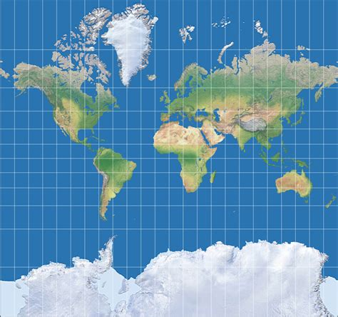
I'm not a researcher, but years ago on Twitter I saw an account promoting anti-climate action nonsense by showing a Mercator projection of the globe and demanding to know how so much ice at the 'poles' could ever be expected to melt or allow the planet to warm.
I was instantly blocked when I questioned it.
So the examples you want don't necessarily need to be sophisticated stuff. Sometimes the biggest, simplest, most outrageous lies will tell the story best.
-
I'm not a researcher, but years ago on Twitter I saw an account promoting anti-climate action nonsense by showing a Mercator projection of the globe and demanding to know how so much ice at the 'poles' could ever be expected to melt or allow the planet to warm.
I was instantly blocked when I questioned it.
So the examples you want don't necessarily need to be sophisticated stuff. Sometimes the biggest, simplest, most outrageous lies will tell the story best.
Ooh. If you ever come across that again, please share.
I'd love to use that as an example
-
I'll be teaching a course in the fall on data communication.
One of the assignments I hope to put together is a lesson on how data is manipulated. I want to show how easy it is for climate change deniers, anti vaxxers, etc to crop data, stretch or flip an axis and suggest the opposite of what the data is actually showing. Still thinking through the assignment and I'm thinking of having them make an honest representation and one less so.
I think there's value to such a lesson given how much downright lying we have from not just randos but even political circles these days.
Was just going to use publicly available data sources but then I am thinking that there must be researchers here who have awesome data they wouldn't mind seeing put into visual form. If you do have data you'd be willing to let me use, please drop me a comment or PM and let me know how to access it. Thanks!
(P.S. would appreciate a share for wider reach)
@chu this is a well known one that I’ve used for the same purposes. https://flowingdata.com/2011/12/12/fox-news-still-makes-awesome-charts/
-
I'll be teaching a course in the fall on data communication.
One of the assignments I hope to put together is a lesson on how data is manipulated. I want to show how easy it is for climate change deniers, anti vaxxers, etc to crop data, stretch or flip an axis and suggest the opposite of what the data is actually showing. Still thinking through the assignment and I'm thinking of having them make an honest representation and one less so.
I think there's value to such a lesson given how much downright lying we have from not just randos but even political circles these days.
Was just going to use publicly available data sources but then I am thinking that there must be researchers here who have awesome data they wouldn't mind seeing put into visual form. If you do have data you'd be willing to let me use, please drop me a comment or PM and let me know how to access it. Thanks!
(P.S. would appreciate a share for wider reach)
@chu
Years ago when I was teaching college freshlings to use Excel, we spent a whole week on "how to lie with charts and graphs." Using 3-d graphs to distort data, usinh amounts when percentages would be more accurate, using graphs that most people are unfamiliar with like radar graphs... -
Ooh. If you ever come across that again, please share.
I'd love to use that as an example
Any Mercator map will do & the story pretty much tells itself.
This might actually be the one they used.
I got used to this format for VTA flying some years ago (the small area around airport terminals). Wiki notes they were also used in old times by sailors, and were in decline until the format happened to work nicely on web browsers, leading to a resurgence in popularity and user recognition - the stuff scammers love to exploit.
-
I'll be teaching a course in the fall on data communication.
One of the assignments I hope to put together is a lesson on how data is manipulated. I want to show how easy it is for climate change deniers, anti vaxxers, etc to crop data, stretch or flip an axis and suggest the opposite of what the data is actually showing. Still thinking through the assignment and I'm thinking of having them make an honest representation and one less so.
I think there's value to such a lesson given how much downright lying we have from not just randos but even political circles these days.
Was just going to use publicly available data sources but then I am thinking that there must be researchers here who have awesome data they wouldn't mind seeing put into visual form. If you do have data you'd be willing to let me use, please drop me a comment or PM and let me know how to access it. Thanks!
(P.S. would appreciate a share for wider reach)
@chu oh that's so cool!
-
I'll be teaching a course in the fall on data communication.
One of the assignments I hope to put together is a lesson on how data is manipulated. I want to show how easy it is for climate change deniers, anti vaxxers, etc to crop data, stretch or flip an axis and suggest the opposite of what the data is actually showing. Still thinking through the assignment and I'm thinking of having them make an honest representation and one less so.
I think there's value to such a lesson given how much downright lying we have from not just randos but even political circles these days.
Was just going to use publicly available data sources but then I am thinking that there must be researchers here who have awesome data they wouldn't mind seeing put into visual form. If you do have data you'd be willing to let me use, please drop me a comment or PM and let me know how to access it. Thanks!
(P.S. would appreciate a share for wider reach)
@chu
https://informationisbeautiful.net/visualizations/climate-change-deniers-vs-the-consensus/
The Escalator
Examines the science and arguments of global warming skepticism. Common objections like 'global warming is caused by the sun', 'temperature has changed naturally in the past' or 'other planets are warming too' are examined to see what the science really says.
Skeptical Science (skepticalscience.com)
-
I'll be teaching a course in the fall on data communication.
One of the assignments I hope to put together is a lesson on how data is manipulated. I want to show how easy it is for climate change deniers, anti vaxxers, etc to crop data, stretch or flip an axis and suggest the opposite of what the data is actually showing. Still thinking through the assignment and I'm thinking of having them make an honest representation and one less so.
I think there's value to such a lesson given how much downright lying we have from not just randos but even political circles these days.
Was just going to use publicly available data sources but then I am thinking that there must be researchers here who have awesome data they wouldn't mind seeing put into visual form. If you do have data you'd be willing to let me use, please drop me a comment or PM and let me know how to access it. Thanks!
(P.S. would appreciate a share for wider reach)
@chu @troublewithwords
I think you probably are, but are you using Tufte's The Visual Display of Quantitative Information?
https://www.edwardtufte.com/book/the-visual-display-of-quantitative-information/
This (and his other works) are my bible for teaching scientific communication via diagrams, charts and graphs.
As well as good practice he highlights poor and deliberately misleading approaches, albeit quite old ones now. -
I'll be teaching a course in the fall on data communication.
One of the assignments I hope to put together is a lesson on how data is manipulated. I want to show how easy it is for climate change deniers, anti vaxxers, etc to crop data, stretch or flip an axis and suggest the opposite of what the data is actually showing. Still thinking through the assignment and I'm thinking of having them make an honest representation and one less so.
I think there's value to such a lesson given how much downright lying we have from not just randos but even political circles these days.
Was just going to use publicly available data sources but then I am thinking that there must be researchers here who have awesome data they wouldn't mind seeing put into visual form. If you do have data you'd be willing to let me use, please drop me a comment or PM and let me know how to access it. Thanks!
(P.S. would appreciate a share for wider reach)
@chu There's a lot of rebuttal on this site. Foster has been doing this noble work for a long time.
e.g. https://tamino.wordpress.com/2025/04/09/un-natural-variation-the-elephant-in-the-room/

What’s Up With That?
The "CO2 Coalition" has prepared a report claiming that in Wyoming, "... high daily temperatures peaked during the Dust Bowl years of the 1930s and have been in a 90-year decline." To back up this claim they show this graph: Note that they list the source for their data as "NOAA National Centers for Environmental…
Open Mind (tamino.wordpress.com)

Not Even Wrong?
Cliff Mass shows a graph, taken from the Seattle Times, of the hottest temperature each July from 1945 through 2022 at Seattle/Tacoma airport (SEATAC). He then says "... and there is very little upward trend! How could this be?" Then he goes further: Just to check on the Seattle Times... I did the same thing…
Open Mind (tamino.wordpress.com)
-
I'll be teaching a course in the fall on data communication.
One of the assignments I hope to put together is a lesson on how data is manipulated. I want to show how easy it is for climate change deniers, anti vaxxers, etc to crop data, stretch or flip an axis and suggest the opposite of what the data is actually showing. Still thinking through the assignment and I'm thinking of having them make an honest representation and one less so.
I think there's value to such a lesson given how much downright lying we have from not just randos but even political circles these days.
Was just going to use publicly available data sources but then I am thinking that there must be researchers here who have awesome data they wouldn't mind seeing put into visual form. If you do have data you'd be willing to let me use, please drop me a comment or PM and let me know how to access it. Thanks!
(P.S. would appreciate a share for wider reach)
@chu this would definitely fit in the television ratings world. Where you can have a show that nobody watches, but Network pundits will claim that it's the number one show for teens age 12 to 16 who live in a certain part of the country and only have three streaming cable channels.