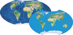
Sadly, I couldn't quote the last post I just...reposted.
-
Sadly, I couldn't quote the last post I just...reposted. So new thread.
One major frustration I have with online maps (and there are a LOT of complaints) is that very few make it easy to see, like, countries. I just want a normal, easy, zoomable political map of the world.
I've been sensitive to the issues of the Mercator projection, but a lot of the alternatives are just a pain. The Equal Earth projection mentioned in the previous post looks like a good compromise.
So I went to equal-earth.com, downloaded a full-resolution map (actually two - one centered on Greenwich, and one on Oceania (150º E). Saved 'em to a local folder, and created a Raycast quick link for them.
So anytime I want to look up a country I see mentioned in an article, I just hit a hot key, type "world", and boom! there's a map.
-
Sadly, I couldn't quote the last post I just...reposted. So new thread.
One major frustration I have with online maps (and there are a LOT of complaints) is that very few make it easy to see, like, countries. I just want a normal, easy, zoomable political map of the world.
I've been sensitive to the issues of the Mercator projection, but a lot of the alternatives are just a pain. The Equal Earth projection mentioned in the previous post looks like a good compromise.
So I went to equal-earth.com, downloaded a full-resolution map (actually two - one centered on Greenwich, and one on Oceania (150º E). Saved 'em to a local folder, and created a Raycast quick link for them.
So anytime I want to look up a country I see mentioned in an article, I just hit a hot key, type "world", and boom! there's a map.
-
@zero_gravitas I knew what this was before I even clicked.

That map just...it adds too many other distortions.
-
@zero_gravitas I do wonder why, when we're almost always looking at maybe <100 mile areas, online maps don't use something other than Mercator. Just zoom in as if you were zooming in on a globe.
-
@zero_gravitas I knew what this was before I even clicked.
That map just...it adds too many other distortions.
@zero_gravitas I just found this - a simple overlay/toggle comparison. I can't say which one is more "right", but that Gall-Peters just, as CJ was saying, looks wrong.
I wonder if the Peters distortions are simply a result of trying to stick to a rectilinear format. I'm okay with the curved sides if it keeps the shapes closer to reality (where, I'll admit, reality is probably more shaped by a lifetime with Mercator than actual reality).
The deformation indicators ("Tissot Indicatrix") at the bottom really sell it to me.
-
@zero_gravitas I do wonder why, when we're almost always looking at maybe <100 mile areas, online maps don't use something other than Mercator. Just zoom in as if you were zooming in on a globe.
@darthnull A globe projection obviously get's you past the worst compromises—at work I've settled on Natural Earth projection... but at times I switch to use a Mercator with a healthy pitch set to the camera—side by side people often prefer the later. Don't get me started on disputed borders though...
-
@darthnull A globe projection obviously get's you past the worst compromises—at work I've settled on Natural Earth projection... but at times I switch to use a Mercator with a healthy pitch set to the camera—side by side people often prefer the later. Don't get me started on disputed borders though...
@zero_gravitas Actually, that Natural Earth looks even better to my eye. I may have to look for a couple good image files of that one also.
But really, I just wanted a quick reference for world nations, which always seemed to become a 5-minute search whenever I wanted to see something "real quick."
-
R relay@relay.infosec.exchange shared this topic