I made a "no-AI" icon, and posted a rant to go along with it.
-
I made a "no-AI" icon, and posted a rant to go along with it. Feel free to use: https://chriskirknielsen.com/blog/no-ai-icon-for-humans/
-
I made a "no-AI" icon, and posted a rant to go along with it. Feel free to use: https://chriskirknielsen.com/blog/no-ai-icon-for-humans/
@chriskirknielsen In good company in my website footer

-
@chriskirknielsen In good company in my website footer
@robb Hell yeah.
-
I made a "no-AI" icon, and posted a rant to go along with it. Feel free to use: https://chriskirknielsen.com/blog/no-ai-icon-for-humans/
@chriskirknielsen I like this! Though it doesn't work that well in small size: it is very hard to tell it is "AI" that has been crossed over.
-
@chriskirknielsen I like this! Though it doesn't work that well in small size: it is very hard to tell it is "AI" that has been crossed over.
@MerriNet Thanks! Yeah I know it gets tough to read — its base 16x16 is probably the absolute limit before it becomes a muddy patch of pixels, and that's with good eyesight and decent contrast. I did try a few variations but this was by far the best one to retain familiar shapes for `A` and `I`.
I guess it means it just has to be used very in-your-face at 512x512.

-
@MerriNet Thanks! Yeah I know it gets tough to read — its base 16x16 is probably the absolute limit before it becomes a muddy patch of pixels, and that's with good eyesight and decent contrast. I did try a few variations but this was by far the best one to retain familiar shapes for `A` and `I`.
I guess it means it just has to be used very in-your-face at 512x512.
@chriskirknielsen I wonder if the "star sparkles" would work better. That at least has some chance unlike the generic "rear hole" AI logos, as you'd cover the hole

-
@chriskirknielsen I wonder if the "star sparkles" would work better. That at least has some chance unlike the generic "rear hole" AI logos, as you'd cover the hole
@MerriNet While I dislike how sparkles have been appropriated by AI companies, you're not wrong… but I don't think they'd be a lot more readable at small sizes. This is a quick mockup, there may be better sparkle to use, but it's definitely more ambiguous in my mind.
The international emoji consortium should just create an emoji like
 perhaps!
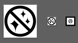
-
@MerriNet While I dislike how sparkles have been appropriated by AI companies, you're not wrong… but I don't think they'd be a lot more readable at small sizes. This is a quick mockup, there may be better sparkle to use, but it's definitely more ambiguous in my mind.
The international emoji consortium should just create an emoji like
perhaps!@chriskirknielsen @MerriNet I’ve adapted the CC styling for mine and just now switched from letters to the robot emoji, but it’s also a bit cluttered and not super readable, but perhaps less ambiguous?
-
@chriskirknielsen @MerriNet I’ve adapted the CC styling for mine and just now switched from letters to the robot emoji, but it’s also a bit cluttered and not super readable, but perhaps less ambiguous?
-
I made a "no-AI" icon, and posted a rant to go along with it. Feel free to use: https://chriskirknielsen.com/blog/no-ai-icon-for-humans/
@chriskirknielsen Thank you!! I just added it to my resume website footer


I'm not sure about my text after it -- my current copy says "Handmade to respect your time"

Thanks for making the icon and sharing it!

-
R relay@relay.mycrowd.ca shared this topic
