I honestly have no words for this awful app icon update.
-
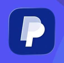
I honestly have no words for this awful app icon update. PayPal does apparently however.


In case you forgot what PayPal’s app icon looked like prior or don’t use PayPal, here’s the before and after. This says so much about them as a company/band and society in general I’m sure I could write and entire essay on the subject.

-
In case you forgot what PayPal’s app icon looked like prior or don’t use PayPal, here’s the before and after. This says so much about them as a company/band and society in general I’m sure I could write and entire essay on the subject.
@gedeonm I still have that one: I guess it won’t last for long.
-
In case you forgot what PayPal’s app icon looked like prior or don’t use PayPal, here’s the before and after. This says so much about them as a company/band and society in general I’m sure I could write and entire essay on the subject.
@gedeonm GRAPHIC DESIGN IS MY PASSION!
-
In case you forgot what PayPal’s app icon looked like prior or don’t use PayPal, here’s the before and after. This says so much about them as a company/band and society in general I’m sure I could write and entire essay on the subject.
@gedeonm “I’m sure I could write and entire essay on the subject.”
OH! Please do, Ged!
-
I honestly have no words for this awful app icon update. PayPal does apparently however.
@gedeonm A source for reference? www.paypal.com still has the old logo (for me)
-
In case you forgot what PayPal’s app icon looked like prior or don’t use PayPal, here’s the before and after. This says so much about them as a company/band and society in general I’m sure I could write and entire essay on the subject.
@gedeonm Some PayPal exec's kid saw 'pee pee' so they started making design decisions.
-
@gedeonm they probably paid some agency a few thousand for it too
@jorijn Lolz! More likely they asked AI to design them a new app icon, one that communicates a strong, clear brand and one people associate with banking/money.

-
@gedeonm A source for reference? www.paypal.com still has the old logo (for me)
@e11bits No source except my Home Screen. My iPhone auto updates and my iPad does not so now I have two different versions.
-
I honestly have no words for this awful app icon update. PayPal does apparently however.
@gedeonm made with chatgpt
-
I honestly have no words for this awful app icon update. PayPal does apparently however.
@gedeonm that is abysmal

-
In case you forgot what PayPal’s app icon looked like prior or don’t use PayPal, here’s the before and after. This says so much about them as a company/band and society in general I’m sure I could write and entire essay on the subject.
@gedeonm I was handling graphic design duties at my previous company between “communications specialists”. I’d noticed the that company logo had drifted from its original design and intent in both the typeface used inside it and the colors. It had been done at the whim of a previous comms manager without real permission by anyone in charge.
I researched the correct colors and found hex, Pantone, and CMYK specs and fixed the colors. Then I replaced the Arial typeface with Helvetica. It think originally had a generic sans serif from 1977 (Trade Gothic?) that was neither Helvetica nor Arial (obviously since it didn’t exist yet)
-
R relay@relay.infosec.exchange shared this topic