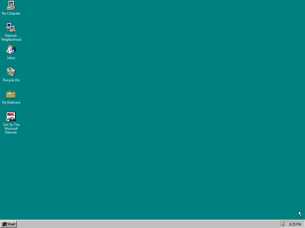
Can't decide whether i love or hate the long covid awareness colours.

-
Can't decide whether i love or hate the long covid awareness colours. Real Windows 3.1 energy
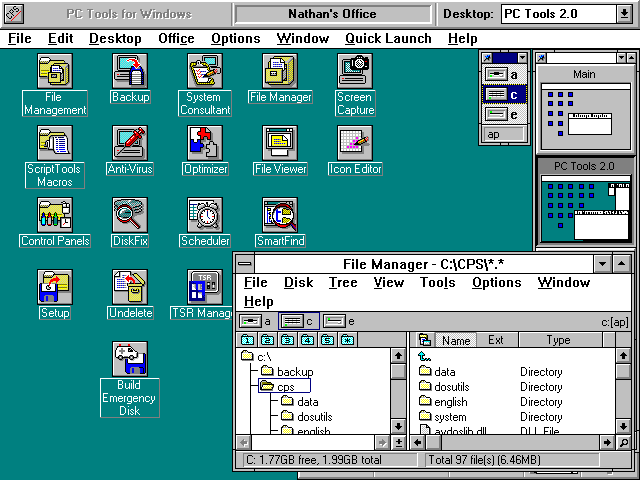
@beandreams this is completely unrelated to your point, but i'm just now learning from that screenshot that there was an alternate desktop shell for windows 3.x that offered multiple desktops. wild.
-
Can't decide whether i love or hate the long covid awareness colours. Real Windows 3.1 energy
@beandreams Bleh
The “ribbon” theme has been overplayed too
-
Can't decide whether i love or hate the long covid awareness colours. Real Windows 3.1 energy
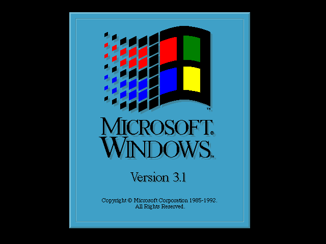
@beandreams@friendhole.social (win3.1 didn't come with the teal background. that's why the screenshot you found is so grotesque. see betawiki for details. AFAICT the first OS to come with the teal background was NT3.1 (1993), and first mainstream one was 95)
-
Can't decide whether i love or hate the long covid awareness colours. Real Windows 3.1 energy
@beandreams long covid drains the life out of us, so I think they actually nailed it. Nostalgia of taste from the 90s
-
Can't decide whether i love or hate the long covid awareness colours. Real Windows 3.1 energy
Vor allem modernes Multitasking ( Windows 3.1 ). "Fortschritt" zu Amiga und Atari
")
-
@beandreams@friendhole.social (win3.1 didn't come with the teal background. that's why the screenshot you found is so grotesque. see betawiki for details. AFAICT the first OS to come with the teal background was NT3.1 (1993), and first mainstream one was 95)
@domi My point is not that the teal was the default background, but mainly that these colours look like they were chosen from the old Windows 4-bit colour palette
-
@domi My point is not that the teal was the default background, but mainly that these colours look like they were chosen from the old Windows 4-bit colour palette
@beandreams@friendhole.social This is not a Windows palette, it's the default EGA palette. Every single program released since October 1984 (which is before Windows was even released) could use them. You associate Windows NT 3.1, NT 3.5x, NT 4.0, 95, 98 with specifically the combination of teal and gray because Microsoft:
- didn't change it (they know how to, Windows XP boot screen changes the default palette, but it covers the most cases)
- used gray for interface background since buttons were usually gray, still are in elevators for example. It was also the background colour in 3.1 as @domi 's thumbnail shows
- chose the colour that makes most sense from dark ones or top row (black on black won't work, red is error, green is success, yellow is just ugly, blue is already in blue screen, purple is a bit aggressive, gray is what they changed from)
Thus, you get a desktop that's just teal and gray and hundreds of millions of people have seen it. Windows 3.1 doesn't use this teal anywhere. The closest thing is boot screen, which is #3fa0c7 as opposed to #0aa and it displays only for a few seconds. If you were to travel back in time to 1994 and ask a random computer user with a colour monitor what colours are in Windows 3.1, their answer would be black and white, red, green, yellow and blue because of the Windows logo, gray, maybe they'd remember pink by some miracle and that's it. If they looked at a teal-gray ribbon like that, there's no way in hell they'd say 'oh, it's a Windows ribbon!' because it doesn't make any sense. That association only started because people were using 95 and 98 especially.
-
@beandreams@friendhole.social This is not a Windows palette, it's the default EGA palette. Every single program released since October 1984 (which is before Windows was even released) could use them. You associate Windows NT 3.1, NT 3.5x, NT 4.0, 95, 98 with specifically the combination of teal and gray because Microsoft:
- didn't change it (they know how to, Windows XP boot screen changes the default palette, but it covers the most cases)
- used gray for interface background since buttons were usually gray, still are in elevators for example. It was also the background colour in 3.1 as @domi 's thumbnail shows
- chose the colour that makes most sense from dark ones or top row (black on black won't work, red is error, green is success, yellow is just ugly, blue is already in blue screen, purple is a bit aggressive, gray is what they changed from)
Thus, you get a desktop that's just teal and gray and hundreds of millions of people have seen it. Windows 3.1 doesn't use this teal anywhere. The closest thing is boot screen, which is #3fa0c7 as opposed to #0aa and it displays only for a few seconds. If you were to travel back in time to 1994 and ask a random computer user with a colour monitor what colours are in Windows 3.1, their answer would be black and white, red, green, yellow and blue because of the Windows logo, gray, maybe they'd remember pink by some miracle and that's it. If they looked at a teal-gray ribbon like that, there's no way in hell they'd say 'oh, it's a Windows ribbon!' because it doesn't make any sense. That association only started because people were using 95 and 98 especially.
@Lili @beandreams@friendhole.social now both of you are kinda ridiculous with the replies <.<
-
@Lili @beandreams@friendhole.social now both of you are kinda ridiculous with the replies <.<
-
@beandreams I mean, if they were willing to start there, why not Hot Dog Stand?
@abmurrow @beandreams "Hot Dog Stand" color scheme is reserved for the "eye cancer awareness ribbon"
-
R relay@relay.mycrowd.ca shared this topic
