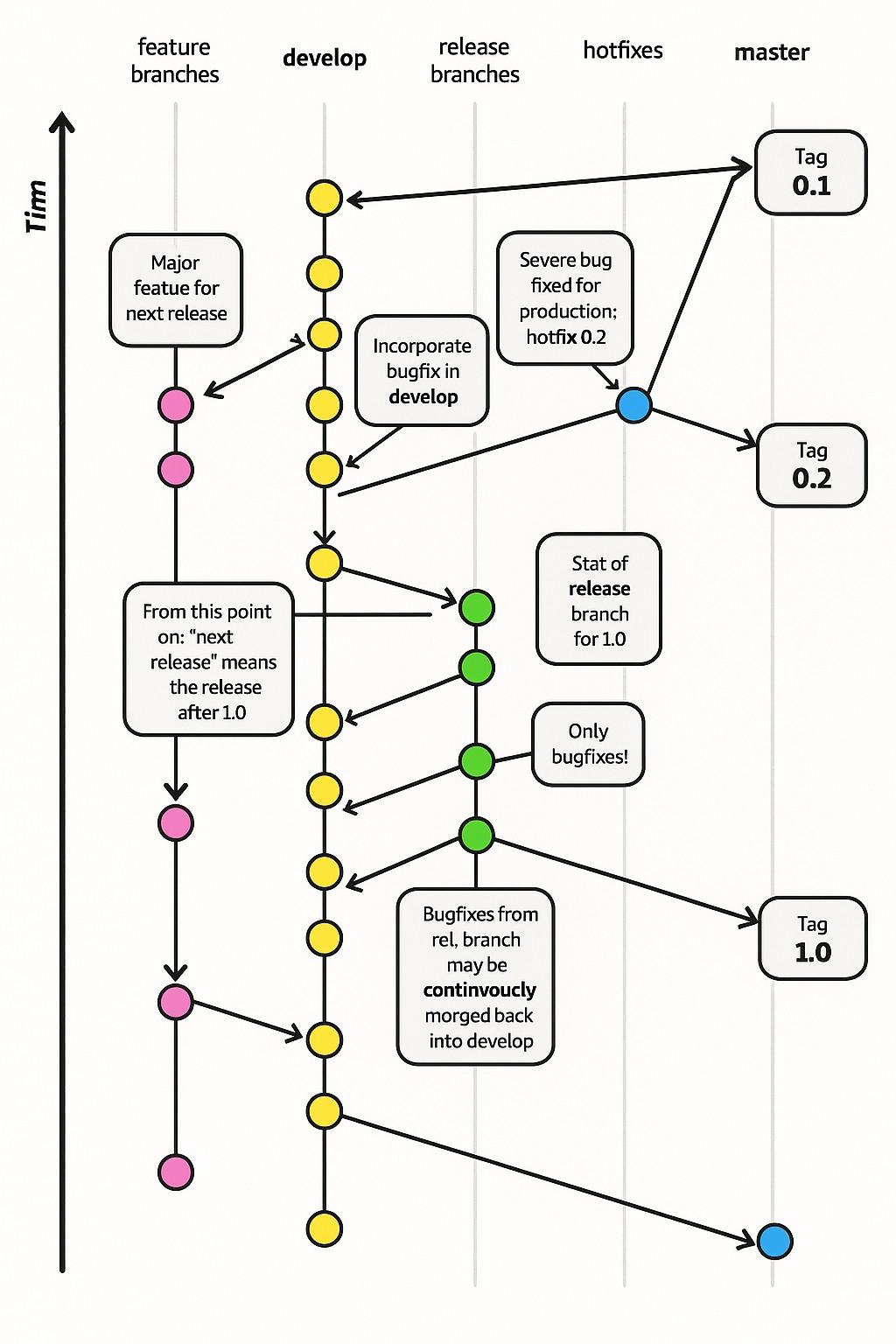
When I was in my early twenties I read The Visual Display of Quantitative Information from Tufte and agonized over making charts great for users.
-
@thomasfuchs you know what this reminds me of? i collect random bootleg items and often times they use flavor text stolen from other things, and then retyped manually by people who don't speak english. so you end up with shit like this:
@GroupNebula563 @thomasfuchs Ahh yes, the Four Stooges of Britain.
-
When I was in my early twenties I read The Visual Display of Quantitative Information from Tufte and agonized over making charts great for users.
These days, Microsoft releases graphs like this
@thomasfuchs looks suspiciously similar to this https://jeffkreeftmeijer.com/git-flow/

-
When I was in my early twenties I read The Visual Display of Quantitative Information from Tufte and agonized over making charts great for users.
These days, Microsoft releases graphs like this
@thomasfuchs You're not wrong about this but, I mean, it's Microsoft.
Stuff that looks like this is their jam.
-
When I was in my early twenties I read The Visual Display of Quantitative Information from Tufte and agonized over making charts great for users.
These days, Microsoft releases graphs like this
@thomasfuchs@hachyderm.io Bad OCR / image generation fail. It's clearly the git flow method. I think they were trying to morge this: https://nvie.com/posts/a-successful-git-branching-model/
-
@nygl @thomasfuchs
TIRED: covfefe
WIRED: continvoucly -
I'm going to be morging my changes back to the develop branch from now on!
... but will you do it continvoucly?
-
When I was in my early twenties I read The Visual Display of Quantitative Information from Tufte and agonized over making charts great for users.
These days, Microsoft releases graphs like this
@thomasfuchs This is a plot diagram of the movie Looper. It did not end well for Timn.
-
@nygl @thomasfuchs My favorite part of software engineering is when I go "it's morgen time" and then morge all those bug fixes back into develop.
-
When I was in my early twenties I read The Visual Display of Quantitative Information from Tufte and agonized over making charts great for users.
These days, Microsoft releases graphs like this
@thomasfuchs this is stolen from here

A successful Git branching model
In this post I present a Git branching strategy for developing and releasing software as I’ve used it in many of my projects, and which has turned out to be very successful.
nvie.com (nvie.com)
It has nothing to do with AI, it was created by a human in 2010.
-
@thomasfuchs this is stolen from here
A successful Git branching model
In this post I present a Git branching strategy for developing and releasing software as I’ve used it in many of my projects, and which has turned out to be very successful.
nvie.com (nvie.com)
It has nothing to do with AI, it was created by a human in 2010.
@thhareau have you read the labels on Microsoft’s chart?
-
@thhareau have you read the labels on Microsoft’s chart?
@thomasfuchs true! So weird...
It's funny to think that nvie is saying in his Note of Reflection that such a model should not be used anymore
-
I have so many question right now.
Did... anyone at Microsoft approve this chart? How come they didn't notice so many glaring errors that produced by AI?
@NovemDecimal @thomasfuchs You may be lucky enough not to work in corporate tech. I say without exaggeration that nobody any longer does any work or thinking at work. 100% of documents, slide decks, charts, slack posts, code, code reviews, etc. are AI generated. In many cases this is mandatory.
-
When I was in my early twenties I read The Visual Display of Quantitative Information from Tufte and agonized over making charts great for users.
These days, Microsoft releases graphs like this
@thomasfuchs Reading this graph went like this in my mind :
- I don't see what the fuss is about, this looks like a pretty classic git flow
[...]
- Wait, wat ?
[...]
- Oh no
[...]
- Oh no
[...]
- Oh noAnd the more you look at it, the worse it gets
-
When I was in my early twenties I read The Visual Display of Quantitative Information from Tufte and agonized over making charts great for users.
These days, Microsoft releases graphs like this
@thomasfuchs can we also speak about how only an idiot would develop with this flow? Let's ignore the deepdream chart. Even if they had managed to communicate this idea clearly, the idea itself is badly flawed! The hotfix never gets released. Also, the only people I've met who would use the word "hotfix" were all dangerously stupid people.

