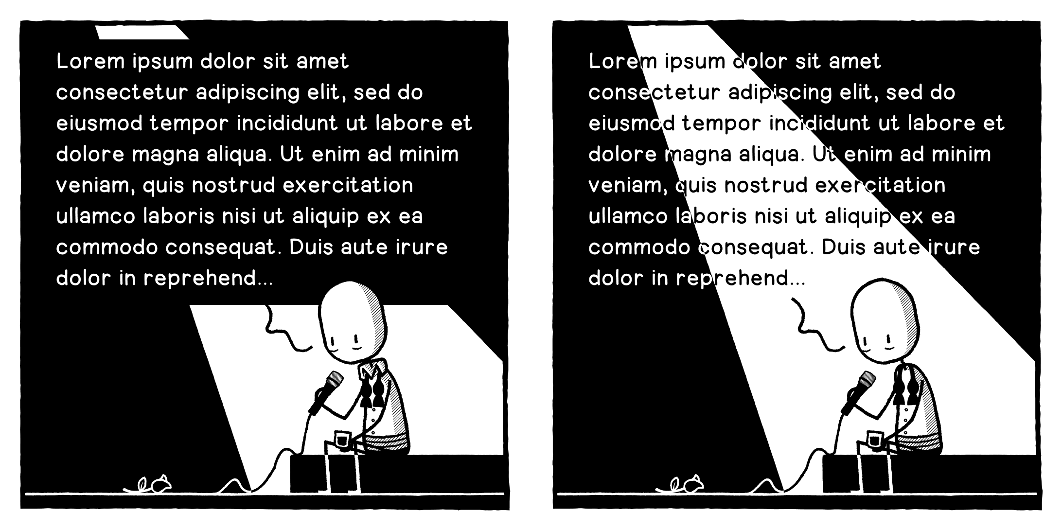
Okay, opinion needed. Should I A: obscure the spotlight to have more legible text, or B: incorporate the text into the spotlight but have it slightly harder to read?
-
Okay, opinion needed. Should I A: obscure the spotlight to have more legible text, or B: incorporate the text into the spotlight but have it slightly harder to read? Text is placeholder obvs.
@designthinkingcomic
Can you reformat the text to fit inside the black sections? -
Another option...
@designthinkingcomic option C seems reasonable.
otherwise A.
-
Another option...
@designthinkingcomic
My favorite. -
Another option...
@designthinkingcomic The translucent option for me, thanks.
-
@designthinkingcomic
Can you reformat the text to fit inside the black sections?@a_cubed Unfortunately not, there's too much of it.
-
Another option...
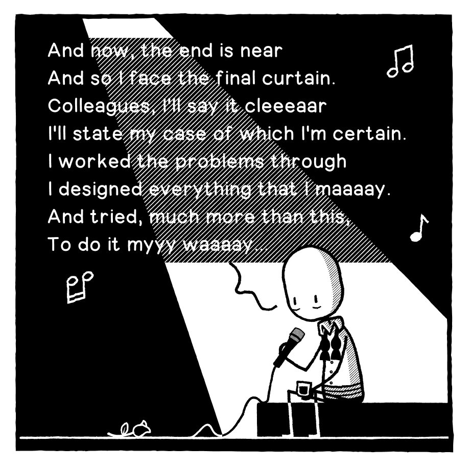
@designthinkingcomic Also, go with this text. It is deeply funny.
-
Another option...
@designthinkingcomic This one works well too!
-
@designthinkingcomic If you can do it, have all the text within the light beam and don't spill it over the edges into the dark. Or vice versa (though this wouldn't work as well), all the text in the dark areas to left and right but none in the light.
@JonnyT Unfortunately not, there's too much of it.
-
Another option...
C. It's clearly a spotlight AND it's legible.

-
Okay, opinion needed. Should I A: obscure the spotlight to have more legible text, or B: incorporate the text into the spotlight but have it slightly harder to read? Text is placeholder obvs.
-
Okay, opinion needed. Should I A: obscure the spotlight to have more legible text, or B: incorporate the text into the spotlight but have it slightly harder to read? Text is placeholder obvs.
@designthinkingcomic C, else A
-
Another option...
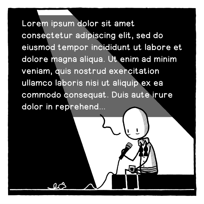
Option D. A last ditch attempt to retain my strip's Black & White aesthetic.
-
Option D. A last ditch attempt to retain my strip's Black & White aesthetic.
@designthinkingcomic I like D a lot!
Because it does not break the style. -
Option D. A last ditch attempt to retain my strip's Black & White aesthetic.
Haha, shit I gave away the premise of the joke...
-
Another option...
@designthinkingcomic
This works well. You already have the same grey in the character shading so it fits. -
Okay, opinion needed. Should I A: obscure the spotlight to have more legible text, or B: incorporate the text into the spotlight but have it slightly harder to read? Text is placeholder obvs.
@designthinkingcomic between de 4, B is still the best for me
-
@designthinkingcomic I like D a lot!
Because it does not break the style.@Aubrieta @designthinkingcomic D for me too.
-
Option D. A last ditch attempt to retain my strip's Black & White aesthetic.
@designthinkingcomic Ofption D is the winner, it has clarity and the style. -
Option D. A last ditch attempt to retain my strip's Black & White aesthetic.
@designthinkingcomic
Make it D -
Another option...
@designthinkingcomic I can read all of them without problem, but C looks the best, imho.