Skip to content
  • Categories
  • Recent
  • Tags
  • Popular
  • World
  • Users
  • Groups
Skins
  • Light
  • Brite
  • Cerulean
  • Cosmo
  • Flatly
  • Journal
  • Litera
  • Lumen
  • Lux
  • Materia
  • Minty
  • Morph
  • Pulse
  • Sandstone
  • Simplex
  • Sketchy
  • Spacelab
  • United
  • Yeti
  • Zephyr
  • Dark
  • Cyborg
  • Darkly
  • Quartz
  • Slate
  • Solar
  • Superhero
  • Vapor

  • Default (Cyborg)
  • No Skin
Collapse
Brand Logo

CIRCLE WITH A DOT

  1. Home
  2. Uncategorized
  3. We know the rise of the Greens & ReformUK Ltd has shifted voters away from supporting the Labour Party.

We know the rise of the Greens & ReformUK Ltd has shifted voters away from supporting the Labour Party.

Scheduled Pinned Locked Moved Uncategorized
politicsgreens
23 Posts 14 Posters 0 Views
  • Oldest to Newest
  • Newest to Oldest
  • Most Votes
Reply
  • Reply as topic
Log in to reply
This topic has been deleted. Only users with topic management privileges can see it.
  • reggiehere@mastodon.socialR reggiehere@mastodon.social

    @ChrisMayLA6

    Presumably that red island at the top of the 2026 image is Labour's centre-right faction?

    geofcox@climatejustice.socialG This user is from outside of this forum
    geofcox@climatejustice.socialG This user is from outside of this forum
    geofcox@climatejustice.social
    wrote last edited by
    #12

    @ReggieHere @ChrisMayLA6
    @ApostateEnglishman

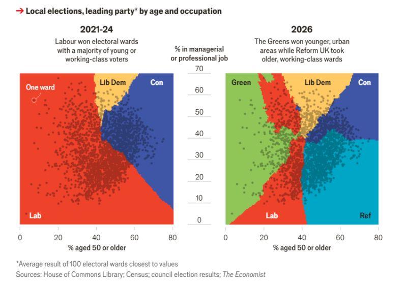
    The line roughly down the middle of the 2026 diagram also makes the generational divide very clear - and remember this is also an educational divide. The Labour governments of the 60s and 70s introduced comprehensive education and massively expanded higher education - in 1960 less than 5% of kids went to university, in 2019 over 50% went.

    reggiehere@mastodon.socialR 1 Reply Last reply
    0
    • reggiehere@mastodon.socialR reggiehere@mastodon.social

      @androcat

      Yes, that makes sense. An unfortnate gap between "briefcase" and "working" Labour.

      @ChrisMayLA6

      androcat@toot.catA This user is from outside of this forum
      androcat@toot.catA This user is from outside of this forum
      androcat@toot.cat
      wrote last edited by
      #13

      @ReggieHere @ChrisMayLA6

      I think I figured it out.
      So the background colourings are a bit misleading. What is displayed is the wards (those granules in darker colour).
      And the granules are tracked in two axes, by the population:
      % managerial, and % aged 50.
      So the wards haven't moved around a lot, because demographics haven't changed much.
      Then the wards were colorized according to leading party, and given an imaginary "territory" to contextualize (the background colours). So you may well be right.

      unchartedworlds@scicomm.xyzU 1 Reply Last reply
      0
      • androcat@toot.catA androcat@toot.cat

        @ReggieHere @ChrisMayLA6

        I think I figured it out.
        So the background colourings are a bit misleading. What is displayed is the wards (those granules in darker colour).
        And the granules are tracked in two axes, by the population:
        % managerial, and % aged 50.
        So the wards haven't moved around a lot, because demographics haven't changed much.
        Then the wards were colorized according to leading party, and given an imaginary "territory" to contextualize (the background colours). So you may well be right.

        unchartedworlds@scicomm.xyzU This user is from outside of this forum
        unchartedworlds@scicomm.xyzU This user is from outside of this forum
        unchartedworlds@scicomm.xyz
        wrote last edited by
        #14

        @androcat @ReggieHere @ChrisMayLA6

        Yes, I was just thinking it would be clearer if they coloured the dots and didn't have the coloured backgrounds.

        androcat@toot.catA 1 Reply Last reply
        0
        • chrismayla6@zirk.usC chrismayla6@zirk.us

          We know the rise of the Greens & ReformUK Ltd has shifted voters away from supporting the Labour Party. The Economist used these results to match the age & work profile of workers to map this transition between 2021 & 2026.

          The diagram below offer a (further) stark demonstration of why the Labour Party is wrong-headed in their aping of ReformUK, not least because their support from such wider base is moving to the Green Party of England & Wales.

          #politics #Greens
          h/t Andy Cotgreave/LinkedIn
          Link Preview Image
          notsoloud@expressional.socialN This user is from outside of this forum
          notsoloud@expressional.socialN This user is from outside of this forum
          notsoloud@expressional.social
          wrote last edited by
          #15

          @ChrisMayLA6
          How are these colorings done? There must be a lot of (over?)simplification going on here. No way the wards divide that nicely by just two variables. The middle should look a lot more mottled.

          1 Reply Last reply
          0
          • chrismayla6@zirk.usC chrismayla6@zirk.us

            @ReggieHere

            Not so sure; I took that to be younger professionals who still hadn't been convinced by the Greens, yet grew up in a social environment were voting right was sees as terminally uncool?

            reggiehere@mastodon.socialR This user is from outside of this forum
            reggiehere@mastodon.socialR This user is from outside of this forum
            reggiehere@mastodon.social
            wrote last edited by
            #16

            @ChrisMayLA6

            That would make sense. It's quite a confusing chart.

            1 Reply Last reply
            0
            • geofcox@climatejustice.socialG geofcox@climatejustice.social

              @ReggieHere @ChrisMayLA6
              @ApostateEnglishman

              The line roughly down the middle of the 2026 diagram also makes the generational divide very clear - and remember this is also an educational divide. The Labour governments of the 60s and 70s introduced comprehensive education and massively expanded higher education - in 1960 less than 5% of kids went to university, in 2019 over 50% went.

              reggiehere@mastodon.socialR This user is from outside of this forum
              reggiehere@mastodon.socialR This user is from outside of this forum
              reggiehere@mastodon.social
              wrote last edited by
              #17

              @GeofCox

              It is a pretty stark cut off. Makes a bit of a mockery of RefUK's claims to attracting younger voters.

              @ChrisMayLA6 @ApostateEnglishman

              1 Reply Last reply
              0
              • unchartedworlds@scicomm.xyzU unchartedworlds@scicomm.xyz

                @androcat @ReggieHere @ChrisMayLA6

                Yes, I was just thinking it would be clearer if they coloured the dots and didn't have the coloured backgrounds.

                androcat@toot.catA This user is from outside of this forum
                androcat@toot.catA This user is from outside of this forum
                androcat@toot.cat
                wrote last edited by
                #18

                @unchartedworlds @ReggieHere @ChrisMayLA6

                It's a striking outcome, though.

                1 Reply Last reply
                0
                • chrismayla6@zirk.usC chrismayla6@zirk.us

                  We know the rise of the Greens & ReformUK Ltd has shifted voters away from supporting the Labour Party. The Economist used these results to match the age & work profile of workers to map this transition between 2021 & 2026.

                  The diagram below offer a (further) stark demonstration of why the Labour Party is wrong-headed in their aping of ReformUK, not least because their support from such wider base is moving to the Green Party of England & Wales.

                  #politics #Greens
                  h/t Andy Cotgreave/LinkedIn

                  Link Preview Image
                  fazalmajid@social.vivaldi.netF This user is from outside of this forum
                  fazalmajid@social.vivaldi.netF This user is from outside of this forum
                  fazalmajid@social.vivaldi.net
                  wrote last edited by
                  #19

                  @ChrisMayLA6 This diagram is misleading because it does not show the ages in proportion to their share of the population, or of their propensity to vote.

                  1 Reply Last reply
                  0
                  • rozeboosje@masto.aiR rozeboosje@masto.ai

                    @ChrisMayLA6 Someone posted an article a few days ago that featured the same graph. It also highlighted a massive flaw in the representation. What looks like losses from Labour to Reform is actually an artefact of the FPTP system, and it represents Reform's ability to mobilise people who wouldn't have voted otherwise. Labour's losses, allegedly, are mainly to the Greens. I can't find the article now, sorry.

                    bazzargh@hachyderm.ioB This user is from outside of this forum
                    bazzargh@hachyderm.ioB This user is from outside of this forum
                    bazzargh@hachyderm.io
                    wrote last edited by
                    #20

                    @rozeboosje @ChrisMayLA6 I think you might have read @Tupp_ed 's The Gist https://www.thegist.ie/the-gist-britain-the-ungoverned-country/ - it has exactly that explanation of why this chart is misleading, and other charts that show a clearer picture.

                    rozeboosje@masto.aiR thedonsielass@mas.toT 2 Replies Last reply
                    0
                    • bazzargh@hachyderm.ioB bazzargh@hachyderm.io

                      @rozeboosje @ChrisMayLA6 I think you might have read @Tupp_ed 's The Gist https://www.thegist.ie/the-gist-britain-the-ungoverned-country/ - it has exactly that explanation of why this chart is misleading, and other charts that show a clearer picture.

                      rozeboosje@masto.aiR This user is from outside of this forum
                      rozeboosje@masto.aiR This user is from outside of this forum
                      rozeboosje@masto.ai
                      wrote last edited by
                      #21

                      @bazzargh @ChrisMayLA6 @Tupp_ed That's the one. Thanks for finding it!

                      1 Reply Last reply
                      0
                      • bazzargh@hachyderm.ioB bazzargh@hachyderm.io

                        @rozeboosje @ChrisMayLA6 I think you might have read @Tupp_ed 's The Gist https://www.thegist.ie/the-gist-britain-the-ungoverned-country/ - it has exactly that explanation of why this chart is misleading, and other charts that show a clearer picture.

                        thedonsielass@mas.toT This user is from outside of this forum
                        thedonsielass@mas.toT This user is from outside of this forum
                        thedonsielass@mas.to
                        wrote last edited by
                        #22

                        @bazzargh Thanks. Really useful article

                        1 Reply Last reply
                        0
                        • chrismayla6@zirk.usC chrismayla6@zirk.us

                          We know the rise of the Greens & ReformUK Ltd has shifted voters away from supporting the Labour Party. The Economist used these results to match the age & work profile of workers to map this transition between 2021 & 2026.

                          The diagram below offer a (further) stark demonstration of why the Labour Party is wrong-headed in their aping of ReformUK, not least because their support from such wider base is moving to the Green Party of England & Wales.

                          #politics #Greens
                          h/t Andy Cotgreave/LinkedIn

                          Link Preview Image
                          W This user is from outside of this forum
                          W This user is from outside of this forum
                          woo@fosstodon.org
                          wrote last edited by
                          #23

                          @ChrisMayLA6 The LibDems seem to have quietly doubled in size too, by their cunning technique of being silenced. I saw one on the wild yesterday, resorting to hand gestures at Jenrick. Not the one I'd have made but funnier.

                          1 Reply Last reply
                          0
                          • R relay@relay.mycrowd.ca shared this topic

                          Reply
                          • Reply as topic
                          Log in to reply
                          • Oldest to Newest
                          • Newest to Oldest
                          • Most Votes


                          • Login

                          • Login or register to search.
                          • First post
                            Last post
                          0
                          • Categories
                          • Recent
                          • Tags
                          • Popular
                          • World
                          • Users
                          • Groups