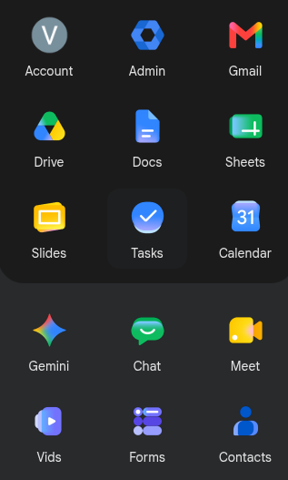
Whoever's promotion was riding on the landing of the new #Google icon revamp needs to reconsider life and perhaps pursue becoming a potatoe farmer.
-
Whoever's promotion was riding on the landing of the new #Google icon revamp needs to reconsider life and perhaps pursue becoming a potatoe farmer.
@vbatts what a drab and uncleart design. Everything looks similar somehow ..
-
Whoever's promotion was riding on the landing of the new #Google icon revamp needs to reconsider life and perhaps pursue becoming a potatoe farmer.
@vbatts I miss the old icons. These are so... bleh.
-
@vbatts I miss the old icons. These are so... bleh.
@tatertot definitely not inspiring
-
Whoever's promotion was riding on the landing of the new #Google icon revamp needs to reconsider life and perhaps pursue becoming a potatoe farmer.
@vbatts these are ugly as fuck
-
Whoever's promotion was riding on the landing of the new #Google icon revamp needs to reconsider life and perhaps pursue becoming a potatoe farmer.
@vbatts
Don't be so mean to us potato farmers! -
@vbatts what a drab and uncleart design. Everything looks similar somehow ..
-
@vbatts but also, keep the designer away from potatoes, also, don't need them mucking with the world's greatest food.
-
Right, but to me that coloring doesn't distinguish them enough for now. It feels all samish...
-
-
@vbatts
Don't be so mean to us potato farmers! -
@vbatts but also, keep the designer away from potatoes, also, don't need them mucking with the world's greatest food.
@tatertot hah!
-
@vbatts these are ugly as fuck
@yith I don't like grumbling, but these have kept me urged for a week
-
-
R relay@relay.an.exchange shared this topic

")