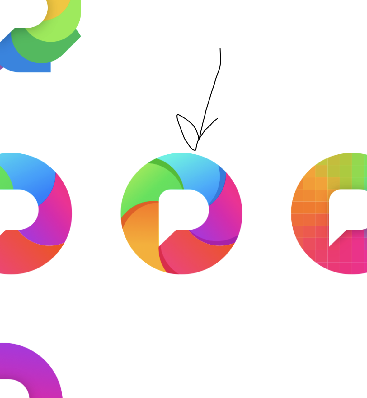
Pixelfed logo variants, one of these will be the new logo ✨

-
Pixelfed logo variants, one of these will be the new logo

I like the 2nd from the right on the third row.
-
Pixelfed logo variants, one of these will be the new logo
@dansup I like this one
-
Pixelfed logo variants, one of these will be the new logo
@dansup the pixelated one (at the end of the third row) makes the most sense for sure

-
Pixelfed logo variants, one of these will be the new logo
@dansup 5 colours in a pinwheel has some similarities to the Immich logo.
That said, I'm not suggesting that you avoid that. I like rainbow colours to indicate photos and the camera iris effect enhances that association.
Just think about how they relate or do not relate.
-
Pixelfed logo variants, one of these will be the new logo
@dansup my graphic designer girlfriend and I both like third row rightmost the best, and the third row in general significantly more than the other rows.
-
Pixelfed logo variants, one of these will be the new logo
I'm personally choosing the 3rd row 4th column so when Dan releases some merch I can buy me some stickers

PS row 2 column 1 and row 2 column 2 somehow remind me of NBC/Peacock and the old Mac spinning wheel respectively.
 The former also reminds me of one of the candidates for PF back when
-
Pixelfed logo variants, one of these will be the new logo
@dansup If you're taking votes, I really like the pixelated gradient one (rightmost on 3rd row).
You lose the camera aperture visual metaphor, but given how many nasty AI companies have similar segmented circle logos, maybe that's not a bad thing?
-
1,2,3 from the right in the third row looks the coolest
-
Pixelfed logo variants, one of these will be the new logo
@dansup I like this one because it looks like camera shutters
-
Pixelfed logo variants, one of these will be the new logo
@dansup
It was easier to explain like this: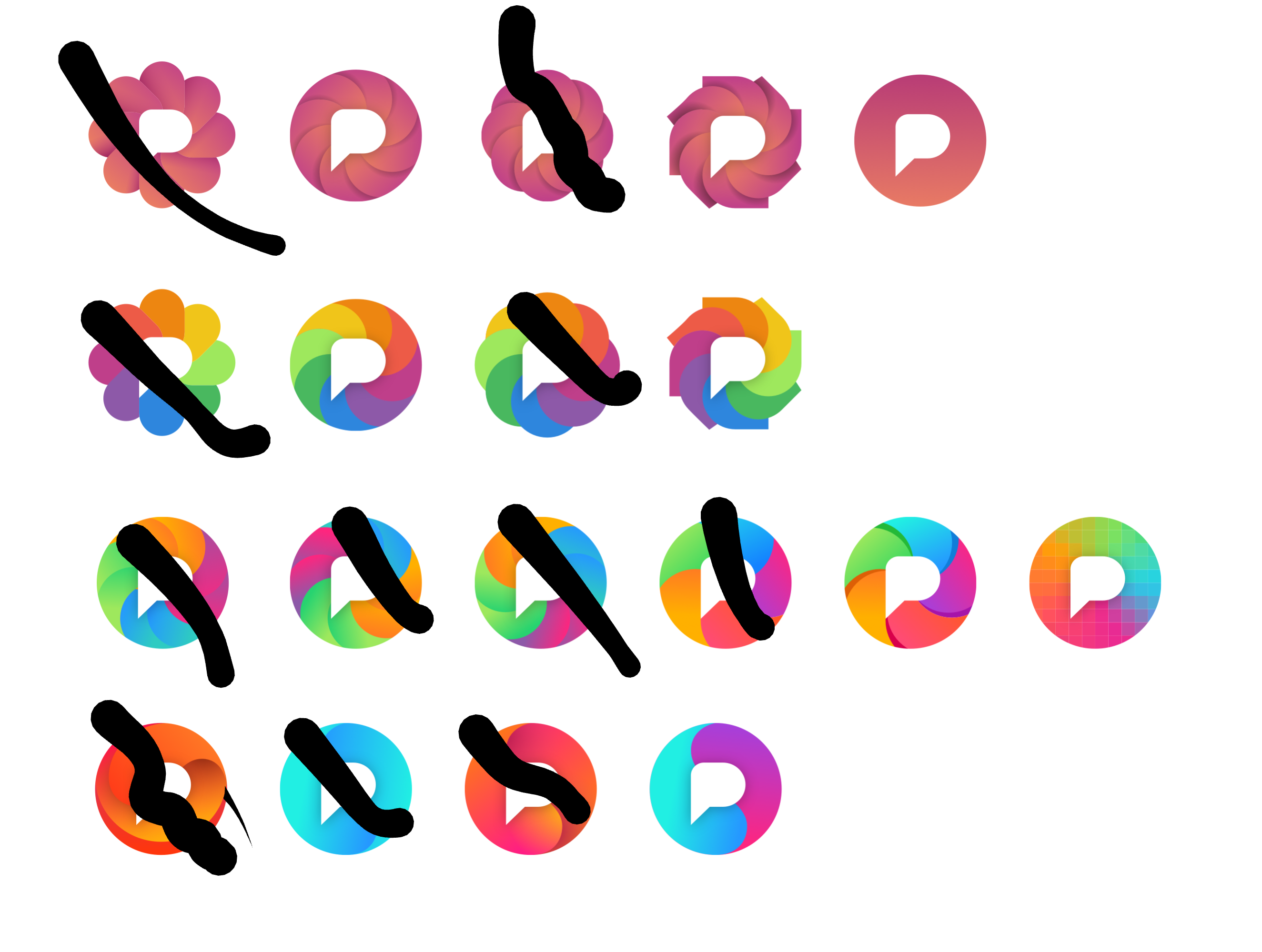
-
@dansup I like this one
-
Pixelfed logo variants, one of these will be the new logo
@dansup Keep doing your thing bud. Props and gratitude
")
-
@dansup I like this one because it looks like camera shutters
@dansup iris?
-
Pixelfed logo variants, one of these will be the new logo
If you're asking for opinions... Disclaimer, I might not even use Pixelfed (but maybe this is somehow useful still).
1st row: none
2nd row: nice, but none
3rd row: good, I vote for all but especially 5 and 6 (last two from left-to-right)
4th row: none
-
Pixelfed logo variants, one of these will be the new logo
@dansup The last one on the third row feels great
-
Pixelfed logo variants, one of these will be the new logo
@dansup
Simple is good so it doesn't get unrecognizable when scaled down in small UI, also needs to look fine on dark/light modes (or have two versions)Although the current logo is busy, it does stand out when you put it next to other platforms
-
R relay@relay.an.exchange shared this topic
-
Pixelfed logo variants, one of these will be the new logo
@dansup number 14 is the strongest IMO
-
Pixelfed logo variants, one of these will be the new logo
@dansup
1,1 1,2 3,2 6,3 4,4 are great
-
At first I thought about the most bottom right version, but that is more my personal taste as it somehow fits within my own designs.
However, I fully agree with the others about the pixelated version being the best. Pixels, yès! All the colours of humanity, yès! It also feels most distinctive from other brands. -
Pixelfed logo variants, one of these will be the new logo
@dansup
All the three last ones on the third row are nice.