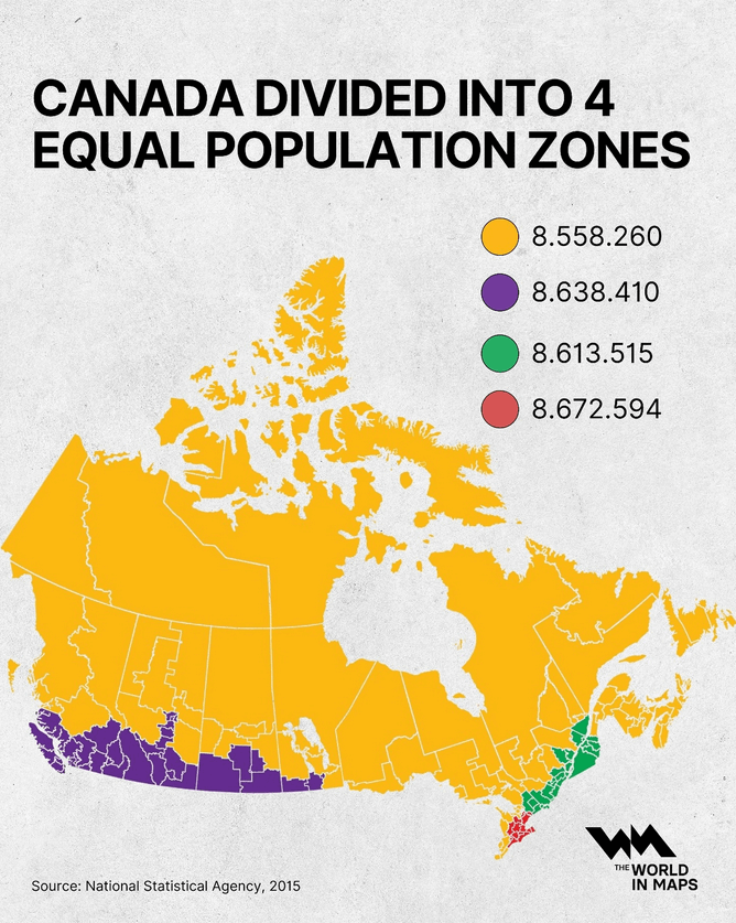
At a glance, Canada looks vast and evenly spread but when you divide the country by population, the picture changes dramatically...
-
At a glance, Canada looks vast and evenly spread but when you divide the country by population, the picture changes dramatically...
by @the.world.in.maps
@infobeautiful Many decades ago (circa 1970) the Queen's Printer created an isodemographic map of Canada using ball bearings and flexible steel splines. The result was gorgeous and informative.
-
At a glance, Canada looks vast and evenly spread but when you divide the country by population, the picture changes dramatically...
by @the.world.in.maps
@infobeautiful Nice graphic, it does seem to be similar for many countries... Russia for example.wonder what it looks like for Greenland?
-
At a glance, Canada looks vast and evenly spread but when you divide the country by population, the picture changes dramatically...
by @the.world.in.maps
@infobeautiful @carusb Poor visualization for red-green colorblind people. The third and fourth colors look pretty much identical and it’s very difficult to see the boundary between the two on the map.
-
At a glance, Canada looks vast and evenly spread but when you divide the country by population, the picture changes dramatically...
by @the.world.in.maps
@infobeautiful
Now if they had only chosen a different projection than mercator that wouldn't have amplified the apparent largeness of the parts of Canada close to the pole making this map still very wrong.