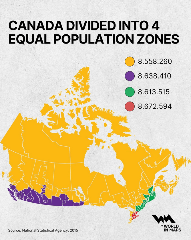
At a glance, Canada looks vast and evenly spread but when you divide the country by population, the picture changes dramatically...
-
At a glance, Canada looks vast and evenly spread but when you divide the country by population, the picture changes dramatically...
by @the.world.in.maps
-
At a glance, Canada looks vast and evenly spread but when you divide the country by population, the picture changes dramatically...
by @the.world.in.maps
I don't believe that there is or has been an agency in Canada called "National Statistical Agency".
-
@sol_hsa @infobeautiful Yeah sadly we are real bad at trains. But a HSR is in the works finally. https://en.wikipedia.org/wiki/Alto_(high-speed_rail)
Okay, but let's not stop there, okay? I'd really like to see some HSR out this way in my lifetime, from someone out in the purple
-
At a glance, Canada looks vast and evenly spread but when you divide the country by population, the picture changes dramatically...
by @the.world.in.maps
@infobeautiful@vis.social
Now do the US (where even not-particularly-large cities have more voters than some entire states). -
At a glance, Canada looks vast and evenly spread but when you divide the country by population, the picture changes dramatically...
by @the.world.in.maps
@infobeautiful What kind of projection is the map? It's obviously not Mercator, but it still seems to have distorted northern area.
-
I don't believe that there is or has been an agency in Canada called "National Statistical Agency".
@zygmyd I actually didn't find any organization in the entire world by that name. The World in Maps is on a number of platforms, but I have no idea who they are. It looks to me like someone's online project. I did not find anything that looked like a professional portal.
My own understanding of population distribution in Canada is different from this, so without some better source or validation, my sense is that this map is likely incorrect.
-
At a glance, Canada looks vast and evenly spread but when you divide the country by population, the picture changes dramatically...
by @the.world.in.maps
@infobeautiful Many decades ago (circa 1970) the Queen's Printer created an isodemographic map of Canada using ball bearings and flexible steel splines. The result was gorgeous and informative.
-
At a glance, Canada looks vast and evenly spread but when you divide the country by population, the picture changes dramatically...
by @the.world.in.maps
@infobeautiful Nice graphic, it does seem to be similar for many countries... Russia for example.wonder what it looks like for Greenland?
-
At a glance, Canada looks vast and evenly spread but when you divide the country by population, the picture changes dramatically...
by @the.world.in.maps
@infobeautiful @carusb Poor visualization for red-green colorblind people. The third and fourth colors look pretty much identical and it’s very difficult to see the boundary between the two on the map.
-
At a glance, Canada looks vast and evenly spread but when you divide the country by population, the picture changes dramatically...
by @the.world.in.maps
@infobeautiful
Now if they had only chosen a different projection than mercator that wouldn't have amplified the apparent largeness of the parts of Canada close to the pole making this map still very wrong.