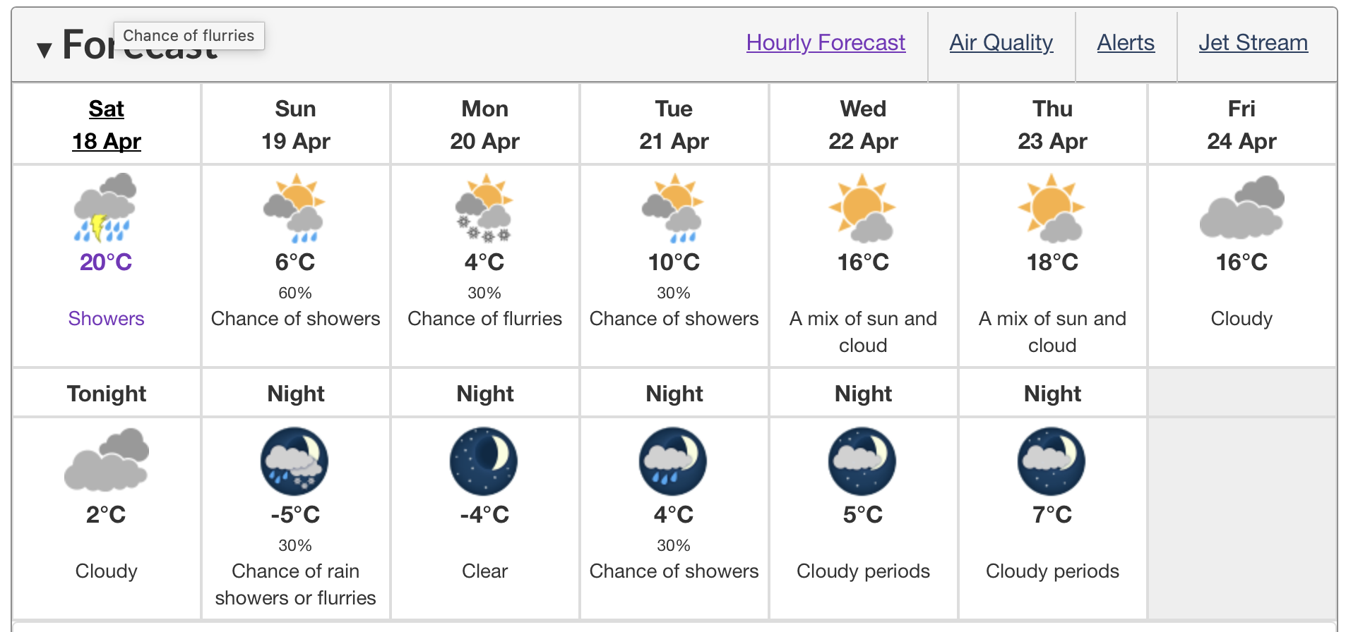
@Chigaze It looks inspired by their mobile app. Including the new icons, but also things I don't like about that app, like separating out the forecast into a separate page from the current conditions. And so much extra whitespace everywhere with the "card" layout for every number, too! And there doesn't seem to be any text forecast anywhere?I guess I will have to fill out their survey. Maybe there is still a chance to make things better.