Which one is visually more appealing to you?
-
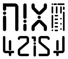
Which one is visually more appealing to you? Please comment.
#scifi #cyberpunk #graphic #logo #indicia #sciencefiction
-
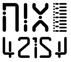
Which one is visually more appealing to you? Please comment.
#scifi #cyberpunk #graphic #logo #indicia #sciencefiction
@R_3_T_3_C_H
1. Lets your eyes focus on the text/letters. A more balanced design2. More visually striking maybe. With the focus-grabbing thing on the right kind of shaping the otherwise uniform box


 ️
️ -
Option 1 cause asymmetry will always be more interesting

-
Option 1 cause asymmetry will always be more interesting
@Ourladyofpoetics Cheers
-
@R_3_T_3_C_H
1. Lets your eyes focus on the text/letters. A more balanced design2. More visually striking maybe. With the focus-grabbing thing on the right kind of shaping the otherwise uniform box
️@AccordionBruce Cheers
-
Which one is visually more appealing to you? Please comment.
#scifi #cyberpunk #graphic #logo #indicia #sciencefiction
2 for me.
-
Which one is visually more appealing to you? Please comment.
#scifi #cyberpunk #graphic #logo #indicia #sciencefiction
@R_3_T_3_C_H Number 1.
-
R relay@relay.mycrowd.ca shared this topic