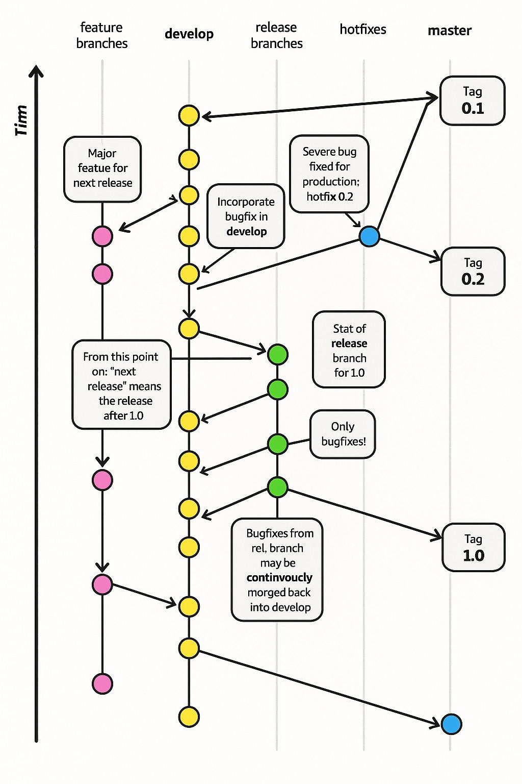
When I was in my early twenties I read The Visual Display of Quantitative Information from Tufte and agonized over making charts great for users.
-
When I was in my early twenties I read The Visual Display of Quantitative Information from Tufte and agonized over making charts great for users.
These days, Microsoft releases graphs like this
@thomasfuchs I love continvoucal integration, i can just morg my featues without worries
-
@thomasfuchs so much of this "article" is factually incorrect. Literally bottom of the barrel slop.
"A commit is a change to one or more files on a branch."
@paulshryock the weird things is that GitHub already has guides for this https://github.com/git-guides/git-commit
-
@thomasfuchs I love continvoucal integration, i can just morg my featues without worries
@lmorchard only timn will tell if that works
-
@thomasfuchs what is Tim doing on the left side?
@jal @thomasfuchs I think Tim's job is to revert changes, because the tagged version gets smaller as Tim goes forward.
And really, with so many AI-generated commits getting continvoucly morged, every company is going to need a full time reverter pretty soon.
-
@NovemDecimal the technical term for this is “not giving a shit”
The worst part is that this is an educational content, so students are learning incorrect information produced by AI.

-
When I was in my early twenties I read The Visual Display of Quantitative Information from Tufte and agonized over making charts great for users.
These days, Microsoft releases graphs like this
-
When I was in my early twenties I read The Visual Display of Quantitative Information from Tufte and agonized over making charts great for users.
These days, Microsoft releases graphs like this
@thomasfuchs This looks like a derivative of the original, which I believe is here: https://jeffkreeftmeijer.com/git-flow/
-
Well, first you need two bottles of industrial lube, a goose, and a bag of pretzels.
-
@colincornaby @thomasfuchs why, yes…yes they did https://social.lol/@db/116082055809272838
@europlus @thomasfuchs @db Ah, clearly I am behind on this story…
-
@thomasfuchs the longer I look the worse it gets. “Tim” had me laughing but then I looked at where they put release branches and how they ordered the tags… I am so confused.
@zachery_delong @thomasfuchs “They” seems to be doing a lot of work in that sentence.
 I suppose this could be a case of malicious compliance, though, by people forced to use a chatbot for everything – a cry for help.
 -
@thomasfuchs This looks like a derivative of the original, which I believe is here: https://jeffkreeftmeijer.com/git-flow/
@fahrni thank you for that link. i was wondering how Tim was involved with any of this @thomasfuchs
-
@thomasfuchs literally yesterday I found that domain (learn.microsoft.com) and out of curiosity just clicked: in the first second I got a vídeo with an AI generated character, and closed that tab. Enshittification at its best.
-
@thomasfuchs This looks like a derivative of the original, which I believe is here: https://jeffkreeftmeijer.com/git-flow/
@fahrni
I was just going to post that version - it's stuck in my memory. I can't tell why they even tried to change it? What led to this crazy fuckup? Who ok-ed it?
@thomasfuchs -
@lmorchard only timn will tell if that works
Backwards timn
-
When I was in my early twenties I read The Visual Display of Quantitative Information from Tufte and agonized over making charts great for users.
These days, Microsoft releases graphs like this
@thomasfuchs When did they release this? And what's Tim up to? I guess he's past the top of the chart? I have enough trouble understanding these when they are well formatted, but um, what's Tim doing up, and arrows pointing down?
-
When I was in my early twenties I read The Visual Display of Quantitative Information from Tufte and agonized over making charts great for users.
These days, Microsoft releases graphs like this
@thomasfuchs even gitflow is too complicated for most projects, and that doesn't even involve morging
-
When I was in my early twenties I read The Visual Display of Quantitative Information from Tufte and agonized over making charts great for users.
These days, Microsoft releases graphs like this
@thomasfuchs I've always wondered how plumbuses were made
-
When I was in my early twenties I read The Visual Display of Quantitative Information from Tufte and agonized over making charts great for users.
These days, Microsoft releases graphs like this
@thomasfuchs yeah.... we think it's like fashion, people who see it may appreciate it in passing but it's only really worth the effort if it also makes us happy to do
-
@thomasfuchs yeah.... we think it's like fashion, people who see it may appreciate it in passing but it's only really worth the effort if it also makes us happy to do
@thomasfuchs since clearly it isn't going to be rewarded in conventional ways, heh sigh
-
I think it's a haiku and they wanted to stretch the sillable count so they made up a word. It's a mood thing, a-la jabberwocky.
Bugfix from rel, branch
Continvoucly morged back
into development