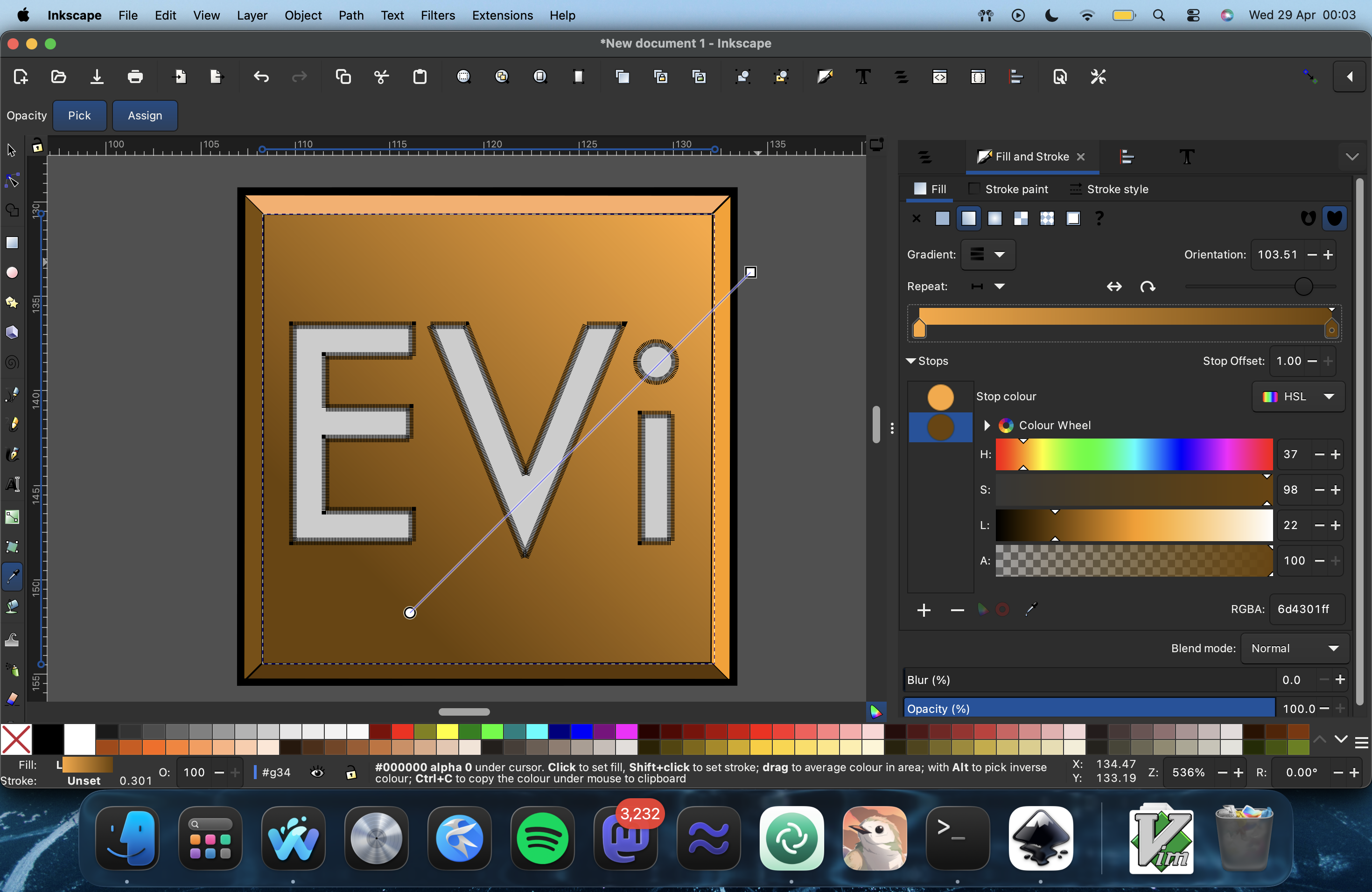
Opinions on this work in progress logo for the #EVi editor?
-
-
@mrmasterkeyboard looks like it's from the periodic table
-
@mrmasterkeyboard looks like it's from the periodic table
@reiddragon lmfao it does a bit
-
@mrmasterkeyboard looks good. What are you going for?
-
@mrmasterkeyboard looks good. What are you going for?
@mrmasterkeyboard generic art things: using a cold color like e.g. blue instead of black in gradients often helps make things pop. Give a peek at the intended size, detail level is often hard to manage perfectly when working on a big canvas.
-
@mrmasterkeyboard looks good. What are you going for?
@felipe well, it's for the anti-AI VIm fork I work on. Me and Reiddragon from the IRC channel who helps to maintain EVi decided someone should make a logo for EVi for the .desktop files and stuff. I used an SVG of the VIm logo and took it apart and regrouped in it Inkscape and did made changes to it to turn it into something new!
If things go well, you should see it at https://codeberg.org/evi-editor/evi eventually or maybe in a different form than you see here.
-
@mrmasterkeyboard too many gradients imo
-
@mrmasterkeyboard too many gradients imo
@hexaheximal There’s only one.