O … K … FINE.
-
…it’s not even that. It’s just ugly. Bad layouts. Bad margins. Bad proportions. Awkward animations. Flickers and flashes. Content peeking through all the negative space so that the screen is filled with visual noise. It feels designed by committee. It feels pasted together.
The feel of Apple products has covered a lot of ground over the decades. They’ve felt elegant. They’ve felt basic. They’ve felt bauble-y and cute. They’ve felt futuristic. They’ve felt practical. But this is the first time I can recall an Apple product feeling •cheap•.
@inthehands assuming you've tried setting "reduce transparency" and "increase contrast"? I'm pretty severely visually impaired, and was scared of the new interface, but those two settings seemed to obviate almost all of the liquid glass crap. That said, I completely agree with you that it was a stupid Apple move, and Apple's been de-prioritizing usability for quite a while I think
Edit: also, dark mode may help. Not sure because I can't see the screen enough to tell what's going on unless it's in dark mode, but you might wanna give that a try. I could see enough of your screenshot to tell your screen was in light mode. But again, I completely agree with you: you shouldn't have to screw around with a bunch of settings to avoid all the liquid glass horrors, especially since liquid glass serves no obvious purpose other than to, well I can't figure out what purpose it might serve actually
-
@inthehands it is an embarrassing pile of garbage and I’m kind of surprised they haven’t just rolled it back.
@inthehands the Home Screen of the Preview app is a particular mess. Weird background things stacked on top of each other that you can’t even tap. Just clutter.
-
Let’s remove that clearly-a-bug gray bar. Better.
Now look at what •should• be negative space around the address bar and X button (highlighted in the second image). Does it add any useful information? No. Does it make the screen visually harder to parse? Yes.
My dudes, what are you even.
-
Now look at what •should• be negative space around the address bar and X button (highlighted in the second image). Does it add any useful information? No. Does it make the screen visually harder to parse? Yes.
My dudes, what are you even.
Let’s turn those gaps into actual negative space. Better.
The margins are all screwy here still. The layout manages to be waste space •and• still somehow be too tight. And don’t even get me started on having •two• “X” buttons right next to each other that do completely different things! But hey…I’m just some rando with an image editor and 10 minutes, and I’ve managed to bring it halfway back to looking as good as the previous iOS version.
-
…it’s not even that. It’s just ugly. Bad layouts. Bad margins. Bad proportions. Awkward animations. Flickers and flashes. Content peeking through all the negative space so that the screen is filled with visual noise. It feels designed by committee. It feels pasted together.
The feel of Apple products has covered a lot of ground over the decades. They’ve felt elegant. They’ve felt basic. They’ve felt bauble-y and cute. They’ve felt futuristic. They’ve felt practical. But this is the first time I can recall an Apple product feeling •cheap•.
@inthehands My biggest objection to things like this is less about how things look and more about how unnecessary User Interface changes affect my flow state. For me for iOS 26, this was 95% about Safari.
For anyone else affected this way, the good news is you can quickly make Safari mostly like iOS 18 by switching to "Bottom" layout.
-
…it’s not even that. It’s just ugly. Bad layouts. Bad margins. Bad proportions. Awkward animations. Flickers and flashes. Content peeking through all the negative space so that the screen is filled with visual noise. It feels designed by committee. It feels pasted together.
The feel of Apple products has covered a lot of ground over the decades. They’ve felt elegant. They’ve felt basic. They’ve felt bauble-y and cute. They’ve felt futuristic. They’ve felt practical. But this is the first time I can recall an Apple product feeling •cheap•.
@inthehands macOS since Big Sur has felt cheap. That was where it was obvious that Apple was going full onto form over function.

A visual comparison of macOS Catalina and Big Sur
This post is an attempt to provide a visual comparison of pretty dramatic UI changes between macOS Catalina and Big Sur.

Andrew Denty (www.andrewdenty.com)
Seems like Liquid Glass is more of the same.
Apple is no different from any other player in the industry when it comes to software now, and possibly even worse because people somehow think that what they do is GOOD, so they copy it and foist it onto the rest of the industry.
Unfortunately, they are just coasting on past glories.
-
Let’s turn those gaps into actual negative space. Better.
The margins are all screwy here still. The layout manages to be waste space •and• still somehow be too tight. And don’t even get me started on having •two• “X” buttons right next to each other that do completely different things! But hey…I’m just some rando with an image editor and 10 minutes, and I’ve managed to bring it halfway back to looking as good as the previous iOS version.
Note that none of the complaints above are about the much-maligned transparency effects (which I have turned off). This is just basic, ground-level 2D design stuff that even this not-a-real-designer rando can pick apart.
The flagship product of one of the wealthiest companies on earth. Seriously.
-
Now look at what •should• be negative space around the address bar and X button (highlighted in the second image). Does it add any useful information? No. Does it make the screen visually harder to parse? Yes.
My dudes, what are you even.
@inthehands also violating the cardinal rule of browsers: never mix chrome and site UI because then you can't tell if it's being spoofed
-
Note that none of the complaints above are about the much-maligned transparency effects (which I have turned off). This is just basic, ground-level 2D design stuff that even this not-a-real-designer rando can pick apart.
The flagship product of one of the wealthiest companies on earth. Seriously.
@inthehands From looking at some screenshots it seems the UI is a bit less dense, but in a way that is not controllable and will hurt usability at least for me. This is not new, iOS 7 was also a disaster for usability that got slowly unwound over the years, but I'm out of patience for living in someone else's bad UI idea showcase.
-
Note that none of the complaints above are about the much-maligned transparency effects (which I have turned off). This is just basic, ground-level 2D design stuff that even this not-a-real-designer rando can pick apart.
The flagship product of one of the wealthiest companies on earth. Seriously.
@inthehands Yup, it’s just good old fashioned buggy, both in behavior and design. Apple’s quality has been sliding for a while, so I assume it’s a cultural shift within the organization. Sad
-
Note that none of the complaints above are about the much-maligned transparency effects (which I have turned off). This is just basic, ground-level 2D design stuff that even this not-a-real-designer rando can pick apart.
The flagship product of one of the wealthiest companies on earth. Seriously.
@inthehands It’s truly horrendous. Not just visually confusing and wasting screen space, but I have (several times, in various contexts) clicked on, even typed into, the wrong thing because of all the overlapping nonsense. Like the edges of things are not where they appear to be so you are actually clicking on the thing behind what you intended.
Do they even use their own products?
I’ve heard they will be making another big set of changes in OS27 — can’t come too soon.
-
Note that none of the complaints above are about the much-maligned transparency effects (which I have turned off). This is just basic, ground-level 2D design stuff that even this not-a-real-designer rando can pick apart.
The flagship product of one of the wealthiest companies on earth. Seriously.
@inthehands how many people in a position to make it better had to look at it and says “yes this is good, we should ship it” for us to get here? It’s mind boggling
-
Note that none of the complaints above are about the much-maligned transparency effects (which I have turned off). This is just basic, ground-level 2D design stuff that even this not-a-real-designer rando can pick apart.
The flagship product of one of the wealthiest companies on earth. Seriously.
@inthehands my thoughts exactly.
Just installed on my personal phone and watch yesterday because of the security issues. Was using iOS 26 lightly for work but not enough to get the full experience.
One more is that the animations are too long and “clever”. They might “delight” the first time, but after that, I feel “wtf is this here”? Apple pushed designers and developers over the years to keep animations tight and relevant. This ignores all of that advice.
1/2 -
Note that none of the complaints above are about the much-maligned transparency effects (which I have turned off). This is just basic, ground-level 2D design stuff that even this not-a-real-designer rando can pick apart.
The flagship product of one of the wealthiest companies on earth. Seriously.
@inthehands I updated a couple of days ago for the same reason.
Holy hell it’s all just so bad. Little things I do multiple times a day require extra steps.
Fuctionally and visually, it all reeks of changes done just to make changes, and then implemented poorly.
It’s death by one thousand cuts.
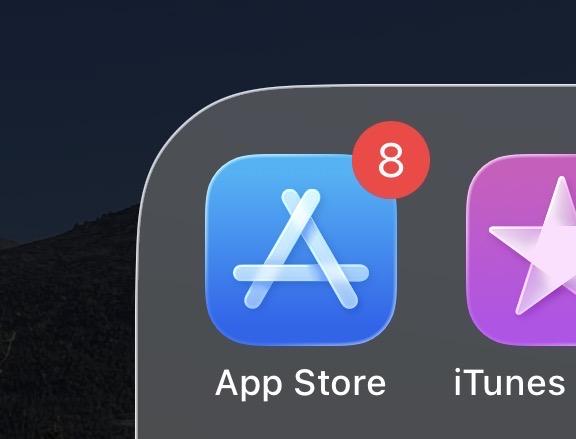
For example, who exactly thinks *this* radius looks good here?
-
@inthehands my thoughts exactly.
Just installed on my personal phone and watch yesterday because of the security issues. Was using iOS 26 lightly for work but not enough to get the full experience.
One more is that the animations are too long and “clever”. They might “delight” the first time, but after that, I feel “wtf is this here”? Apple pushed designers and developers over the years to keep animations tight and relevant. This ignores all of that advice.
1/2@inthehands Even the PIN entry on the Watch is bad.
I don’t see current leadership walking back any of this in a meaningful way.
For the first time in my life I can say, “Steve would have never allowed this”It’s just ugly.
2/2
-
Note that none of the complaints above are about the much-maligned transparency effects (which I have turned off). This is just basic, ground-level 2D design stuff that even this not-a-real-designer rando can pick apart.
The flagship product of one of the wealthiest companies on earth. Seriously.
This is exactly the thing I wonder about. Was it shoved through over internal objections? Was it many teams’ separate good work stuck together too hastily? Was it the wrong kind of pressure from above, or bad taste from below, or what?
It’s frustrating because as a dev I catch glimpses of all the really fantastic engineering work folks at Apple are doing •inside• the box, and they’re feeling very little love for it right now because the •outside•is so clunky.
Steve (@scm@sfba.social)
@inthehands@hachyderm.io how many people in a position to make it better had to look at it and says “yes this is good, we should ship it” for us to get here? It’s mind boggling

SFBA.social (sfba.social)
-
This is exactly the thing I wonder about. Was it shoved through over internal objections? Was it many teams’ separate good work stuck together too hastily? Was it the wrong kind of pressure from above, or bad taste from below, or what?
It’s frustrating because as a dev I catch glimpses of all the really fantastic engineering work folks at Apple are doing •inside• the box, and they’re feeling very little love for it right now because the •outside•is so clunky.
Steve (@scm@sfba.social)
@inthehands@hachyderm.io how many people in a position to make it better had to look at it and says “yes this is good, we should ship it” for us to get here? It’s mind boggling
SFBA.social (sfba.social)
@inthehands I think it comes back to "they have no taste" https://www.youtube.com/watch?v=dR8SAFRBmcU
-
@inthehands I think it comes back to "they have no taste" https://www.youtube.com/watch?v=dR8SAFRBmcU
@celeduc @inthehands It really is that simple.
-
This is exactly the thing I wonder about. Was it shoved through over internal objections? Was it many teams’ separate good work stuck together too hastily? Was it the wrong kind of pressure from above, or bad taste from below, or what?
It’s frustrating because as a dev I catch glimpses of all the really fantastic engineering work folks at Apple are doing •inside• the box, and they’re feeling very little love for it right now because the •outside•is so clunky.
Steve (@scm@sfba.social)
@inthehands@hachyderm.io how many people in a position to make it better had to look at it and says “yes this is good, we should ship it” for us to get here? It’s mind boggling
SFBA.social (sfba.social)
Say what you will about Steve Jobs, who was •not• a super nice person to work for and a bad role model for management in many many ways, but he did have one superpower that I really miss right now:
He had a stubborn willingness to •not• release things if they just did’t feel right. If it feels wrong, it doesn’t go out the door. With a few notable exceptions (MobileMe!), no deadline mattered as much as that.
-
@inthehands I think it comes back to "they have no taste" https://www.youtube.com/watch?v=dR8SAFRBmcU
@celeduc
Agreed; my only question is “Who is ‘they’ here?” Individual designers? Tim Apple? I guarantee that •somebody• at Apple knew this sucked before it went out the door; why didn’t they win the day?