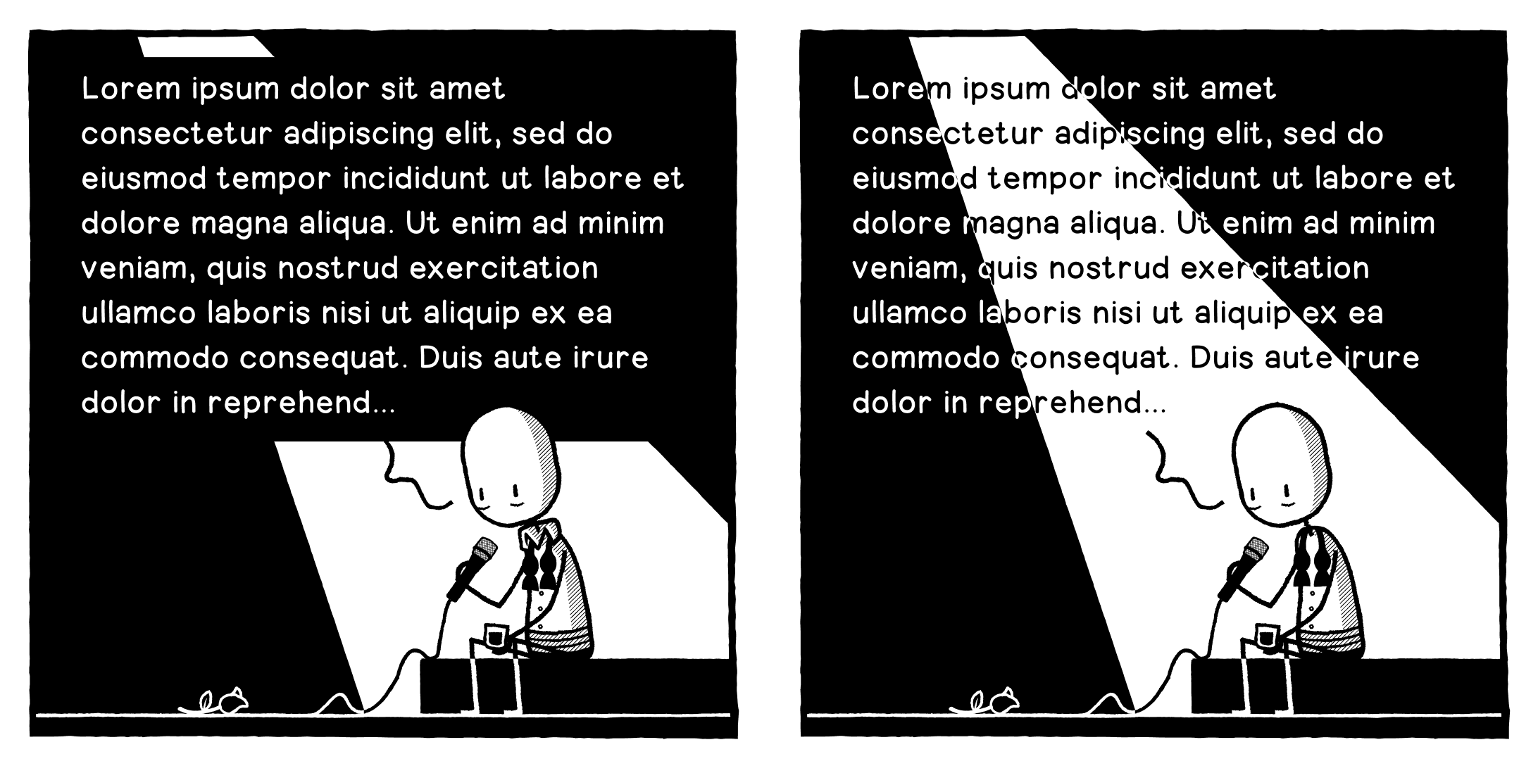
Okay, opinion needed. Should I A: obscure the spotlight to have more legible text, or B: incorporate the text into the spotlight but have it slightly harder to read?
-
Okay, opinion needed. Should I A: obscure the spotlight to have more legible text, or B: incorporate the text into the spotlight but have it slightly harder to read? Text is placeholder obvs.
@designthinkingcomic Tricky, but I'd go with B. It's a little less legible, but there's not that much text to read.
-
Okay, opinion needed. Should I A: obscure the spotlight to have more legible text, or B: incorporate the text into the spotlight but have it slightly harder to read? Text is placeholder obvs.
@designthinkingcomic A without hesitation. Readability is the most important imho.
-
Okay, opinion needed. Should I A: obscure the spotlight to have more legible text, or B: incorporate the text into the spotlight but have it slightly harder to read? Text is placeholder obvs.
@designthinkingcomic I find B a bit distractingly difficult to read so I'd choose A (but I have 0 design experience).
-
Okay, opinion needed. Should I A: obscure the spotlight to have more legible text, or B: incorporate the text into the spotlight but have it slightly harder to read? Text is placeholder obvs.
3. Contrasting outline over text to make it easier to read "stroke"
-
Okay, opinion needed. Should I A: obscure the spotlight to have more legible text, or B: incorporate the text into the spotlight but have it slightly harder to read? Text is placeholder obvs.
@designthinkingcomic choosing between the given options: B
Because of the height of the textbox, you otherwise lose the integrety of the light beam.
Other option: Give the text a grey background using angled lines. This only done for the black areas should enhance the readability.
Additionally it is obviously not part of the picture itself, but makes for a more homogenous background for the text.Edit: Tried my own advice and it does not work well when having a black/white setup. It works only with very fine lines or directly with a grey background, with destroys the black/white theme.
Hm. -
Okay, opinion needed. Should I A: obscure the spotlight to have more legible text, or B: incorporate the text into the spotlight but have it slightly harder to read? Text is placeholder obvs.
-
Okay, opinion needed. Should I A: obscure the spotlight to have more legible text, or B: incorporate the text into the spotlight but have it slightly harder to read? Text is placeholder obvs.
@designthinkingcomic I would prefer the first option with text easier to read.
-
Okay, opinion needed. Should I A: obscure the spotlight to have more legible text, or B: incorporate the text into the spotlight but have it slightly harder to read? Text is placeholder obvs.
@designthinkingcomic Main problem with B for me is the beam edges cutting directly through single letters, which makes it a pain to read. The switch between black and white for full words I find less problematic than that.
-
Okay, opinion needed. Should I A: obscure the spotlight to have more legible text, or B: incorporate the text into the spotlight but have it slightly harder to read? Text is placeholder obvs.
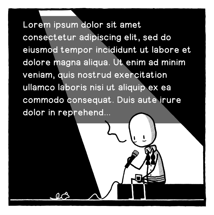
Another option...
-
Okay, opinion needed. Should I A: obscure the spotlight to have more legible text, or B: incorporate the text into the spotlight but have it slightly harder to read? Text is placeholder obvs.
@designthinkingcomic
Its a matter of preference:
Some people prefer reading the text,
other just look at the picture and skip text.
If you want people to read the text, choose A. -
Another option...
@designthinkingcomic the best option.
-
Okay, opinion needed. Should I A: obscure the spotlight to have more legible text, or B: incorporate the text into the spotlight but have it slightly harder to read? Text is placeholder obvs.
@designthinkingcomic
Can you reformat the text to fit inside the black sections? -
Another option...
@designthinkingcomic option C seems reasonable.
otherwise A.
-
Another option...
@designthinkingcomic
My favorite. -
Another option...
@designthinkingcomic The translucent option for me, thanks.
-
@designthinkingcomic
Can you reformat the text to fit inside the black sections?@a_cubed Unfortunately not, there's too much of it.
-
Another option...
@designthinkingcomic Also, go with this text. It is deeply funny.
-
Another option...
@designthinkingcomic This one works well too!
-
@designthinkingcomic If you can do it, have all the text within the light beam and don't spill it over the edges into the dark. Or vice versa (though this wouldn't work as well), all the text in the dark areas to left and right but none in the light.
@JonnyT Unfortunately not, there's too much of it.
-
Another option...
C. It's clearly a spotlight AND it's legible.
