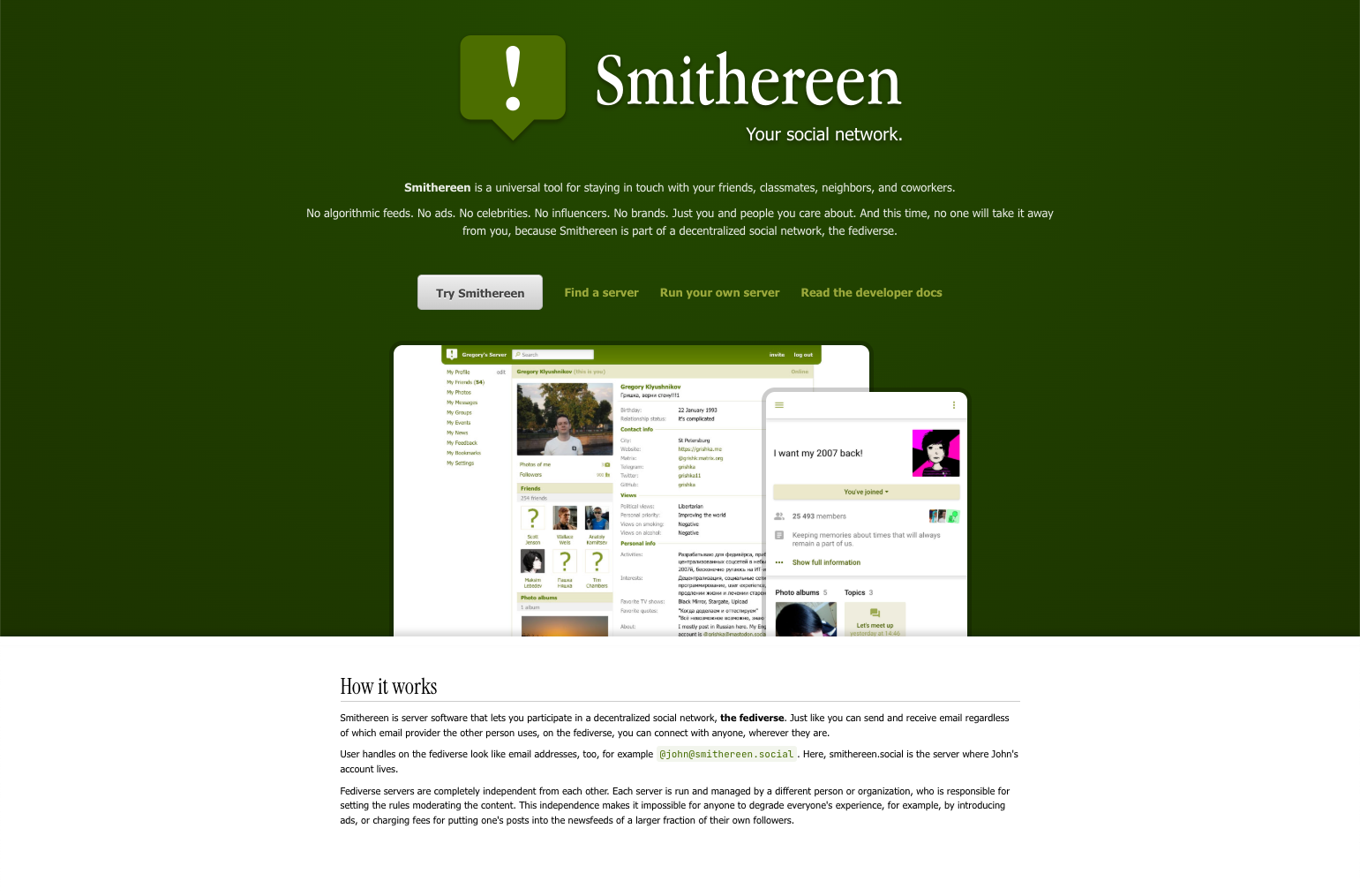
Which one is better?
-
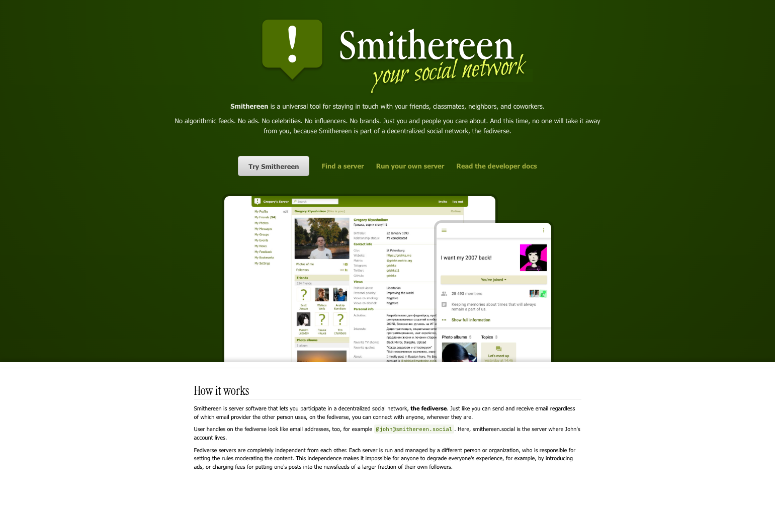
Which one is better?
-
Which one is better?
@grishka I prefer the first one. The bright green, handwriting font looks a little bit cheap, and detracts from the main Smithereen logo.
-
Which one is better?
-
Which one is better?
@grishka I've already mentioned this, but on the first one the font reminds me the one that was used in "The Social Network" movie (although I understand that they're not the same font), which I see as a cool easter egg.

-
@grishka I've already mentioned this, but on the first one the font reminds me the one that was used in "The Social Network" movie (although I understand that they're not the same font), which I see as a cool easter egg.
@broadway_lamb that's just Tahoma lol. The one in your picture is (almost) Facebook logo font
-
@broadway_lamb that's just Tahoma lol. The one in your picture is (almost) Facebook logo font
@grishka yep, I know, but the vibe is kind of similar, at least for me
-
Which one is better?
@grishka I prefer second one
-
Which one is better?
@grishka the first one 1
-
 D dansup@mastodon.social shared this topic