This is a thread of beautiful or interesting computer-y things I scanned at the Museum of Printing this weekend.
-
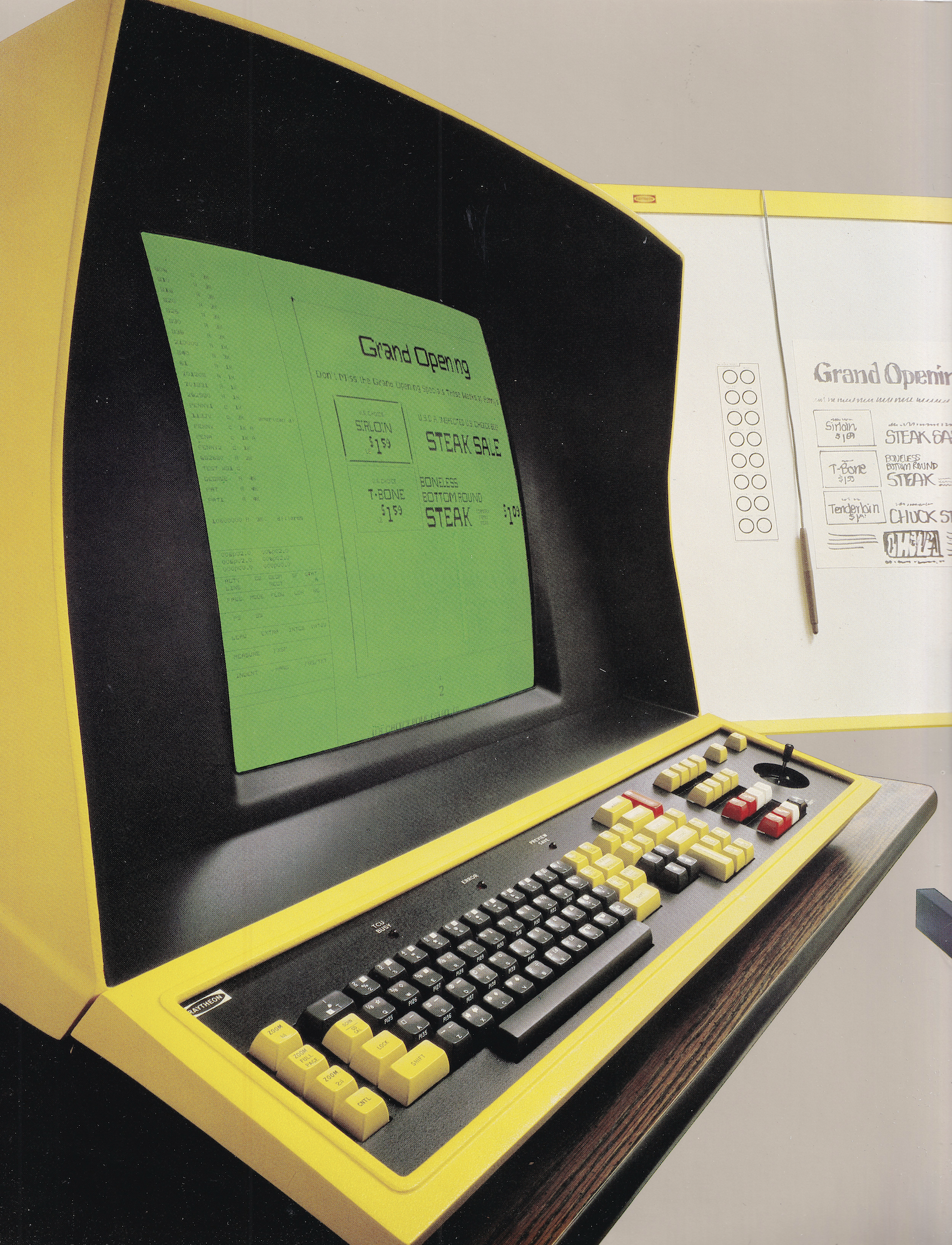
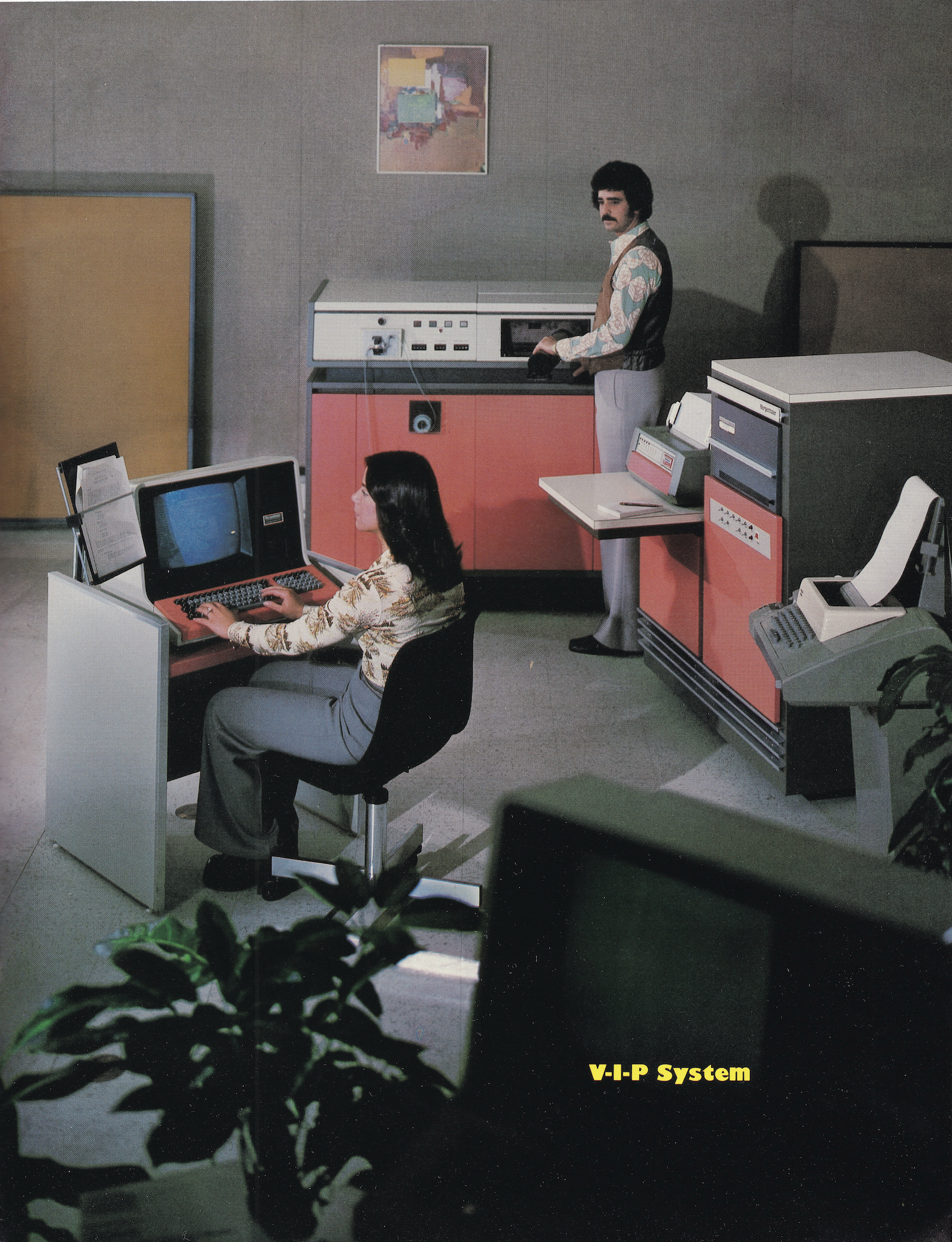
11. Holy lord, look at this colour-coordinated Avis setup from 1979.
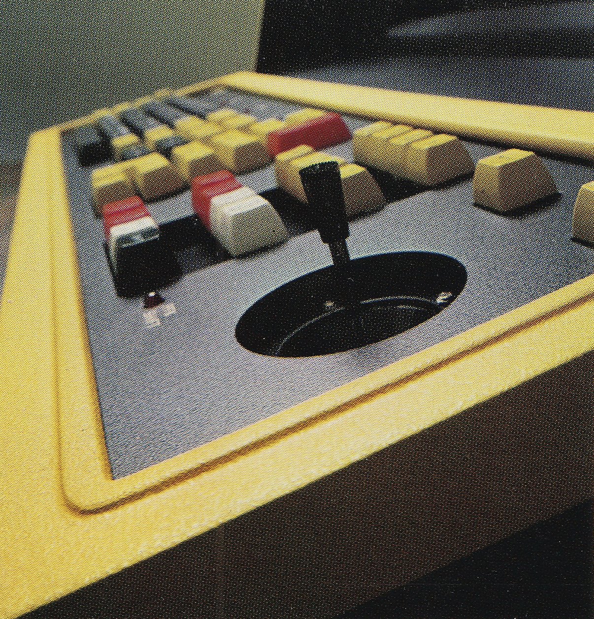
12. This photo from the same Harris brochure is also cool.
-
3. This could’ve been me if I played my cards right.
@mwichary Whatever he’s working on, it looks mysterious and important!
-
12. This photo from the same Harris brochure is also cool.
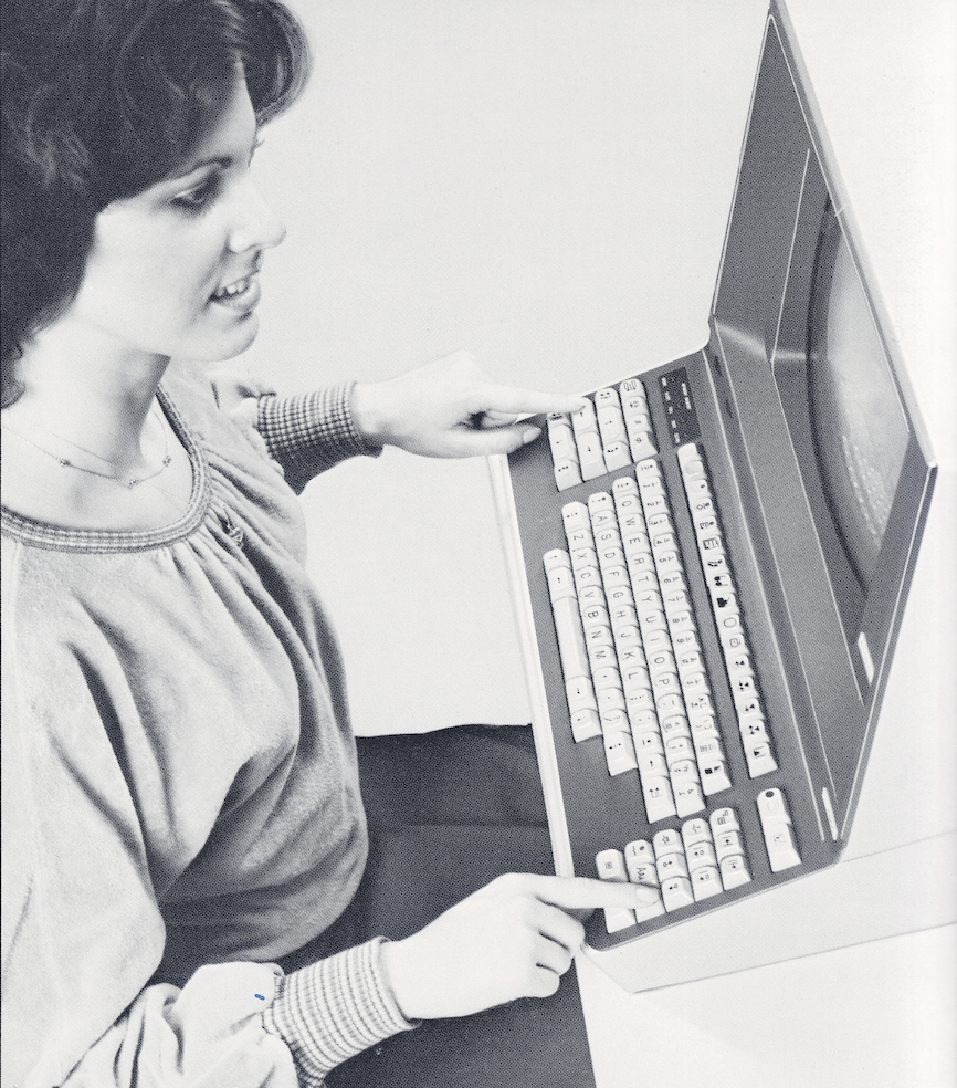
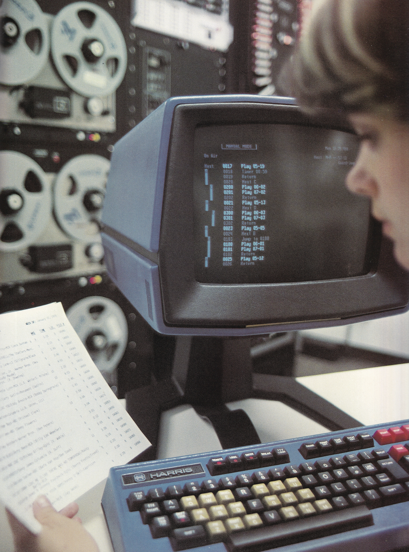
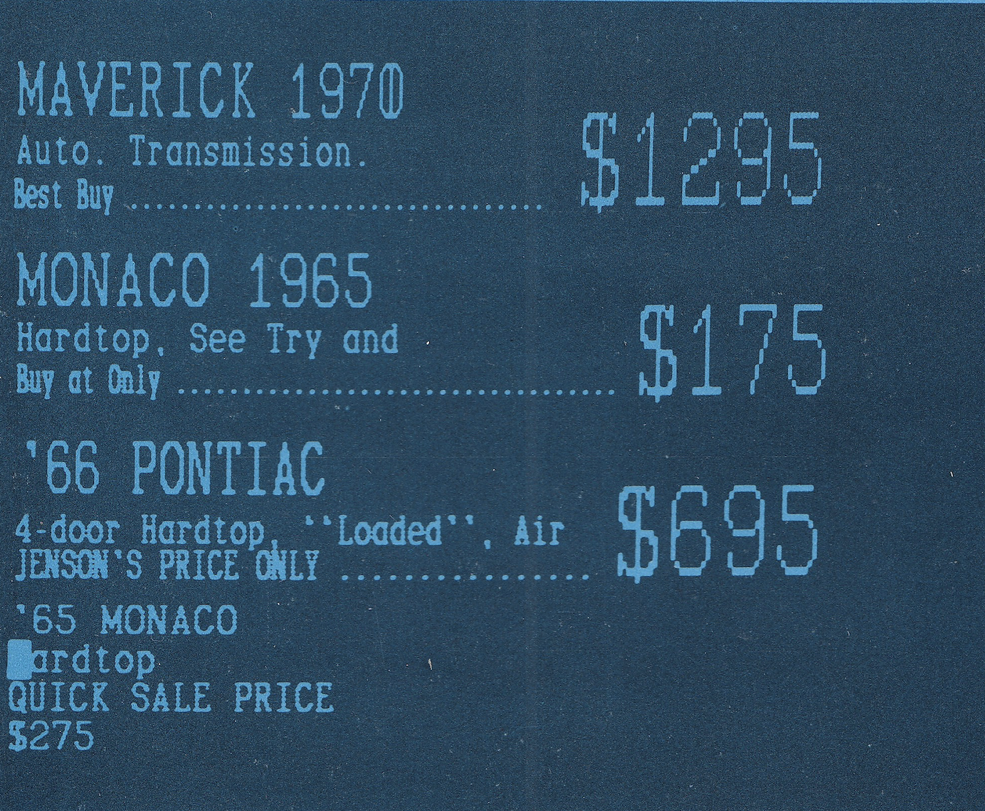
13. Just this aesthetic.
-
13. Just this aesthetic.
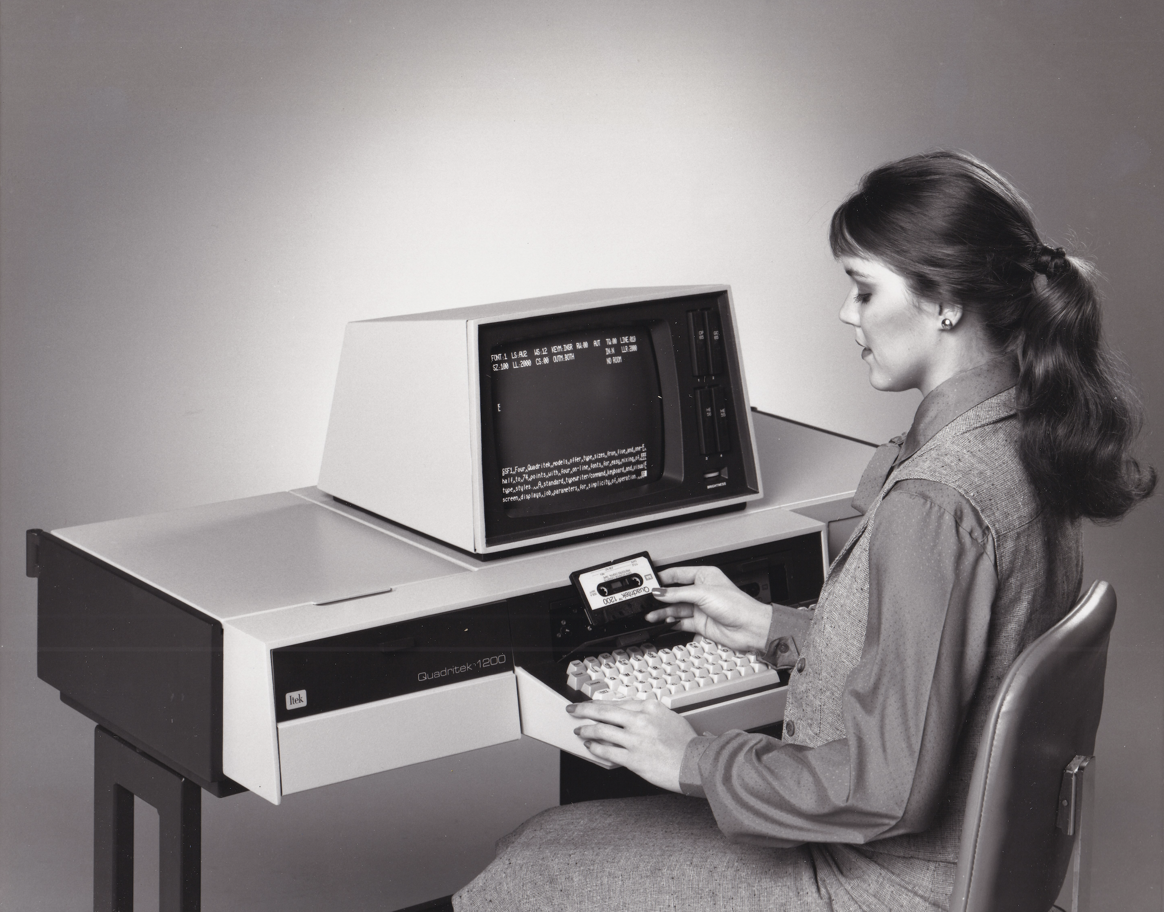
14. I associate compact cassettes with cheap home computers, but that hasn’t always been the case.
-
This is a thread of beautiful or interesting computer-y things I scanned at the Museum of Printing this weekend.
(Eventually all of this will be processed and deposited at Internet Archive!)
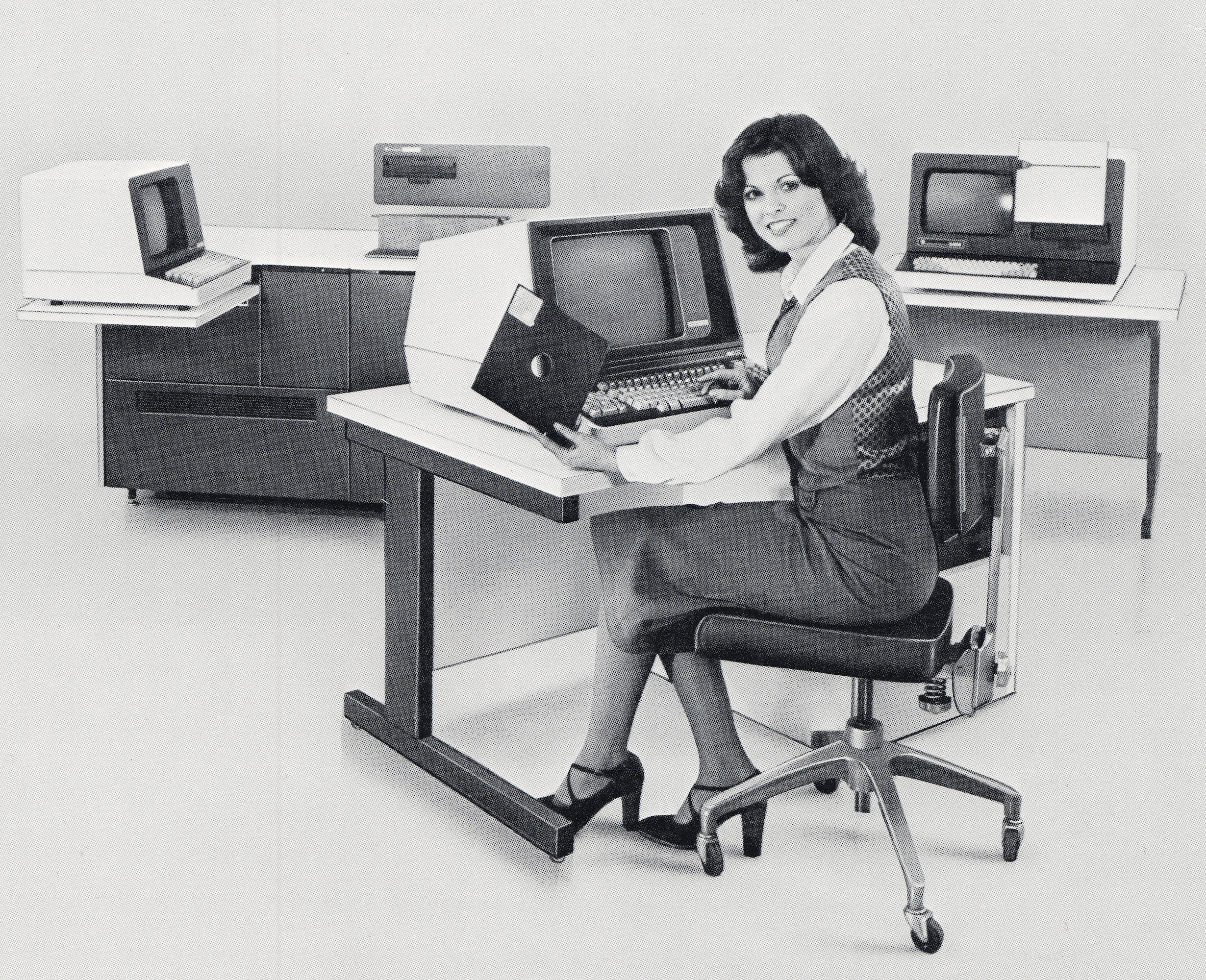
1. You don’t see a lot of yellow in computing.
@mwichary
Sadly. I think the Acorn Phoebe was the last one? -
14. I associate compact cassettes with cheap home computers, but that hasn’t always been the case.
15. This cool drawing of a keyboard for a manual, with a lot of corrections and whiteouts (if you look closely).
-
@aarbrk I think that’s a traditional name for symbols/iconography. Something like Windings.
@mwichary Thanks, looks right
 https://printwiki.org/Pi_Characters
 -
15. This cool drawing of a keyboard for a manual, with a lot of corrections and whiteouts (if you look closely).
16. Bad Boys (1995)
-
16. Bad Boys (1995)
17. More red computing.
-
11. Holy lord, look at this colour-coordinated Avis setup from 1979.
@mwichary Hot.
-
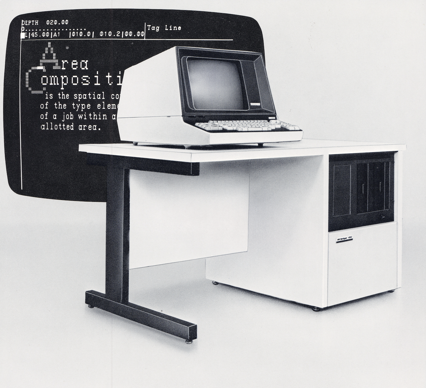
10. You could have a 1,000 tries, and you would never guess how VariTyper named its Helvetica knock-off.
@mwichary Leader of the Deceptifonts
-
11. Holy lord, look at this colour-coordinated Avis setup from 1979.
@mwichary a thing of absolute beauty
-
17. More red computing.
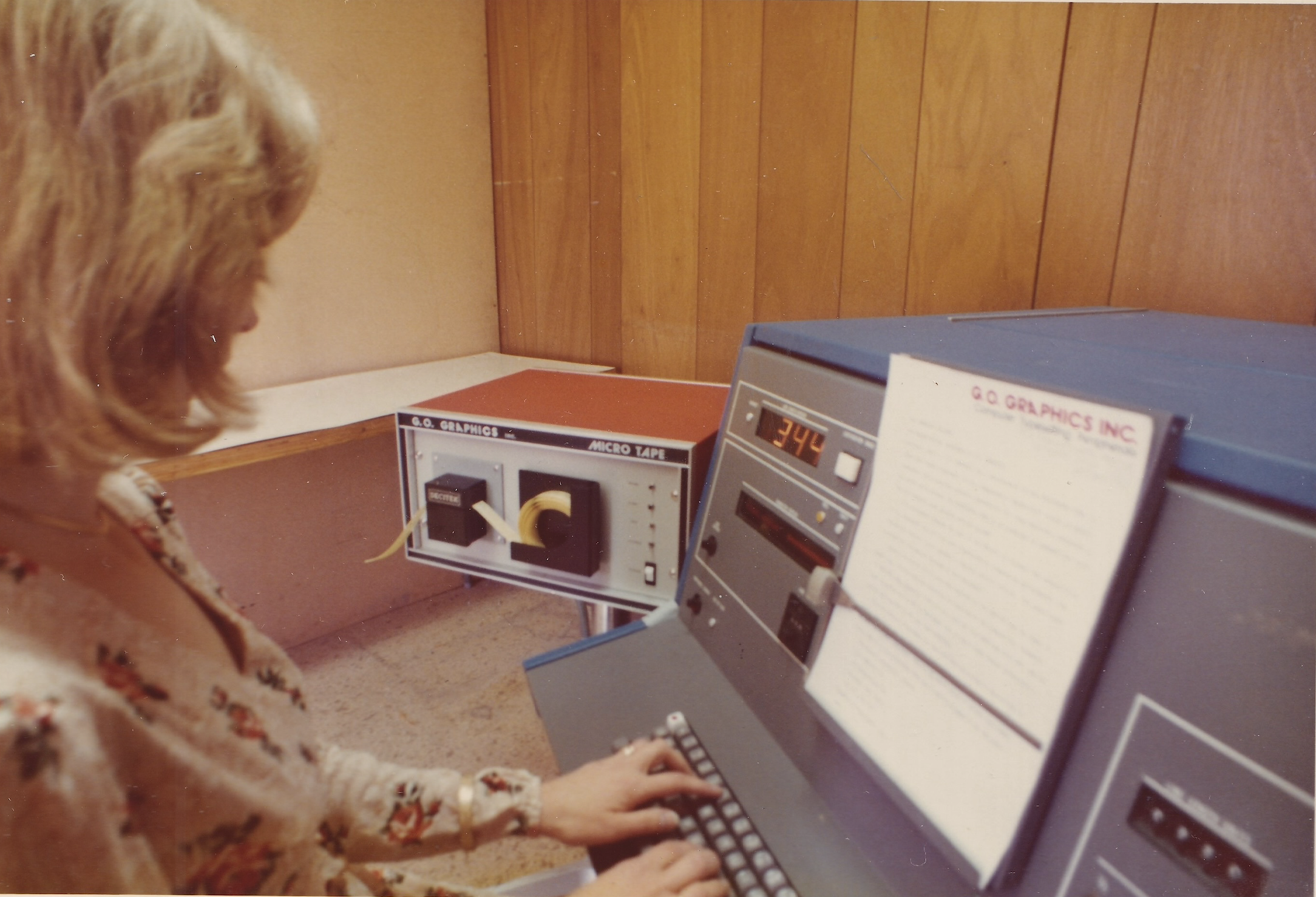
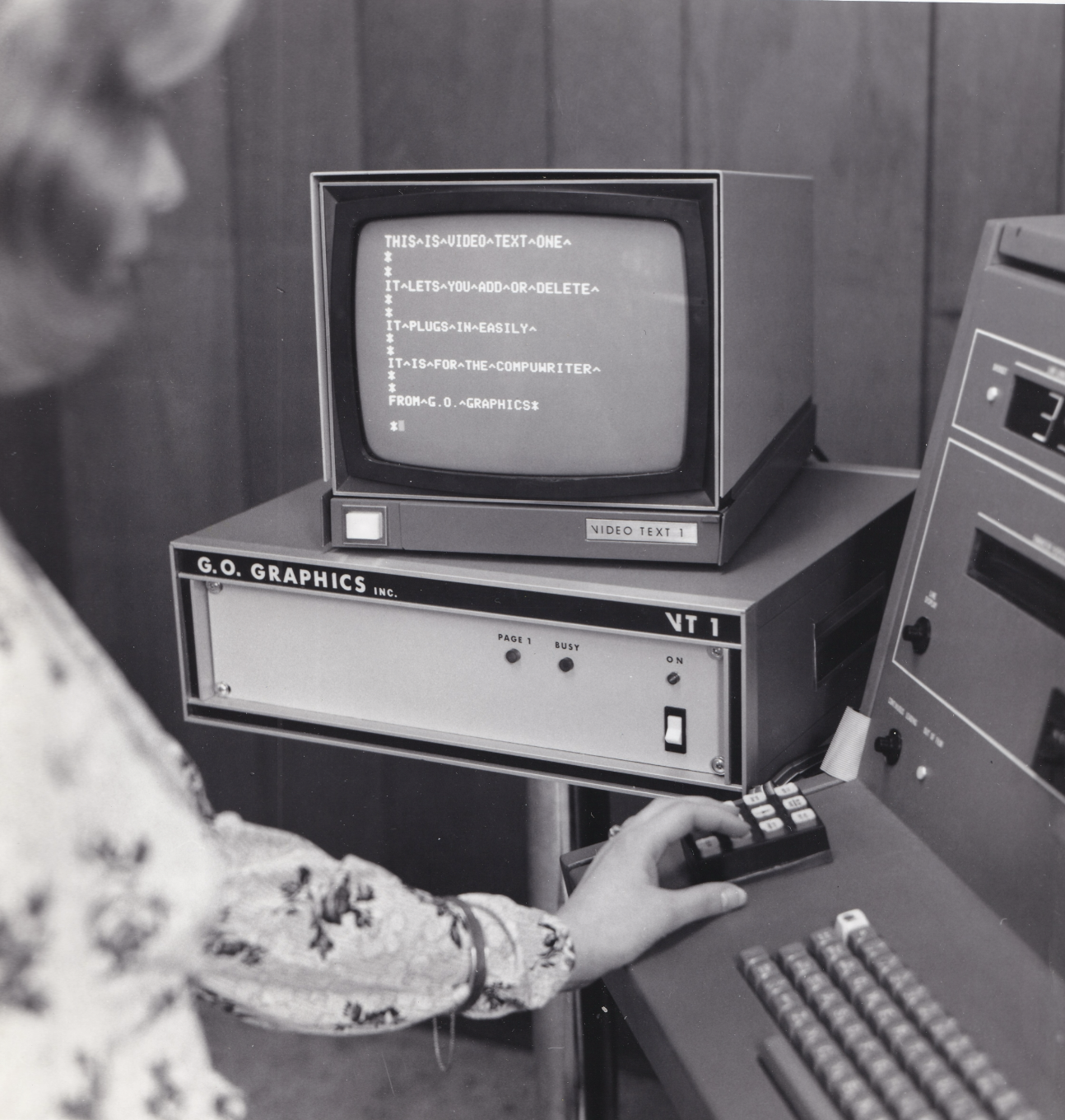
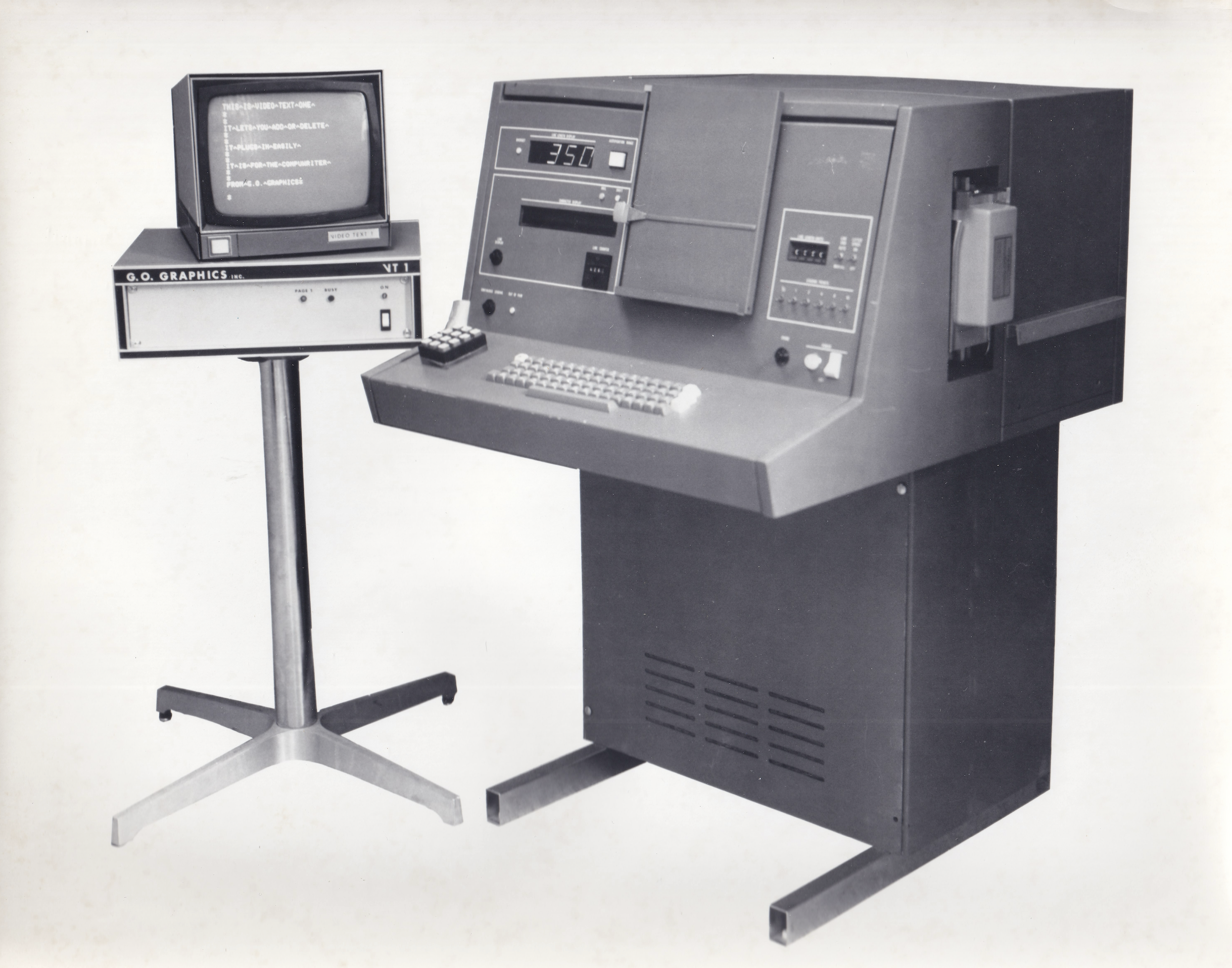
18. This company is called G. O. GRAPHICS. Cute.
-
15. This cool drawing of a keyboard for a manual, with a lot of corrections and whiteouts (if you look closely).
@mwichary illustrations like this (and, in particular, Transformers transformation instruction sheets) are what lead me to learn technical illustration so many decades ago. Love this, and the whiteout.
-
18. This company is called G. O. GRAPHICS. Cute.
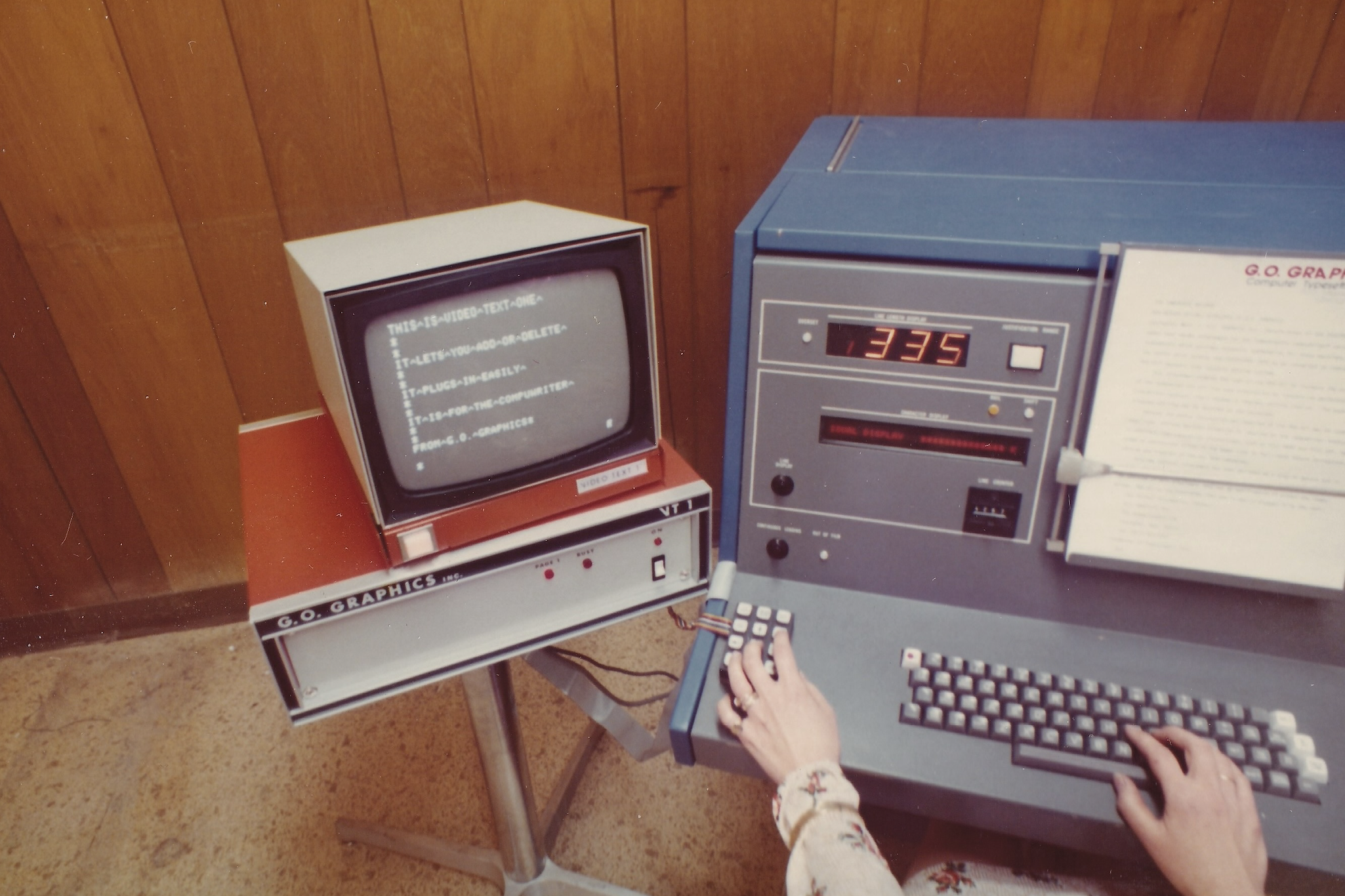
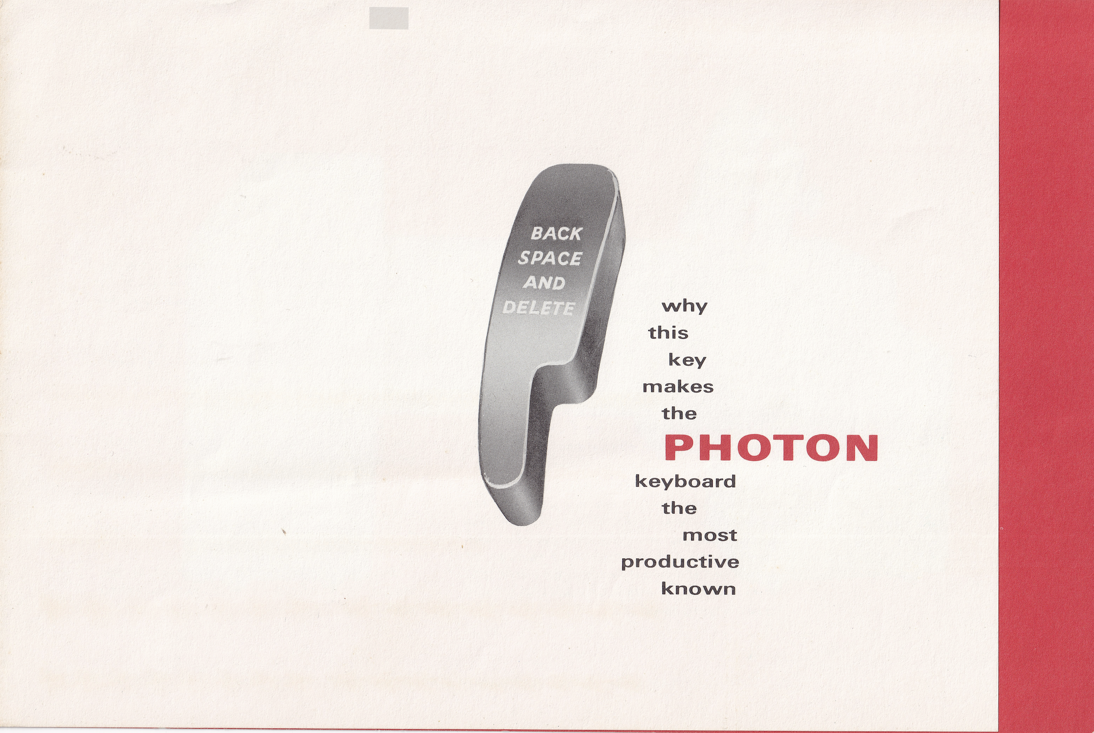
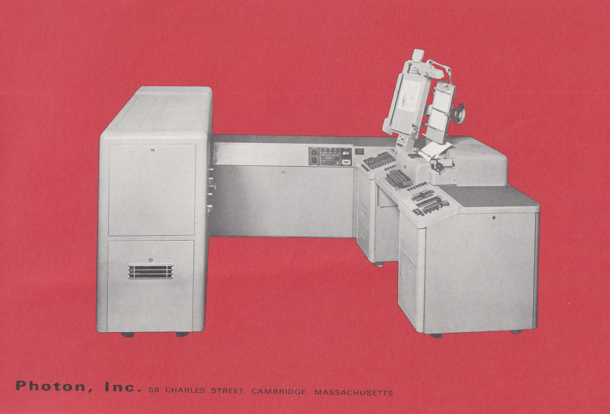
19. I would have put this in my book in an instant.
-
11. Holy lord, look at this colour-coordinated Avis setup from 1979.
@mwichary real color, not white, grey or beige.
-
11. Holy lord, look at this colour-coordinated Avis setup from 1979.
@mwichary Adding a bit of the complementary color green would have really helped here. Or, even just a bit of red-orange, for an analogous color palette.
-
19. I would have put this in my book in an instant.
20. More cool keys from the Photon.
-
16. Bad Boys (1995)
@mwichary My computer programmer dad had a work setup a lot like this. They hired me to run backups so I got to mess with it
-
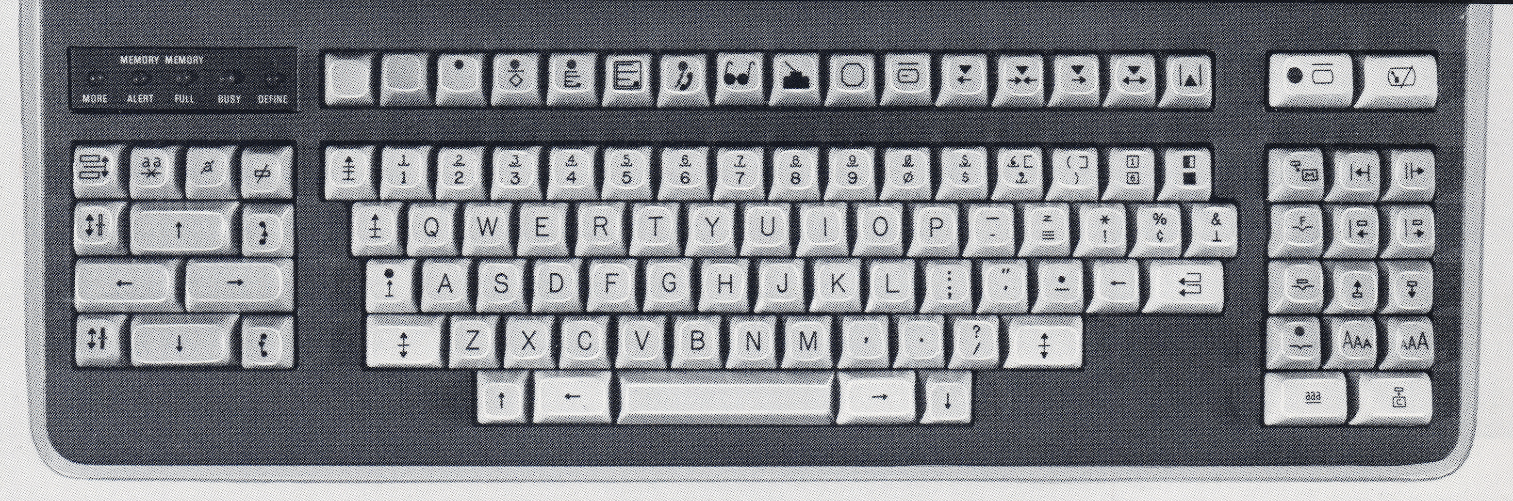
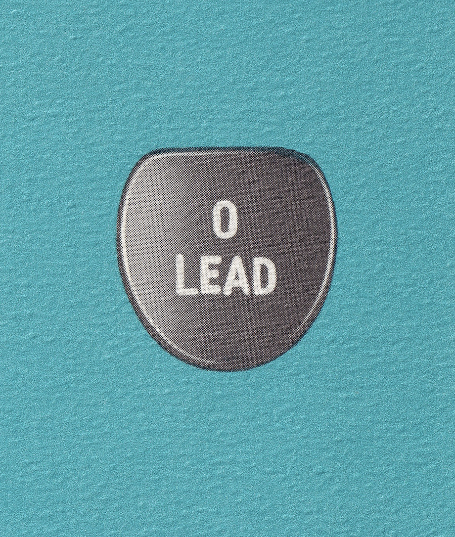
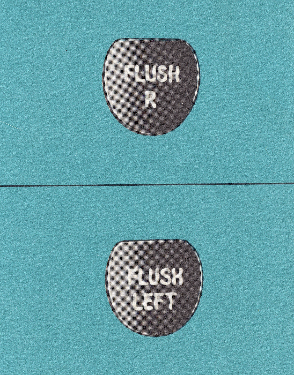
20. More cool keys from the Photon.
21. The keyboard of Comp/Set 4800, and an 8" floppy disk.