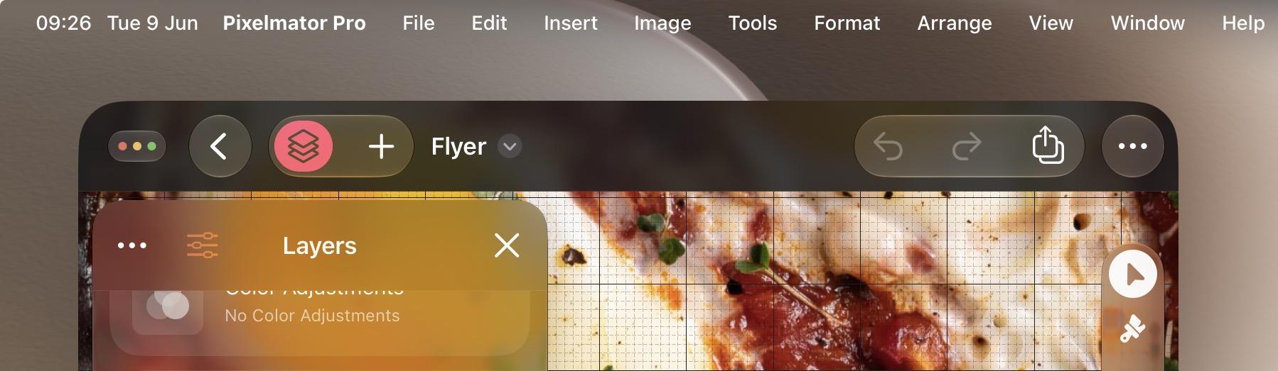
On the plus side of the design language, look at this and tell me we’re not almost back to iOS 6 levels of chrome.
-
On the plus side of the design language, look at this and tell me we’re not almost back to iOS 6 levels of chrome. Nature is healing…
@stroughtonsmith I do wonder whether at some point, all this refraction bollocks will become an option or just be quietly dropped. Watching SOTU, it’s like they felt forced to say “but that refraction thing is still in the sidebar”, and it was the first point where I was all: “Oh good. You’ve still made it so you can make text less legible for no discernible benefit. Go you.”
-
Tell me that's not Aqua
The Add Homescreen Widget panel on iPad looks like it’s straight out of iOS 6, with the opaque panels, blue tints, and generous drop shadows
-
Tell me that's not Aqua
-
@gameshack_ That looks so cool, I hope they keep expanding UI & UX like that!
-
The Add Homescreen Widget panel on iPad looks like it’s straight out of iOS 6, with the opaque panels, blue tints, and generous drop shadows
macOS Golden Gate doesn't look 'refined', it looks retro. It's honestly shocking at first launch. It's like we've slowly moving into a timeline where iOS 7 never happened

-
macOS Golden Gate doesn't look 'refined', it looks retro. It's honestly shocking at first launch. It's like we've slowly moving into a timeline where iOS 7 never happened
@stroughtonsmith I really like that version of Liquid Glass, though. Finally some contrast and a bit of realism. Just makes me wish selection states (like sidebar or tabs) would follow suit.
-
macOS Golden Gate doesn't look 'refined', it looks retro. It's honestly shocking at first launch. It's like we've slowly moving into a timeline where iOS 7 never happened
Seeing nav bars return is wild; they painted themselves into such a corner last year that they had to hit the "break [Liquid] Glass in case of emergency" lever
-
macOS Golden Gate doesn't look 'refined', it looks retro. It's honestly shocking at first launch. It's like we've slowly moving into a timeline where iOS 7 never happened
@stroughtonsmith I really like the improved Liquid Glass materials. The buttons are almost lickable again
-
Seeing nav bars return is wild; they painted themselves into such a corner last year that they had to hit the "break [Liquid] Glass in case of emergency" lever
The Liquid Glass version of Pages on macOS 27 almost looks like it could be running on Mac OS X Tiger. Can't wait to see what this OS looks like after apps refresh their designs to fit in

-
macOS Golden Gate doesn't look 'refined', it looks retro. It's honestly shocking at first launch. It's like we've slowly moving into a timeline where iOS 7 never happened
@stroughtonsmith A return to being able to tell UI elements apart from each other will be so nice. Can you imagine being able to tell at a glance whether something is a text label, a web link or a button?

-
On the plus side of the design language, look at this and tell me we’re not almost back to iOS 6 levels of chrome. Nature is healing…
@stroughtonsmith yeah no we’re not.
- Pointless translucency on permanent window chrome.
- lack of labels
- missing titlebar
- button chrome when unnecessary (surrounding your buttons with circles reduces shape uniqueness if they are already in an area devoted to buttons)
- mostly monochrome
- button design doesn’t clearly convey purpose the way proper skeumorphic buttons do
- semi-random button grouping -
Tell me that's not Aqua
@stroughtonsmith that’s not aqua, see my last.
Just because something has vaguely aqua buttons doesn’t mean the rest of the design language isn’t wrong -
The Liquid Glass version of Pages on macOS 27 almost looks like it could be running on Mac OS X Tiger. Can't wait to see what this OS looks like after apps refresh their designs to fit in
@stroughtonsmith again, this toolbar still fails to return to many solid design principles. This is the actual pages from the late 2000s and it has sooo many more affordances in its toolbar (it also doesn’t make the mistake of squashing the titlebar and toolbar together)

-
macOS Golden Gate doesn't look 'refined', it looks retro. It's honestly shocking at first launch. It's like we've slowly moving into a timeline where iOS 7 never happened
@stroughtonsmith and they recently brought back @sdw so maybe we’ll get full anthropomorphic within the next 5 years!
-
macOS Golden Gate doesn't look 'refined', it looks retro. It's honestly shocking at first launch. It's like we've slowly moving into a timeline where iOS 7 never happened
@stroughtonsmith So… skeuomorphism rendered real-time instead of pre-rendered?
-
Seeing nav bars return is wild; they painted themselves into such a corner last year that they had to hit the "break [Liquid] Glass in case of emergency" lever
@stroughtonsmith hemlines go up, hemlines go down. but seriously I’m so ready for turning away from the flat sterile world we’ve lived in since iOS 7
-
@stroughtonsmith again, this toolbar still fails to return to many solid design principles. This is the actual pages from the late 2000s and it has sooo many more affordances in its toolbar (it also doesn’t make the mistake of squashing the titlebar and toolbar together)
@amonduin @stroughtonsmith Pages ’09 will remain the best of class for many years to come.
-
The Liquid Glass version of Pages on macOS 27 almost looks like it could be running on Mac OS X Tiger. Can't wait to see what this OS looks like after apps refresh their designs to fit in
@stroughtonsmith This is excellent news!
-
macOS Golden Gate doesn't look 'refined', it looks retro. It's honestly shocking at first launch. It's like we've slowly moving into a timeline where iOS 7 never happened
@stroughtonsmith It is much improved, though I do wish they would get away from the “text fields that look exactly like buttons” designs. The search field should have some kind of distinct frame for example, and not look like a giant button.
-
R relay@relay.infosec.exchange shared this topic
